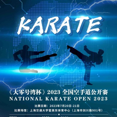
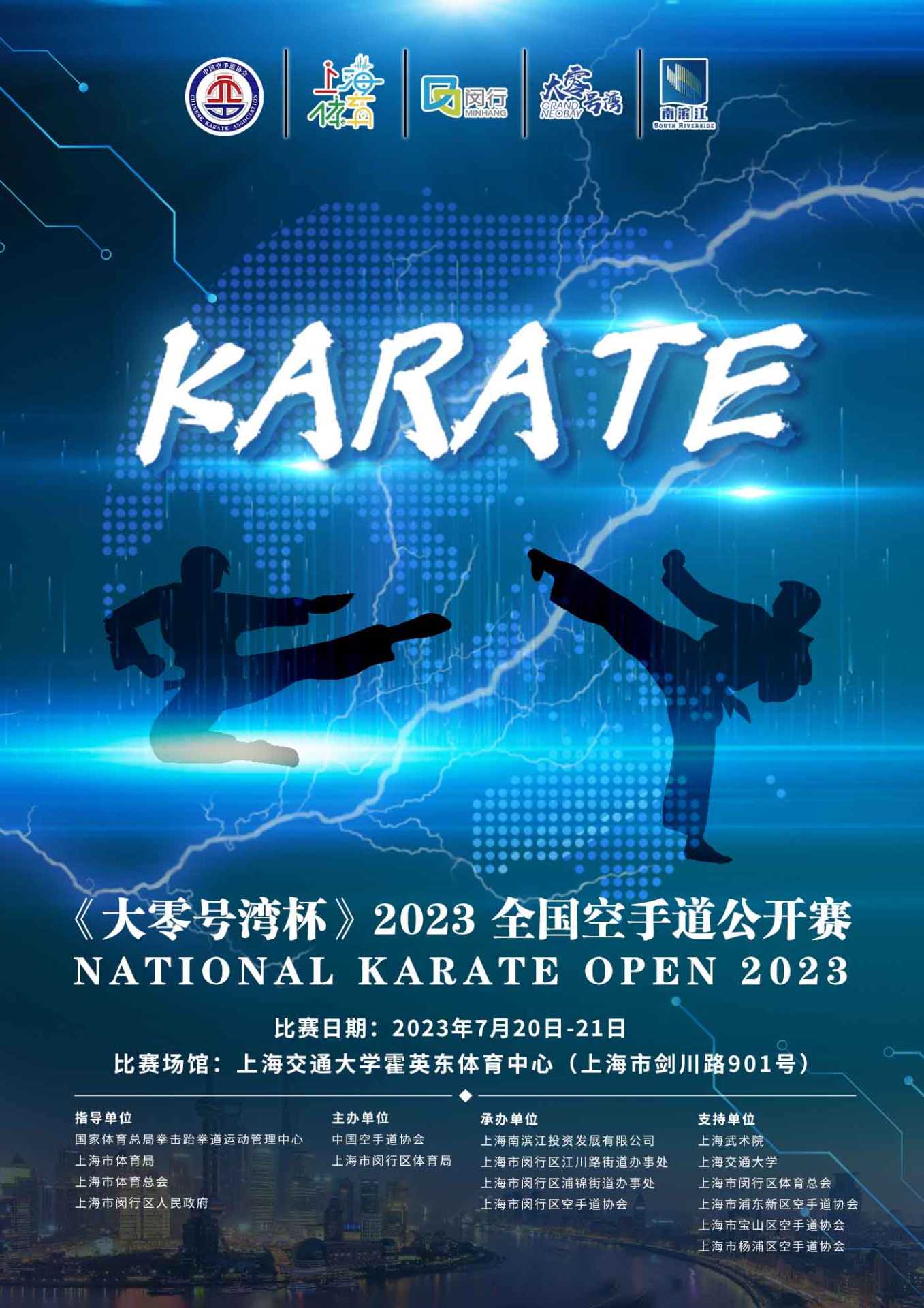
This karate competition poster is exquisitely designed and highlights the resolute spirit of karate with a strong visual impact. The poster uses bright colors and dynamic patterns to show the power and majesty of karate. The text layout is orderly, the key points are prominent, and the competition information is clear at a glance. The overall layout is reasonable, and the simple style reveals the passion and vitality of karate, which perfectly integrates the competition information and the spirit of cultural promotion.
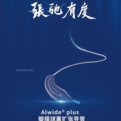
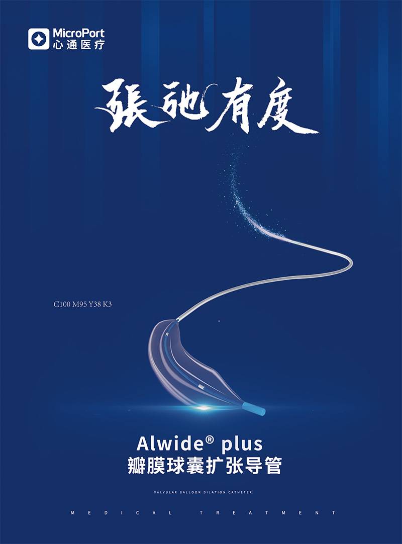
This case shows the visual design of Microport Alwide Plus series products, creating an impactful and recognizable brand image through the ultimate innovative concept. The poster adopts a highly technological blue tone and elegant and smooth curve elements to create a modern professional atmosphere. At the same time, Chinese fonts are integrated into calligraphy style, and Chinese and western cultural elements are organically combined to enhance the local cultural connotation. In terms of content design, we comprehensively and systematically introduce the core functions and application scenarios of products, focus on professionalism and practicality, and build user trust. In the printing process, the material of high gram weight matte powder paper is selected and the local UV process is matched.
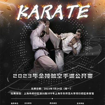
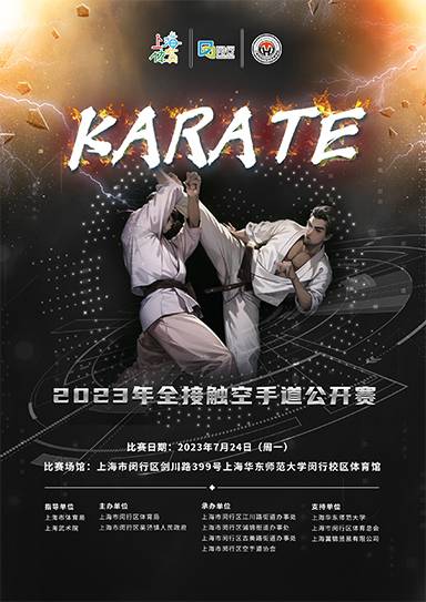
The poster design of this karate open tournament is full of the perfect combination of strength and beauty. The theme of the poster is clear, showing the fierce and wonderful moments of the competition with strong visual impact. The design elements are selected just right, and the dynamics of the contestants' attack are outlined through lines, which closely attracts the audience's attention. In terms of color, the use of vibrant blue, red, yellow and other tones not only brings strong visual impact, but also highlights the passion and vitality of karate competitions. The overall layout is reasonable and the theme is prominent, so that the audience can quickly understand the competition information at a glance. At the same time, the poster also highlights the diversity of organizers and units, reflecting the common
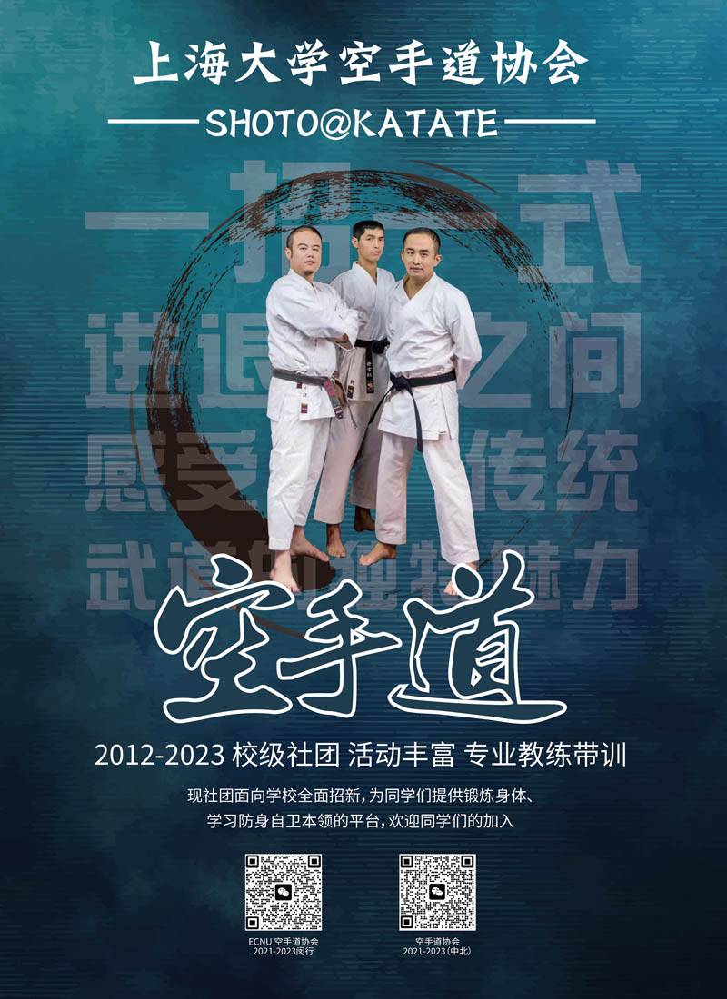
This poster shows a shocking picture of members of the Karate Association of Shanghai University forming a circle. They wore white karate costumes and black belts on their waists, and their eyes were deep and firm, revealing deep thinking. As a bond, the black belt symbolizes the friendship and unity among members, and at the same time highlights the spirit and strength of karate. The poster design uses a minimalist concept to convey the true meaning of karate with pure strength and emotion. The bright colors contrast strongly with the black belt, emphasizing the power and majesty of karate. The perfect circle surrounded by the members makes the whole picture full of harmony and unity, showing the cohesion of the association.
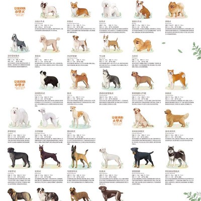
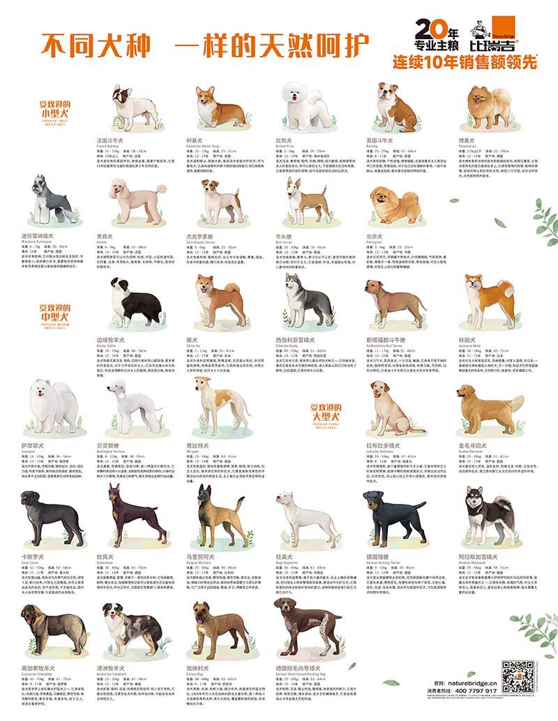
With the theme of natural care, this dog food applicable poster has a concise and clear design, and high-definition images show the cute gestures and expressions of different breeds of dogs, as well as their happy moments enjoying natural food. The colors of the poster are soft and warm, highlighting the natural and healthy characteristics of dog food. The font is simple and straightforward, and quickly conveys the benefits of dog food, such as balanced nutrition, rich in natural ingredients, improving immunity, etc. The brand, name and contact information of dog food are clearly displayed at the bottom of the poster, which is convenient for consumers to choose the dog food that suits them. The overall design not only shows the charm of the dog, but also provides practical breeding information.
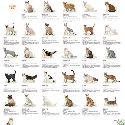
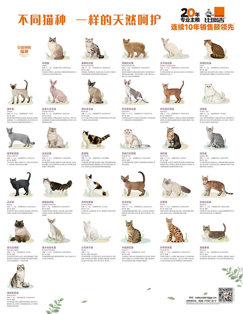
This cat food brand poster design skillfully combines images and words, vividly presenting the core concept of "the same natural care". The poster uses warm colors and matches the scenes of family and pet elements to highlight the natural connection and deep emotions between people and cats. In the text part, "the same natural care" not only conveys the brand's meticulous care for each cat, but also emphasizes the brand's concept of natural food. The brand is committed to caring for the health of cats in an all-round way, from ingredient selection to product formula and taste, in the way closest to the natural diet of cats, so that every cat can taste the purest natural delicacy.
Brake with strength, with both virtue and talent. The contrast effect of dark blue and white highlights the professionalism and high quality of the product. Choose high-quality materials, provide high-quality products and services, and win the trust of consumers.
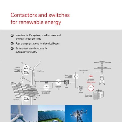
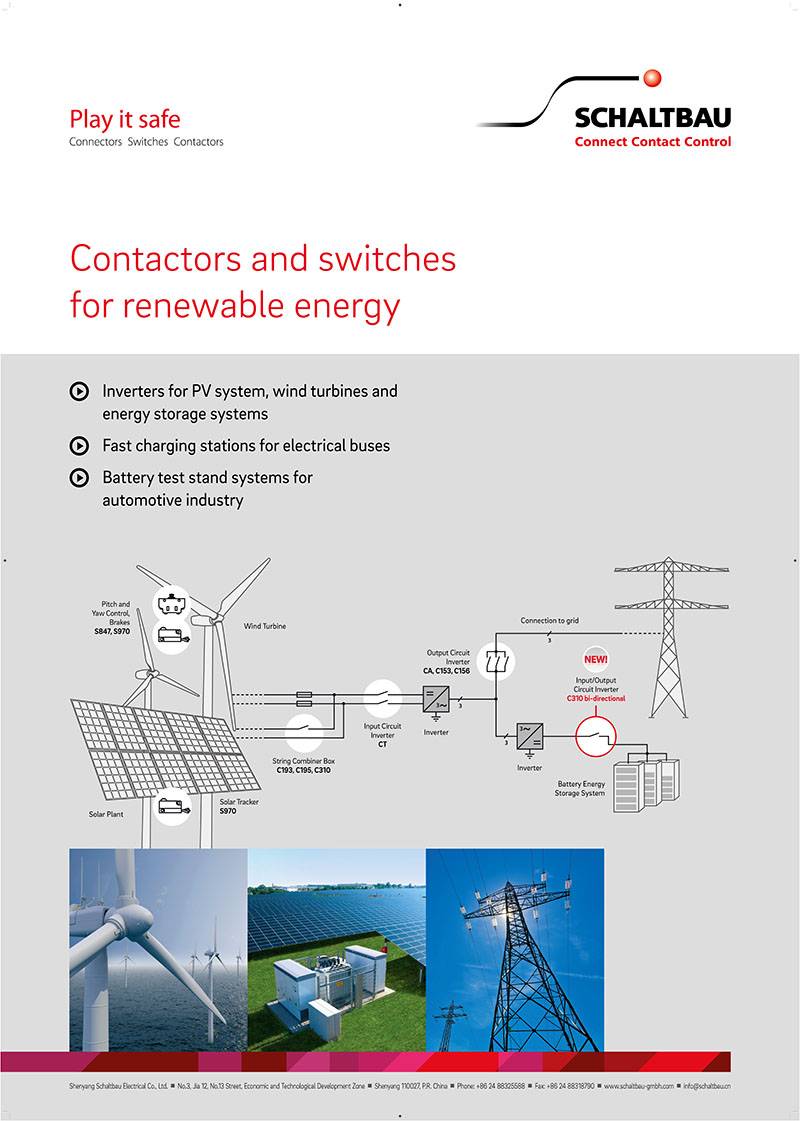
With the theme of "Renewable Energy", this set of poster designs shows power installation control panels and switches composed of solar panels, wind generators, hydroelectric power stations and other components through vivid colors and bold graphic elements. The design details highlight the charm and precision of technology, while clearly conveying the diversity and powerful functionality of renewable energy. The text "Contactors and switches for renewable energy" is direct and clear, enhancing the communication effect of the poster and leading the audience to a green future.
The advertising poster uses blue as the main color, conveying the brand concept of freshness, environmental protection and health. The poster features a delicate bottle and automotive fuel oil with a green logo, highlighting brand characteristics and concern for the environment. The concise and clear design allows consumers to see at a glance, successfully conveys brand value and environmental protection concepts, and enhances consumer awareness and loyalty.
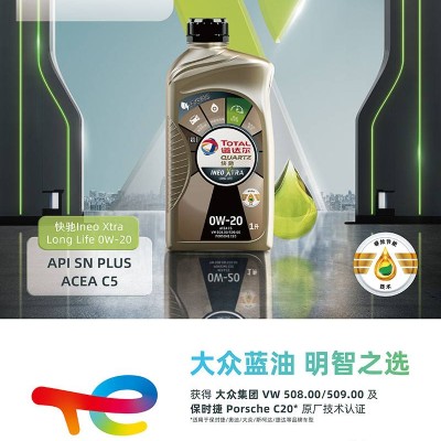
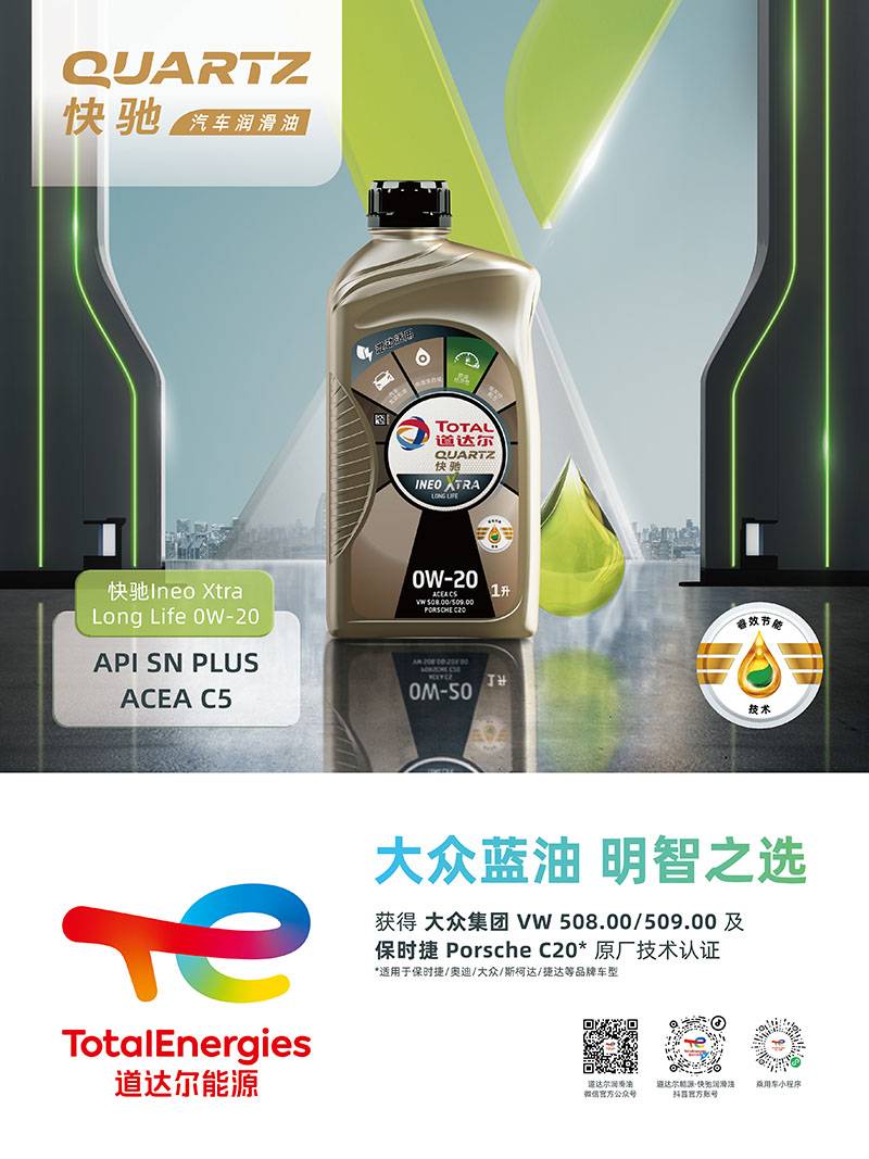
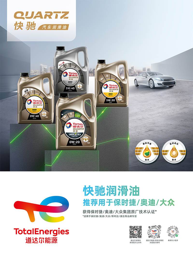
Lubricant advertising posters use red as the main color to highlight the brand image, and are accompanied by pictures of luxury cars such as Porsche, Audi and Volkswagen to emphasize the reliability and efficiency of products. The simple and elegant font design and eye-catching color matching make the poster more visually impactful and attractive. Recommended for luxury cars, further demonstrating the product's adaptability to high-end car brands. This advertising poster successfully conveys the high-quality image and product advantages of Kuaichi Lubricants, and improves brand awareness.
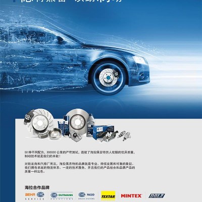
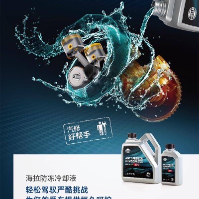
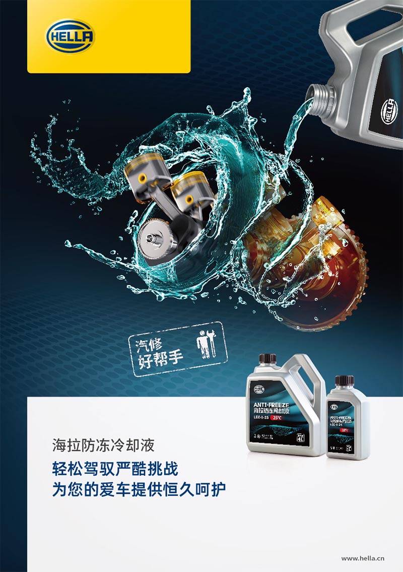
The anti-freeze coolant poster features dark blue as the main color, highlighting the cold and durable characteristics of the product, and echoing the brand name "Hella". The white text clearly expresses the slogan "Easily handle harsh challenges and provide you with lasting care", emphasizing product efficacy and quality. The centered composition of the product forms the visual focus, and the automotive pattern in the background highlights the importance of antifreeze coolant. The overall design is full of three-dimensional sense, attracting the attention of potential customers and enhancing the brand image.
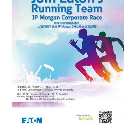
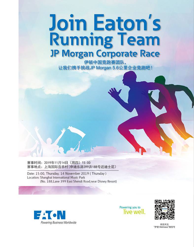
The poster of the running team is uniquely designed, with a group of people running as the theme, showing a positive and energetic atmosphere. The background is integrated into the music performance scene, adding interest and vividness to the running competition. The text section uses strong contrasting colors and bold fonts to highlight the theme and event name, attracting people's attention and understanding the event information. The overall design is both practical and creative, highlighting the healthy and energetic image of Eaton China Race Team and enhancing the attractiveness and participation of the event.
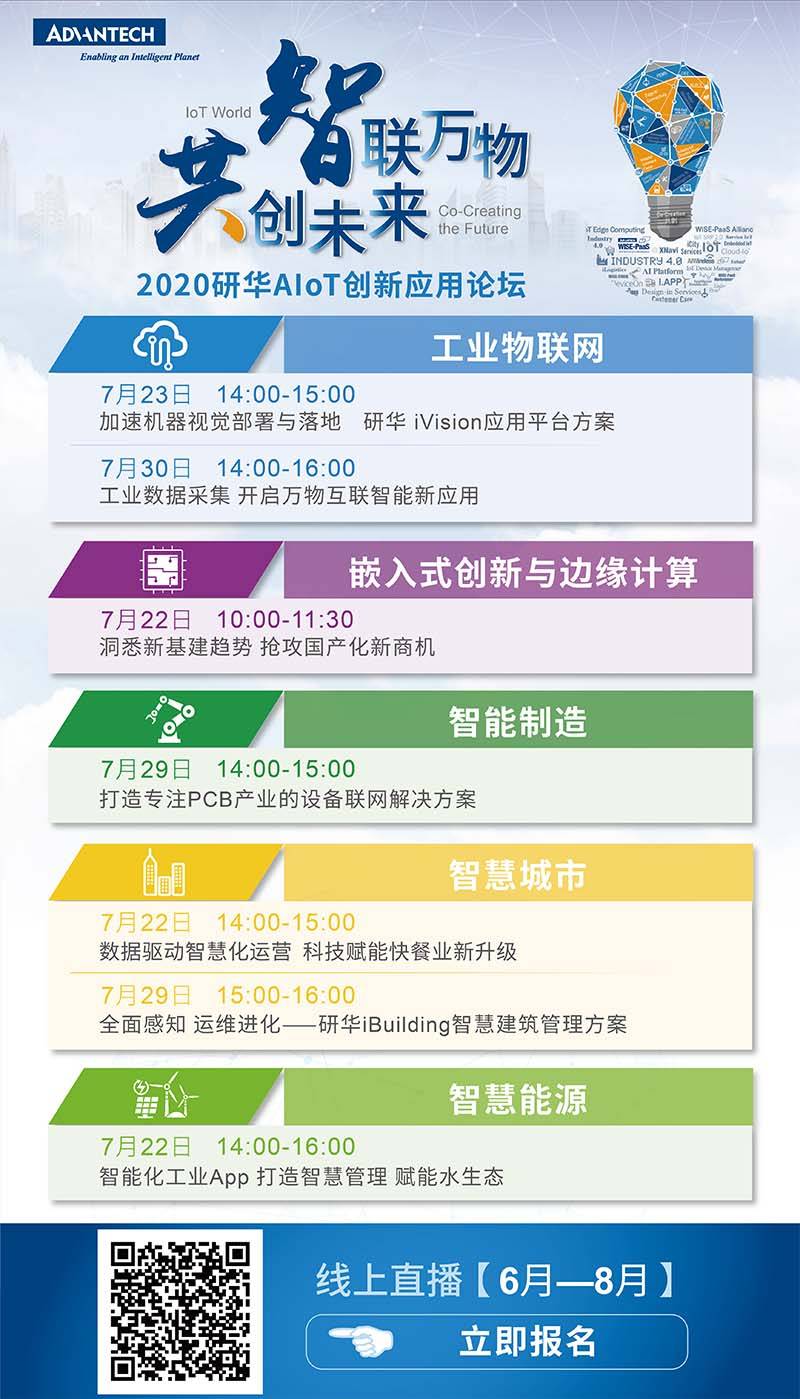
The poster of the exhibition "Connecting Everything, Creating the Future" has white as the main background, which is in sharp contrast with the theme text and attracts attention. Modern fonts show the spirit of innovation and development, and dynamic and tension coexist. The three key words "connection", "thing" and "creation" are arranged symmetrically, highlighting the core elements of the exhibition, and the bright colors add to the eye-catching effect. The poster also incorporates online live broadcast information to remind the audience to pay attention to participation. The overall design is streamlined and atmospheric, reflecting the theme and values of the exhibition, aiming at attracting wide participation.
The poster of "Lianwu Creating the Future" is simple and elegant with white background. The theme text "Lianwu" and "Creating the Future" are highlighted in bright blue and yellow, which is in sharp contrast with the background and quickly attracts the attention of the audience. The font is clear and concise, highlighting the theme of the event, and has a strong visual impact. The overall design color is simple, the theme is prominent, and the visual effect is strong, which perfectly fits the corporate image and the main theme of the event.
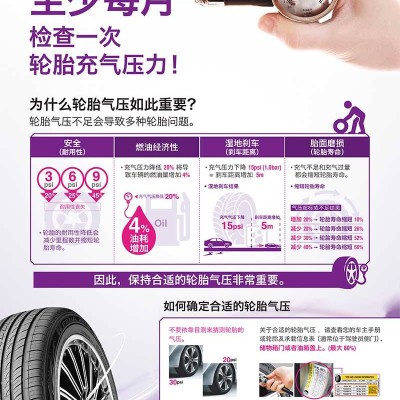
This poster uses white as the background, and "Shanghai Nexen Tire Sales Co., Ltd." is presented in large font in the center. The black font has a prominent visual effect. A QR code is attached at the bottom of the text, which is convenient for the audience to scan the code for more information. The poster is decorated with tires and air pump patterns on all sides, and black lines outline the outline to attract attention. The overall design is clean and concise, with strong visual effects and clear at a glance. At the same time, it demonstrates the professionalism and high-quality characteristics of Nexen tires and effectively enhances the brand image.
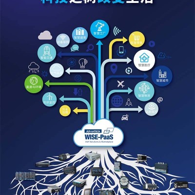
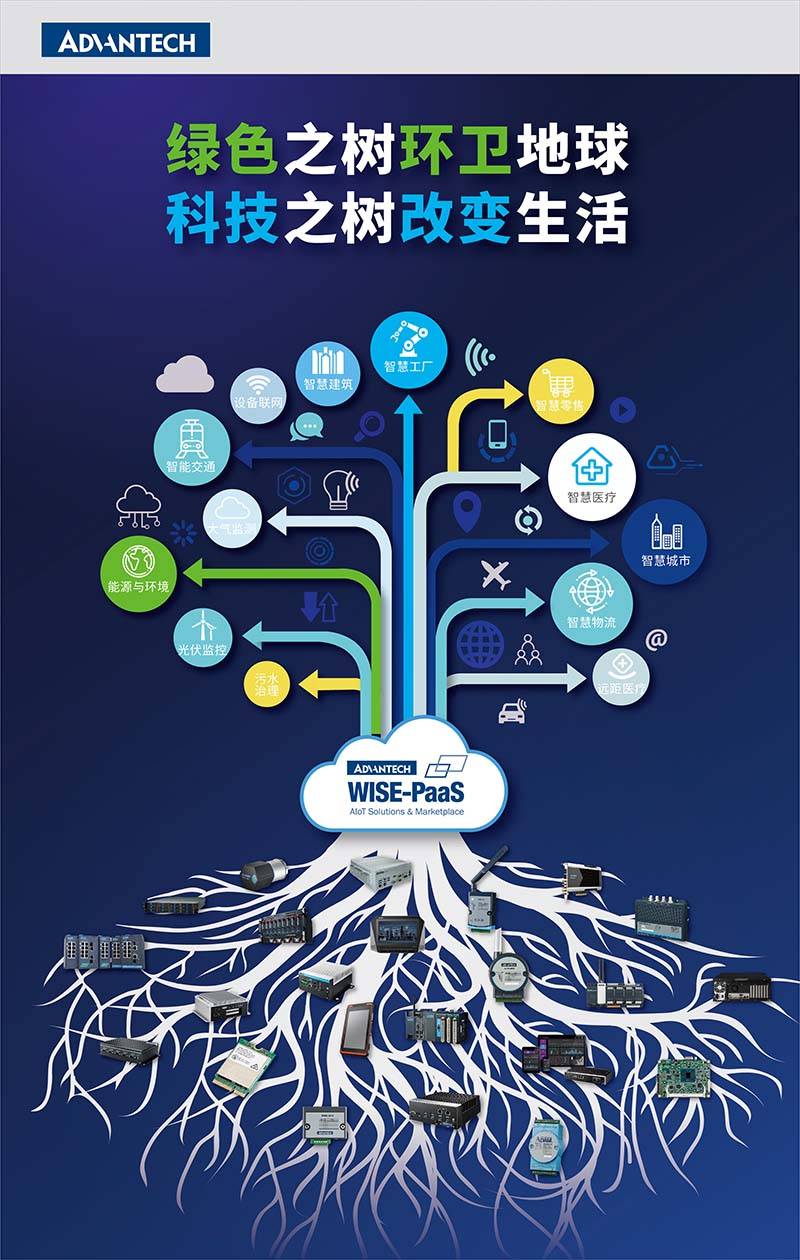
This poster is uniquely designed, with blue as the main color symbolizing environmental protection and sustainable development, supplemented by red and yellow to represent the progress of energy, infrastructure and communication technology. Various colors and shapes are intertwined into a beautiful and vibrant network architecture diagram, which implies the interdependence and common development of science and technology and environmental protection. The text "Green tree sanitates the earth, and the tree of science and technology changes life" is simple, generous and dynamic, which appropriately expresses the theme and enhances the visual impact and attraction of the poster.
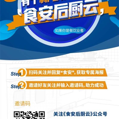
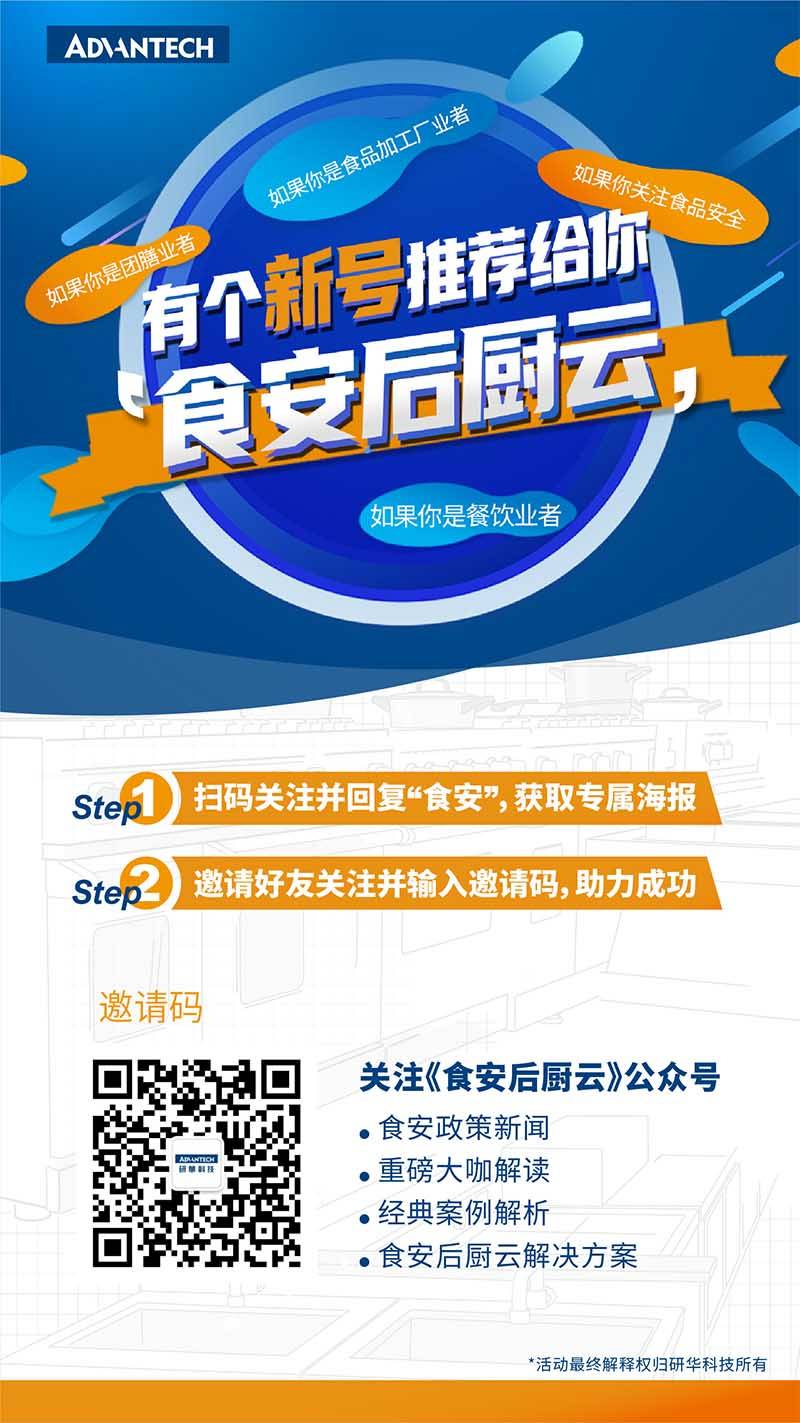
Food platform promotional advertisements feature attractive food as the theme, with warm backgrounds and food-related pictures or pattern accessories to create a mouth-watering visual effect. In the advertisement, the QR code and the WeChat official account name of "Food Safety Kitchen Cloud" are highlighted in large fonts to attract customers' attention at first glance. The slogan adopts lowercase letters, which are neat and harmonious, and complements the warm colors of food. The overall poster design is full of creativity and beauty, which reflects the platform's care and emphasis on food. By scanning the QR code to follow WeChat official account, customers can gain food safety knowledge and experience, and enhance brand reputation and customer loyalty.
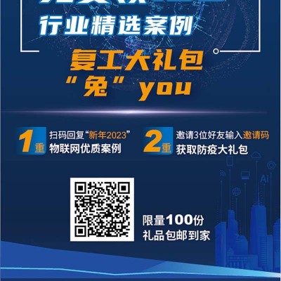
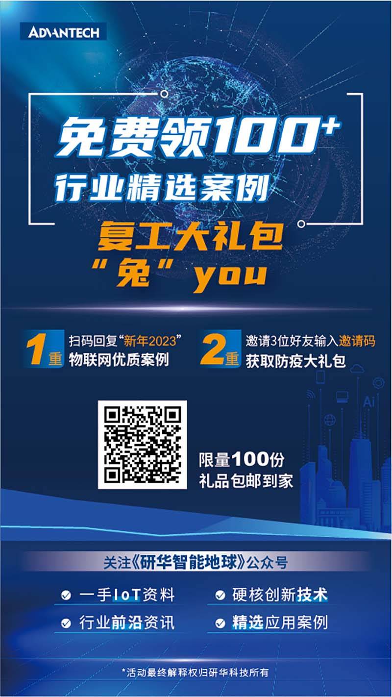
This poster is exquisitely designed, with the theme of science and technology. The overall design is concise and clear, with smooth lines and cold colors, which shows the professionalism and calm temperament of ADanTech Company. Posters are rich in features, including gift package content, QR code, invitation code, high-quality cases of Internet of Things and epidemic prevention gift packages, etc., which are highlighted through ingenious composition and bright colors to enhance the visual impact. The text layout is neat and orderly, which not only introduces the contents of the gift package but also gives the way to obtain it, which is clear at a glance. The bottom provides information on the "Advantech Smart Earth" official account to enhance interactivity and provide more publicity opportunities for ADanTech. The overall design is full of technology and modernity


