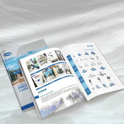
This product brochure design features yellow, blue and black as the main colors, interwoven with unique visual effects, highlighting modernity and technological power. During the design, the detailed information of various equipment and products is carefully arranged and presented in an intuitive and clear way, allowing readers to clearly understand the product features and values at a glance. Simple and powerful design techniques make the whole album both attractive and unforgettable, successfully integrating technology and aesthetics, conveying the power of innovation and showing the unique charm of enterprise products.
Step into our brochure design world and experience simple but not simple visual enjoyment. Adopting classic black and white color scheme, supplemented by bold fonts and exquisite icons, the designed brochure not only highlights high-end quality, but also stands out visually. Every detail is carefully carved to perfectly blend company information with project characteristics, adding luster to your brand image.
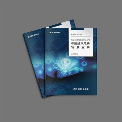
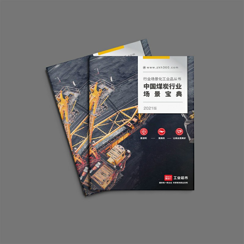
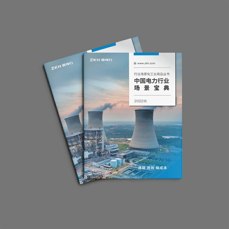
Appreciate the visual charm of Zhenkunxing's coal industry brochure! Using eye-catching colors and exquisite layout, combined with the characteristic elements of the coal industry, we create a professional and attractive industrial supplies brochure. Our design team carefully plans, from vision, color to overall design, to show the brand image and product advantages in an all-round way to help you promote your marketing.
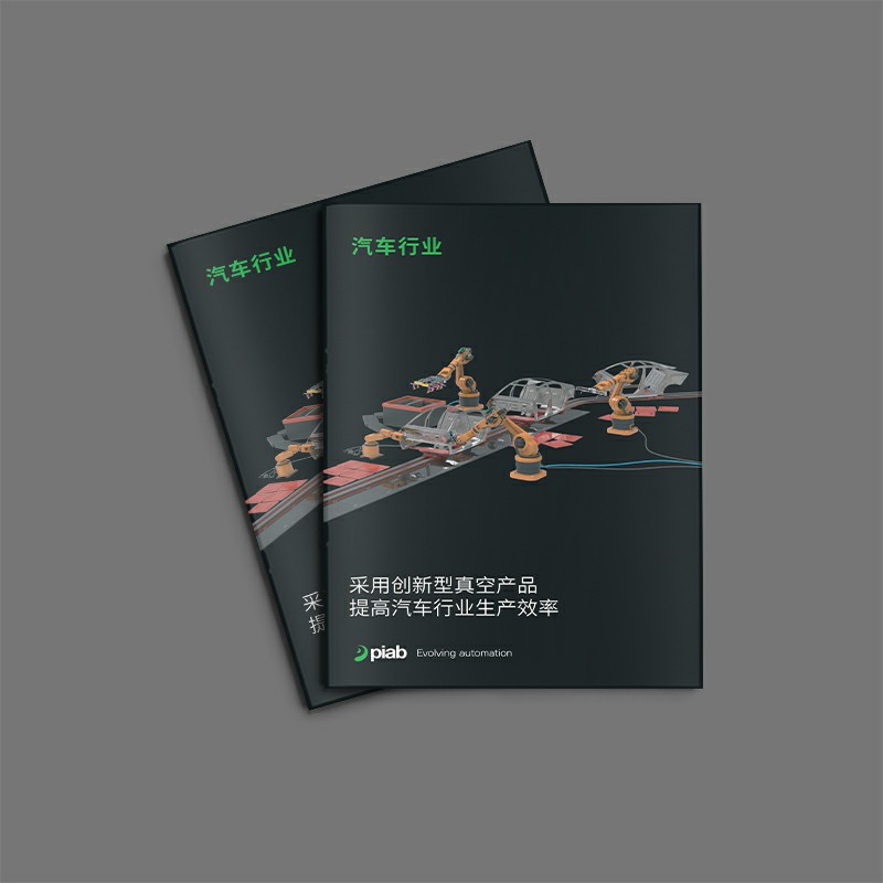
Discover the extraordinary design of Piab's Automotive Industry Giclee! The cover is dominated by black and green, with a compact element layout, which highlights the beauty of modern simplicity. The world map on the back cover is in sharp contrast with the logo of green enterprises, highlighting the global business layout. Every detail has been carefully planned, from visual impact to design innovation, showing Piab's brand strength and product charm in all directions.
Step into the artistic temple of brochure design! Specializing in the perfect combination of form art and word art, we use innovative typography styles and bold color combinations to create high-end brochures tailored for you. From the details to the overall style, every detail has been carefully crafted to enhance the brand image and attract the attention of potential customers.
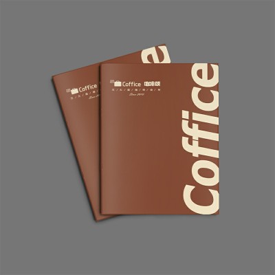
Tianjin Coffee Ode Recipe Album, the beige background is simple but elegant, and the dark gray label clearly guides the line of sight. Multi-angle product display and simulated usage scenarios allow readers to fully understand the product. The combination of exquisite design and detailed introduction creates a double feast of vision and information, and enhances brand image and user experience.
Discover our brochure design cases with white backgrounds and black fonts, bold colors and sophisticated icons for a simple yet high-end visual style. Highlight the company's brand image and core features of the project through innovative design, and attract the attention of potential customers.
This brochure features yellow and black as the main colors, creating a strong visual impact, which is eye-catching and eye-catching. The design cleverly incorporates unique styling elements, such as robots and cars, which not only shows the characteristics of the product, but also increases the overall visual impact. The layout is eclectic and modern, and every detail is carefully designed to highlight the product features and brand image. The overall design is simple and powerful, which can not only effectively attract the attention of potential customers, but also highlight the innovative spirit and forward-looking vision of the enterprise, and help to enhance brand value and market competitiveness.
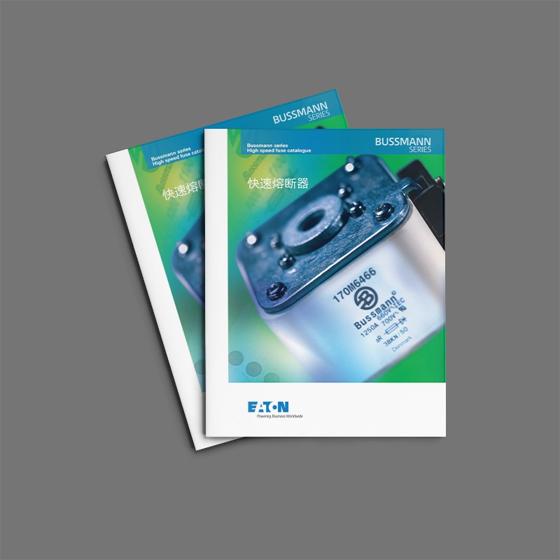
This power brochure is designed with blue and white as the main colors, creating a fresh atmosphere of technology and clean energy. Through exquisite pictures and vivid text descriptions, the development history, core elements and future trends of the power field are displayed. The design layout is concise and clear, which not only highlights scientific and technological elements, but also facilitates readers to quickly obtain key information. Whether it is the explosion view of the power battery or the detailed display of various batteries, chargers and other products, it reflects the ingenuity of the design in detail processing and overall aesthetic feeling. This brochure not only provides readers with a comprehensive and professional information feast, but also brand strength and science
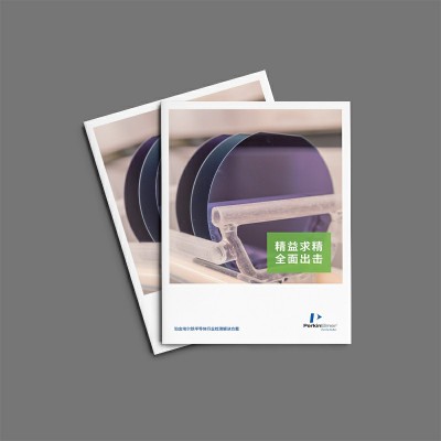
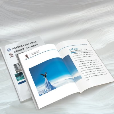
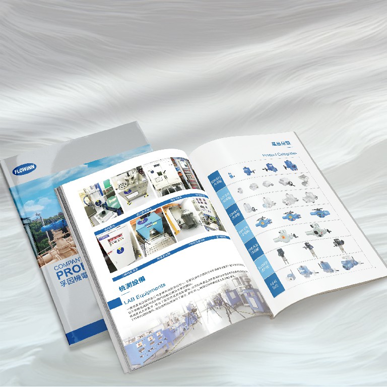
This product sample design manual uses blue and green as the main colors. Through careful color matching and detail processing, it shows the unique charm and modernity of the brand or product. Designers skillfully use color psychology, and blend blue and green to create a fresh and comfortable visual experience, while emphasizing the characteristics and advantages of products. The typography layout is concise and clear, and the fonts are properly selected, which is both easy to read and rich in design. Every detail has been carefully polished, aiming to enhance the brand image and attract the attention and trust of the target audience through high-quality visual presentation.
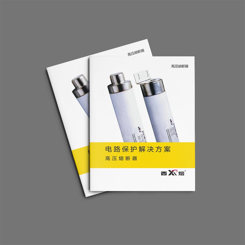
This circuit protection scheme brochure is modern and professional in design, with grey and white as the main colors, creating a professional atmosphere with a sense of technology. The cover adopts a modern font design, which visually shows the professionalism of circuit protection technology. The inner pages concisely introduce the core concepts and practical methods of circuit protection through carefully orchestrated layouts and numerous diagrams and pictures. The overall design pays attention to detail, and each element is carefully selected and laid out, aiming to visually present the importance and application value of circuit protection solutions, enhance brand image and enhance customer trust.
This brochure features red and blue as the main colors, and cleverly blends white and yellow to form a sharp contrast, highlighting the passion, strength and modernity of the brand. The design is clean yet creative, and the font style is modern and powerful, complementing the overall design. Each page is carefully laid out to visually display product features while profoundly conveying brand spirit and culture. This is not only a picture album, but also a perfect presentation of brand innovation and charm, aiming at attracting the target audience and enhancing brand influence.
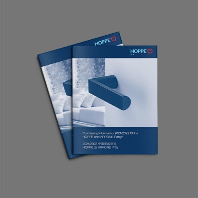
The HOPPE Hardware Door Handle Brochure is uniquely designed, with a black background in sharp contrast with white text, which shows a simple yet elegant visual effect. Colorful colors, modern fonts and creative patterns are cleverly used in the design to add vitality and a sense of technology. Each design element has been carefully laid out to visually show the product features and innovations. The overall style is modern and impactful, which can quickly attract the attention of the target audience and effectively convey the unique charm and brand value of the product.
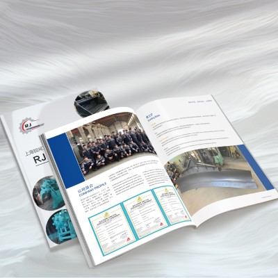
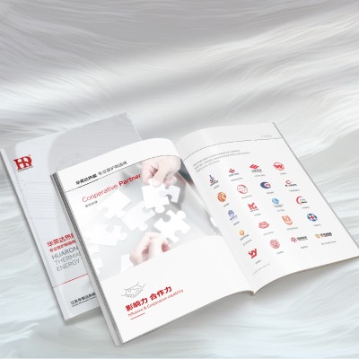
The design of this enterprise's internal magazine is simplified and generous, skillfully integrating a large number of charts and images, and visually presenting the company's products, services and market positioning. In the design, the company's iconic colors and fonts run throughout, highlighting the brand characteristics. Carefully laid out layout and crisp image selection allow readers to quickly access key information and gain insight into the company culture and brand philosophy. This is not only an internal corporate magazine, but also a perfect integration of brand essence and market strategy, aiming at enhancing brand image and promoting market awareness.
From 16P saddle stud binding to product parameter visualization, dismantling the design logic of engineering attachment album of an enterprise
Series, exploring the functionality and brand expression of printed matter in industrial scenarios.
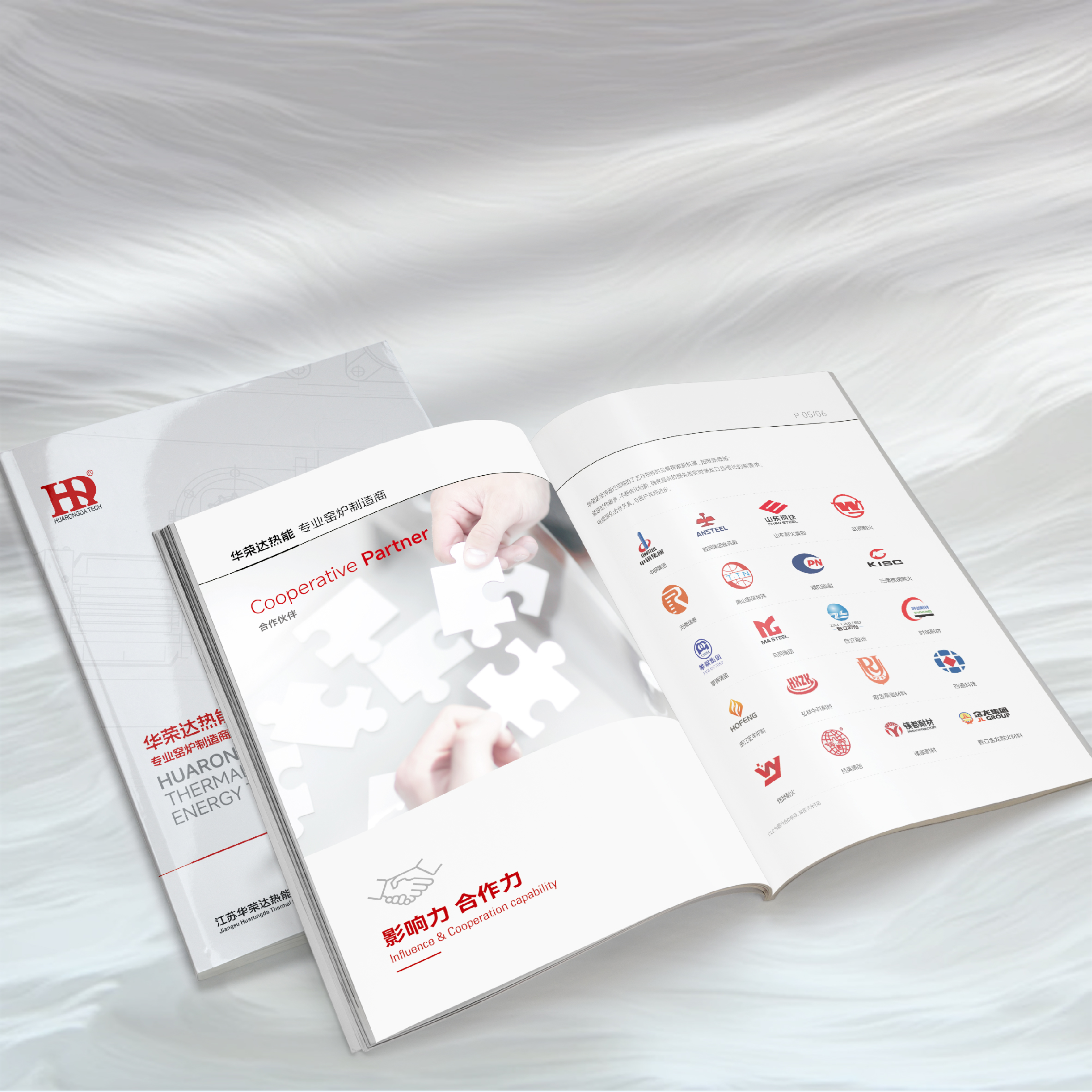
An in-depth analysis of the brochure design strategy of a thermal energy technology company, covering details such as microscopic photography, energy efficiency visualization charts, and oil-proof film technology, and explaining how heavy industry albums balance professionalism and affinity.
Analyze the brochure design strategy of an electromechanical enterprise, covering rainbow chromatography navigation, Braille contact design,
Technical details such as Pantone spot color control explore how industrial albums can build technical trust.
In-depth dismantling of the brochure design strategy of a trading company, covering details such as ladder color block typesetting, metal particle hot stamping, and regional time map, and analyzing how heavy industry albums can balance practicality and brand communication.


