Dismantle the brochure design strategy of a financial technology company, covering technical details such as dynamic data charts, color temperature partition navigation, and frosted UV process, and explore how digital albums can balance professionalism and affinity.
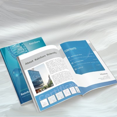
Disassemble the product manual design of a medical technology company, from modular typesetting to microfluidic technology, and analyze how to achieve high professionalism at low cost.
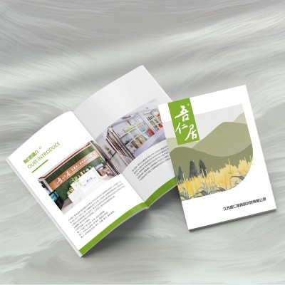
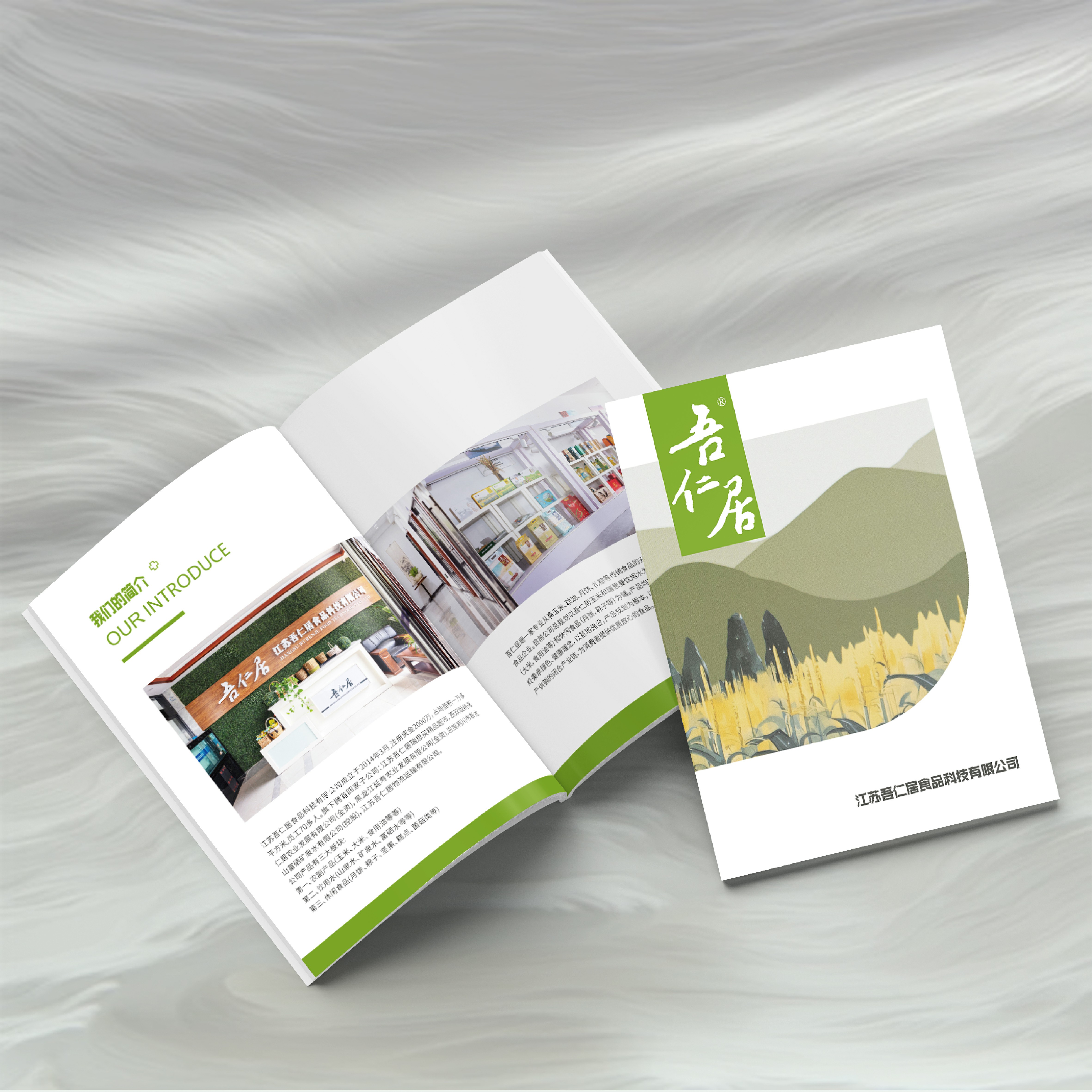
Under the concept of green health, how to use fresh color matching, hand-painted illustrations and product photos in corporate brochures
Display and other design highlights, combined with environmentally friendly printing materials, optimize the reading experience and shape a professional brand image.
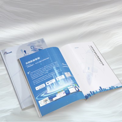
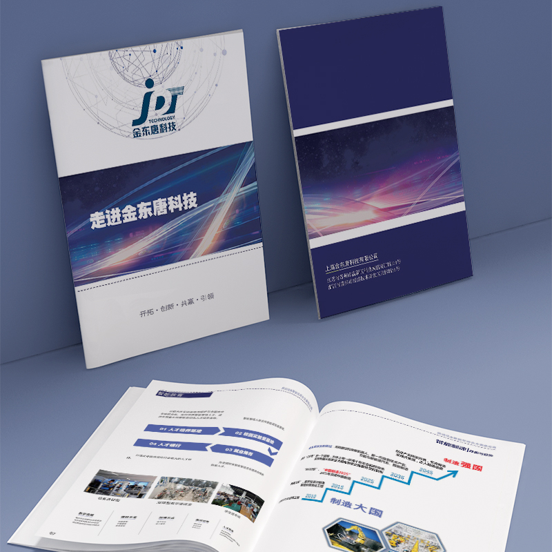
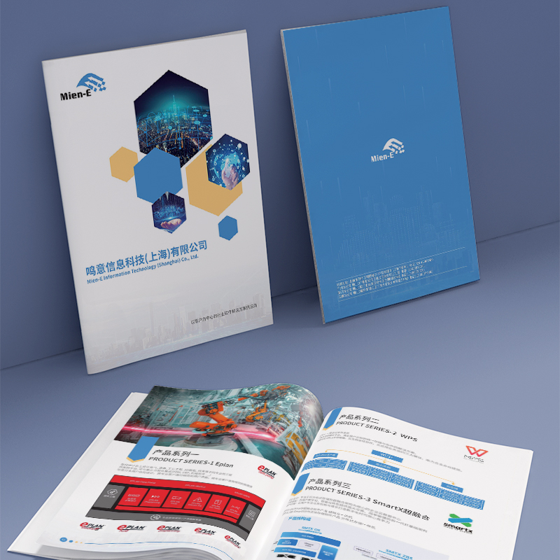
Visually, this brochure uses blue and dynamic lines to create a strong sense of technology and futurism. At the same time, rich infographics, technical details, and application scenarios are carefully choreographed to enhance the visual impact and ensure a coherent message delivery. Particularly worth mentioning is that the album has put a lot of effort into the paper and the printing process, giving the whole a sense of outstanding professional quality. This combination of cutting-edge visual language and high-quality manufacturing techniques will undoubtedly inject powerful momentum into the construction of corporate brand image. In terms of content planning, the publicity
Visually, this brochure uses blue and dynamic lines to create a strong sense of technology and futurism. At the same time, the elaborate arrangement of various chart data, process details, and application scenarios not only enhances the visual impact, but also ensures that information is communicated in an orderly manner. It's worth mentioning that the album has put a lot of effort into the paper and printing process, giving the whole a sense of outstanding professional quality. This combination of innovative visual language and high-quality manufacturing processes will undoubtedly inject powerful momentum into the building of a brand image. In terms of content planning, the brochure provides a comprehensive description of the public
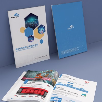
From the overall visual design, the album uses a lot of blue and dynamic lines to create a strong sense of technology and futuristic. At the same time, rich chart data, process details, and careful layout of product application scenarios not only add visual impact, but also ensure that information is organized and readable. Especially in the paper material and the printing process of the careful selection, let the whole album present the special professional quality sense. This combination of innovative visual language and industry content is a successful brand image presentation. In terms of content planning, the brochure provides a comprehensive overview of the company's efforts in electronic components,
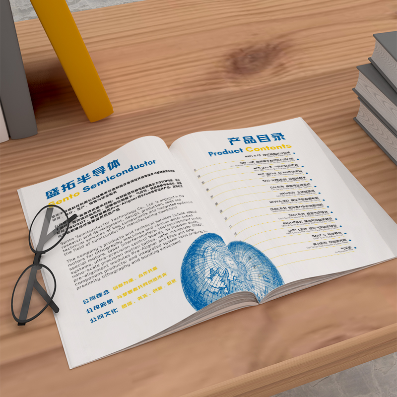
The entire album is visually presented with the full use of blue and gradient lines to create a sense of technology and cutting edge. Fine layout and information level optimization ensure the efficient delivery of various products and technical details. At the same time, the special paper material and high-quality printing process, but also for the overall design added high-end atmosphere quality sense. This combination of innovative visual language and professional content will undoubtedly attract readers' attention and mutual interest. In terms of content planning, the brochure showcases the company's technical strength in each product line. Including all kinds of terminal equipment, electronic components and so on.
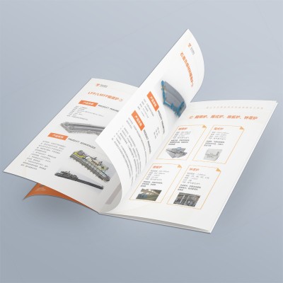
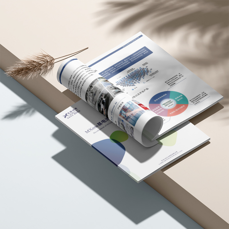
The entire brochure uses a blue-based color scheme to create a strong sense of technology and futuristic. At the same time, the application of a large number of product pictures, process details and parameter data fully demonstrates the enterprise's deep accumulation in the professional field. Exquisite typography layout and high-end paper material selection, more so that this brochure from the visual and tactile to give people extraordinary quality experience. In addition to the excellent visual presentation, the brochure also goes to great lengths on content planning. It not only covers the core parameters and key patents of various product lines, but also demonstrates the enterprise's smart system through a large number of process diagrams and application scenarios.
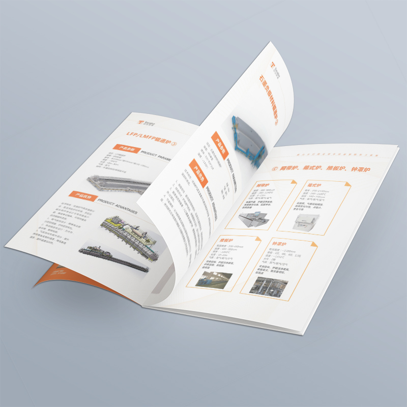
The entire brochure has a striking orange tone, creating a strong sense of technology and cutting edge. This bold use of color contrasts with the global business map on the cover, giving the overall visuals a richer and more dynamic look. At the same time, well-designed layout and information levels, also make the content more orderly. In addition to the excellent visual design, the brochure does a great job of conveying the professional strength of the business. The internal pages are heavily used with product process diagrams, performance parameters and other information, showing the company's strengths in core technology R&D and manufacturing capabilities. Detailed description of the process and key patents
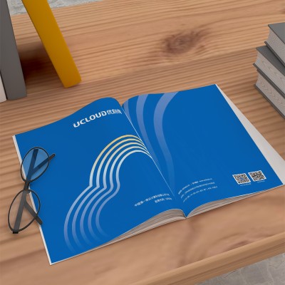
The entire album uses a blue-and-purple gradient color scheme to create a strong sense of technology and futuristic. A large area of gradual background and dynamic streamlined elements combine to give people visual impact and scientific aesthetics. This design approach is in line with the company's leading position and innovative spirit in the industry. In addition to the visual sharpness, the album has also done a lot of optimizations in the message delivery aspect. The internal page layout incorporates a large number of visual elements, such as data charts and flowcharts, to transform complex industry data into intuitive and easy-to-understand content representations. This not only enhances the overall reading experience, but also better highlights the company's technology and services
Under the background of digital transformation, technology-based enterprises pay more and more attention to visual design innovation in brand image communication. This brochure, launched by a Chinese technology company, vividly illustrates their cutting-edge explorations in visual expression and messaging. The entire album is dominated by blue-purple gradients, creating a sense of technology and futuristic. This cool color combination contrasts with the image of the soaring sailboat on the cover, highlighting the company's leading position in the industry. At the same time, rich dynamic visual elements run through it, so that graphic design is full of vitality and interaction. In addition to the eye-catching visual design, the brochure is informative.
The entire album features a blue-and-purple gradient tones, creating a technologically futuristic sense. Dynamic fluid elements intersperse them, so that the graphic design is full of rhythm movement and three-dimensional feeling. This combination of visual impact and technology, the brand image of the instant gorgeous transformation, from traditional to modern avant-garde. The interior page layout of the album skillfully uses the layer overlay effect triggered by page turning, naturally concatenates information such as product parameters, customer cases, and service processes to form an interactive information presentation. This structure not only enhances the coherence of the reading experience, but also enhances the user's sense of engagement, allowing boring technical information to become alive.
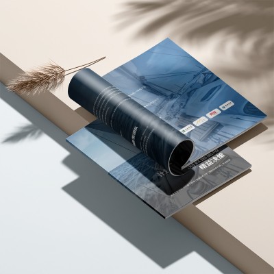
Instead of the conventional flat color block design, the new sample book features deep-space blue gradient transitions and dynamic fluid visual elements. Indentation die-cutting process formed the spatial layers, with ultra-fine 0.2mm wire hot stamping, to build a virtual reality interface-like three-dimensional effect. This design solution transforms the light and shadow perception in user AR experience to physical media, so that paper carriers present the texture of digital products. Subverts the traditional linear typesetting. This design enables technical parameters, customer cases, and service processes to form associated visual groups through layer overlays triggered by page turning. With the introduction of responsive design principle, each spread forms an independent information module. chuang
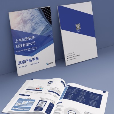
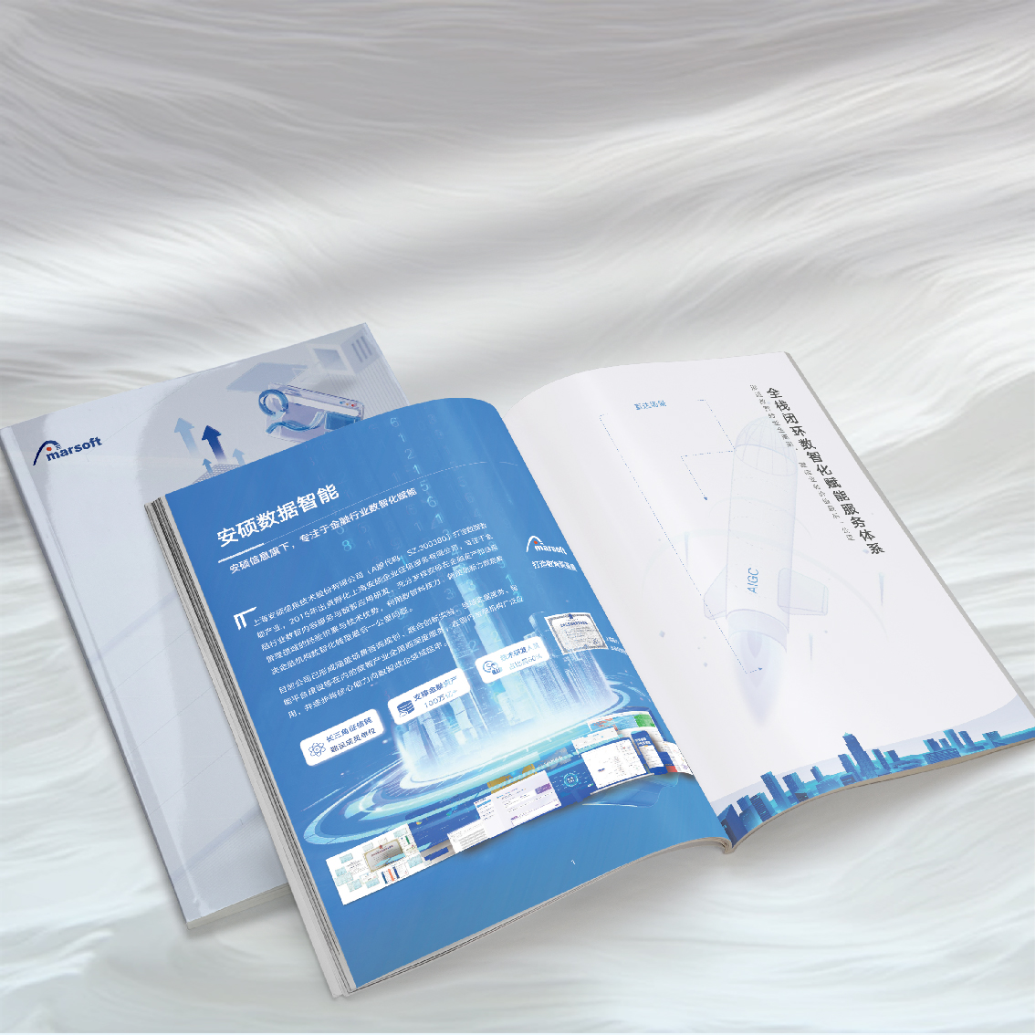
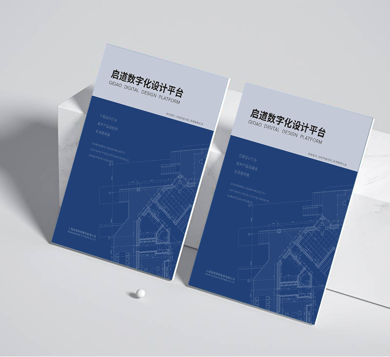
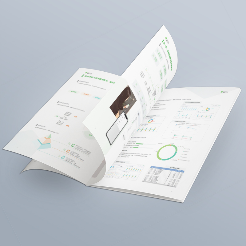
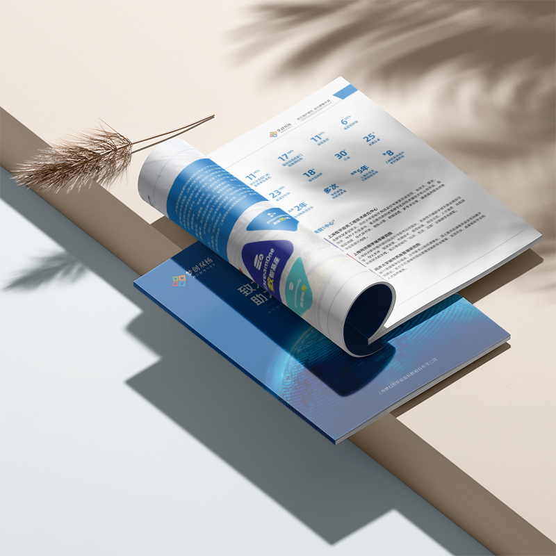
Brochure overall to cold-tuned blue-green as the main tone, which not only echoes the characteristics of the technology industry in which the enterprise is located, but also injects professional, steady brand temperament for the overall design. At the same time, the extensive use of simple geometric figures and modern illustrations and other visual elements, further enhances this technical visual image. This combination of industry attributes and brand attributes will undoubtedly better attract the attention and recognition of the target audience. The picture book does an excellent job of structuring the content. From company profiles to business data to various products and services, each module is presented in an orderly manner. Among them, a large number of infographics,
The whole product brochure is based on a deep and steady blue tone, which is not only highly consistent with the corporate brand image, but also infuse the whole album with a strong sense of technology and professionalism. At the same time, the clever use of geometric lines, dynamic graphics and other visual elements, further strengthen this avant-garde industrial style brand image. This combination of the brand's visual identity and innovative design language is an effective way to capture the attention of our target customers. The product brochure does an excellent job of structuring the content. From company profiles, products and services to various data metrics, each module is well-organized and comprehensive. At the same time, a large number of
The whole brochure adopts deep and atmospheric blue tone, which is not only highly unified with the brand color of the enterprise, but also injects a strong sense of technology and professional temperament for the overall vision. At the same time, geometric lines, dynamic graphics and other elements ingenious application, further strengthen this avant-garde industrial style brand visual image. This clever combination of brand identity and innovative design is an effective way to attract the attention of our target customers. The brochure does an excellent job of structuring the content. From the company introduction, business introduction to various data indicators, each module is systematically explained. In addition, a large number of pie charts and information flowcharts are used.
The whole brochure adopts deep and atmospheric blue tone, which not only echoes the corporate brand color highly, but also creates a strong sense of technology and professionalism for the album. Large area of blue space collocation geometric line elements, let the overall vision present a kind of simple and avant-garde industrial aesthetics. This clever combination of the brand's visual identity and innovative design vocabulary will undoubtedly better attract the attention of the target customer. The brochure does an excellent job of structuring the content. From the company profile, product strengths to the global service layout, each module is well-organized and comprehensive. At the same time, a lot of data graphs and information visualizations are used.
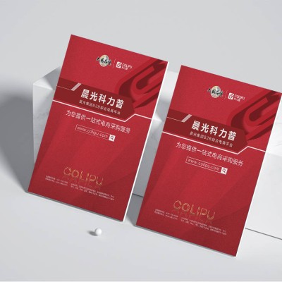
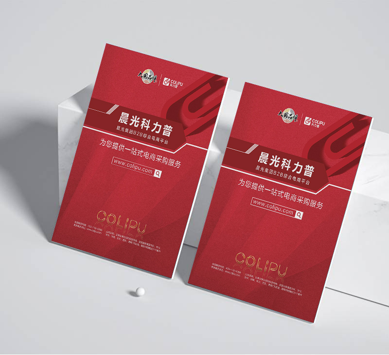
The whole brochure uses bright red as the main keynote, which not only echoes the corporate brand color, but also injects a strong visual impact into the whole album. At the same time, geometry, explosive composition and other avant-garde elements, but also for graphic design added dynamic and technological sense. This combination of brand vision and innovative design approach will undoubtedly better capture the attention of target customers. The product brochure does an excellent job of organizing the content. From the enterprise introduction, product function introduction, to offline store network distribution, each section is well-organized and comprehensive exposition. At the same time, a large number of mobile apps are used.


