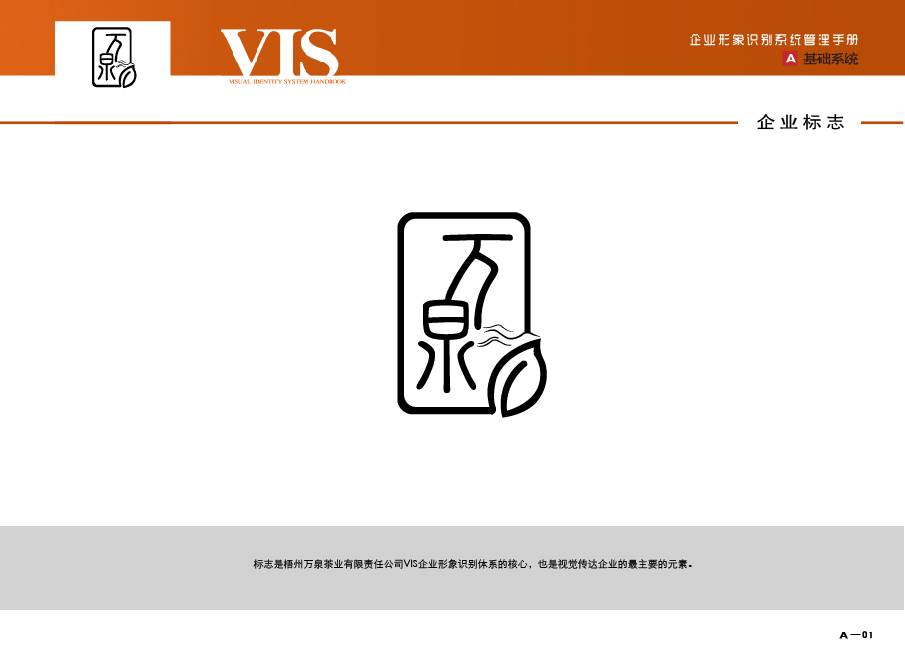
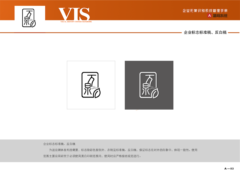
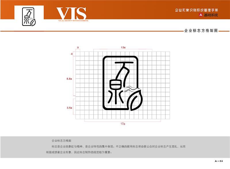
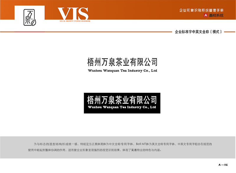
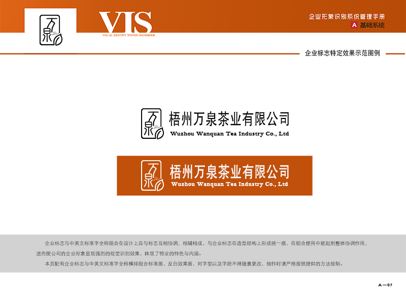

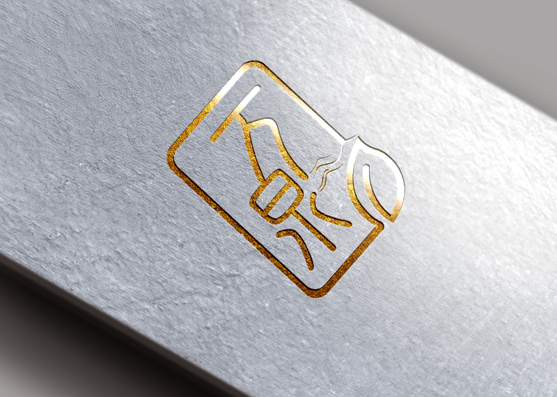

This corporate logo design cleverly combines the word "Wanquan" with the image of tea to form a unique and creative logo.
First of all, the design of the word "Wanquan" is full of artistic sense. The shapes of these two characters have been carefully deformed, and the lines are smooth and natural, reflecting both the charm of Chinese characters and the flowing sense of tea. This design approach makes the company stand out and stand out among many brands.
Secondly, the application of leaf image in Logo fully expresses that the enterprise is a tea company. Tea is an important part of Chinese traditional culture, and this design combines tea with the company's main business perfectly, highlighting the industry attributes and unique selling points of the company.
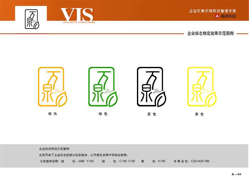
In addition, the logo is designed with emphasis on the use of color. Green is the representative color of tea, but also the symbol of nature and health. This color allows consumers to quickly associate tea leaves, thus enhancing brand recognition.
Overall, thisLogo DesignThe combination of the word "Wanquan" and tea image not only highlights the main business of the enterprise, but also expresses the regional characteristics of the enterprise and respect for the traditional culture. At the same time, through the unique line design and color application, the logo also shows the enterprise's creativity and delicate design concept.
