
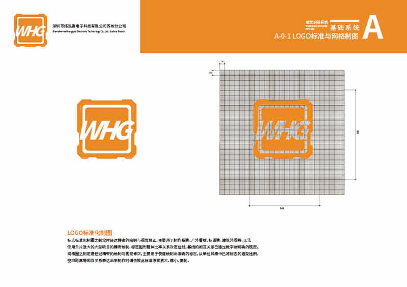
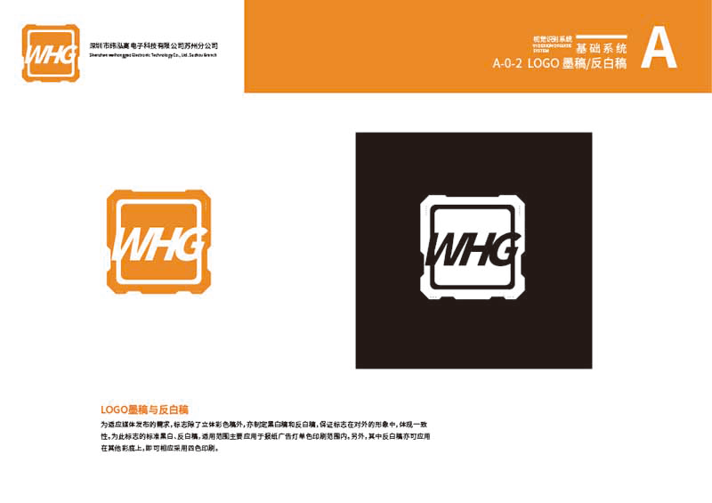
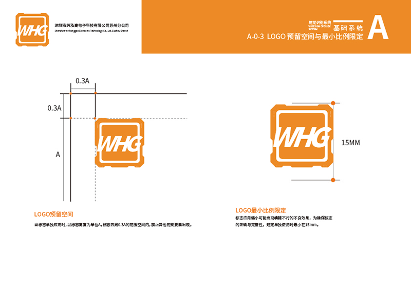




This set of images shows a corporate logo design that is simple but not simple. From the brand point of view, a simple but not simple logo can convey a high quality feeling, but also can better display the brand concept and style.
In this logo design, we can see a very simple line that forms the main part of the logo. The line is smooth and natural, giving a simple and generous feel. This line does not have too much decoration or overly complicated design elements, but it does a good job of showing the brand's personality and character.
In this logo, we can see a very simple font design. The font design is also very simple, not too much decoration and detail, but can be a good representation of the brand name and concept. The color of this font design is also very fresh and natural, and the lines very echo, the overall constitute a simple but not simple brand.Logo Design。
