
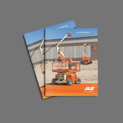
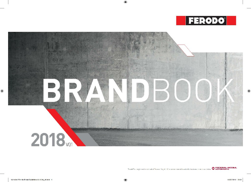
After more than ten years of album design, I found that the manual of corporate code of conduct is changing from a "slogan on the wall" to a "guide in the palm". The case of a subsidiary of a European industrial giant in China is very typical-after the new manual uses bumping technology and metal cold ironing, the circulation rate of employees has increased by nearly half. Today, analyze this booklet to see how foreign-funded enterprises use design to solve cultural differences.
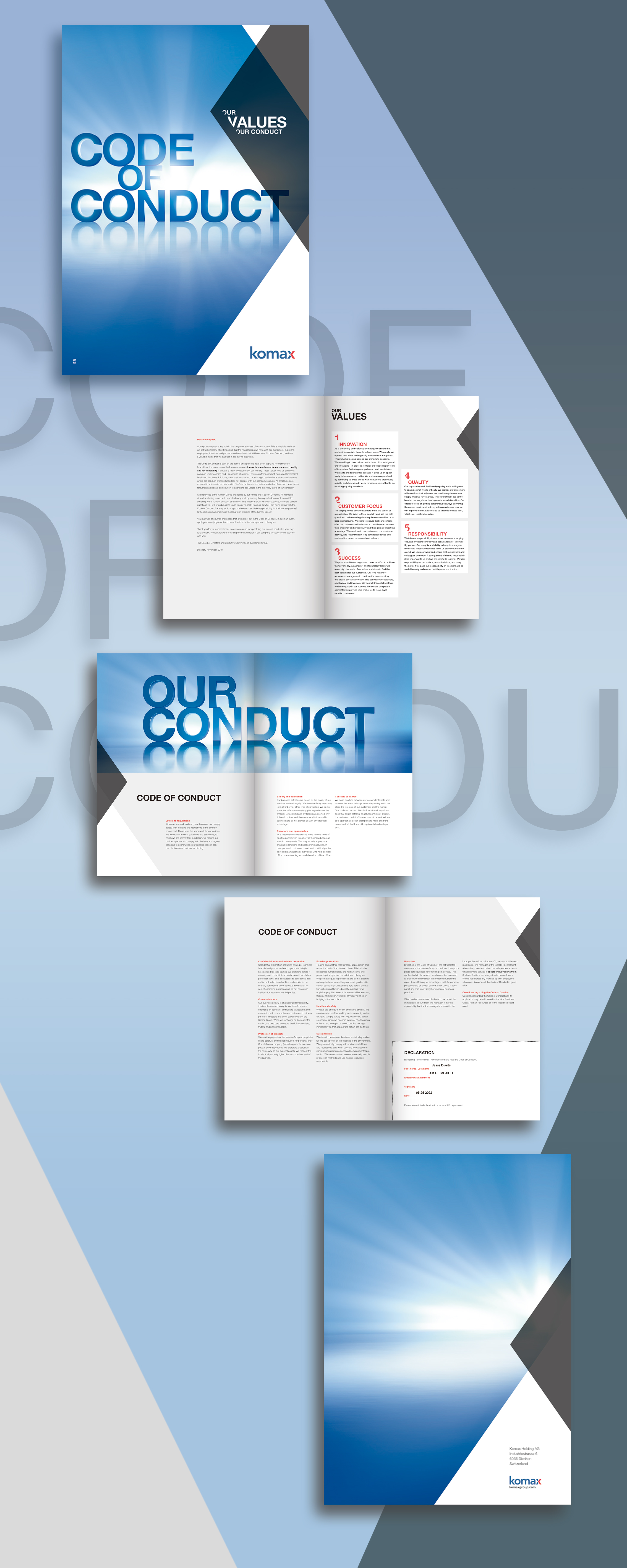
Design style: cool industrial style collides with ink and wash artistic conception
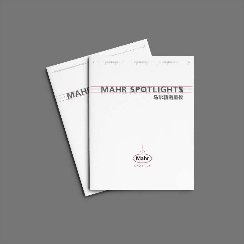
The code manuals of foreign-funded enterprises are often criticized as "cold and difficult to understand", but this design is playing with temperature. The cover is made of 320g rigid grain paper, with a rough touch simulated metal panel, and Pantone 432C cold gray hot stamping, which coincides with the concept of "discipline and temperature coexist".
Design idea: Turn terms into visual language
There are two core challenges: first, how to localize transnational clauses; The second is how boring words can enhance reading stickiness. The solution is clever:
1. Tactile coding system: the key terms are marked by the convex process, and the importance can be perceived by fingertip touch;
2. Modular information architecture: split the code of conduct into three-color areas of "red line-yellow line-green line", and cooperate with the metal cold ironing process;
3. Contextual icon design: original hand-drawn icon library, complex terms are simpler and easier to understand.
The text on the page is clear and clear, not only emphasizing the company's values, but also detailing the company's code of conduct. With precise and powerful language, these words demonstrate the company's adherence to and pursuit of core values such as integrity, professionalism, and service. At the same time, it also conveys the deep understanding and rich experience of the enterprises to international trade.
The light grey of the background color contrasts with the blue tones, making the entire bookBrochure DesignThe visuals are even more prominent. This brochure is not only a display of corporate culture, but also an expression of corporate commitment and attitude to the foreign trade market. It will attract more international customers' attention and build a good image of the company in the global market.


Scan code to add customer service WeChat
Scan attention official service number

