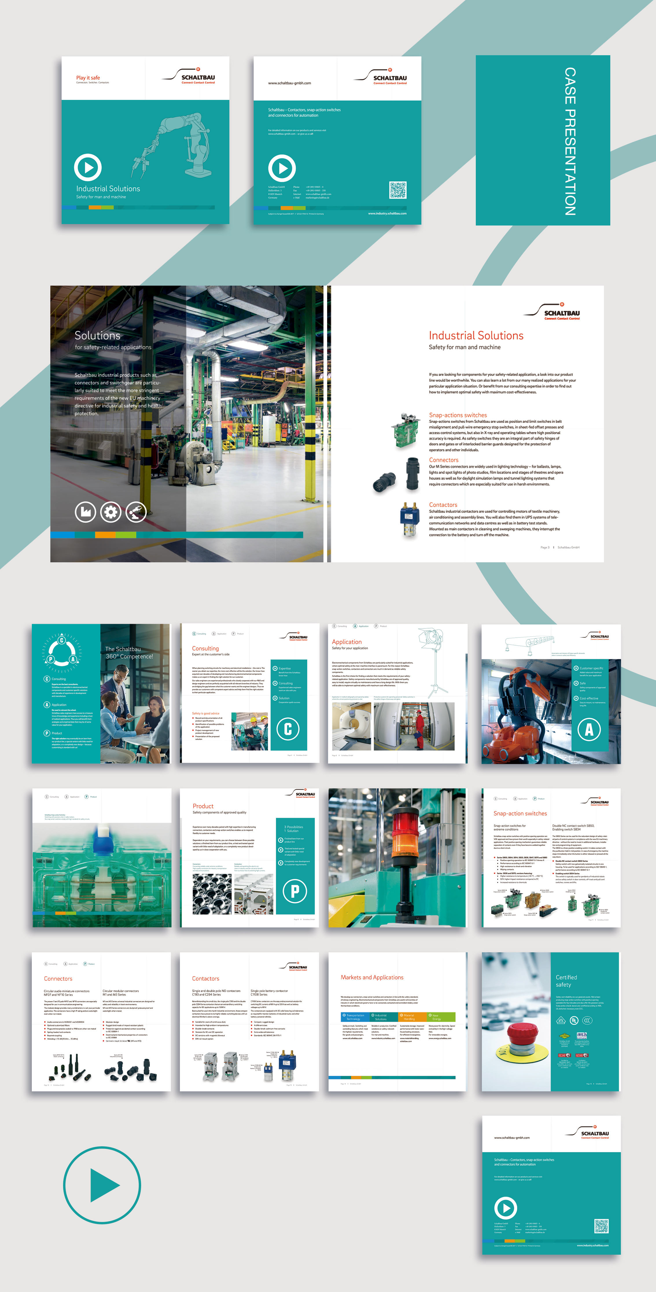
With the rapid development of China's industrial manufacturing industry, the brand promotion of enterprises in the local market is undergoing a deep transformation from emphasis on technical attributes to prominent professional image. This trend is fully reflected in the design of this brand handbook by Schaltbau, a German industrial company.
In terms of overall visual style, the manual takes away from the mechanical design common in traditional industrial brochures and uses a clean, clean color scheme with a blue-green hue. This not only creates a more professional and stable brand image for enterprises, but also echoes the trend of consumers' increasing concern about environmental awareness in the Chinese market. At the same time, the designer cleverly uses the gradation color block that embellishes the detail, adds the visual interest, reflects the enterprise science and technology strength.

In terms of content planning, the manual provides a comprehensive and systematic introduction to the core product lines of the enterprise, ranging from industrial automation, building applications to agricultural equipment. At the same time, according to the characteristics of the Chinese market, the designers specially added topics such as "Product Application Scenario" and "Safety Standards" to highlight the professional level of the products in the local environment. This kind of content planning is close to the needs of users and is conducive to the establishment of the enterprise's professional image in China.
In the printing process aspect, the manual uses matte powder material, with local UV process embellishment, not only enhances the overall texture, but also enhances the visual impact. In addition, the manual is bilingual in Chinese and English, which fully meets the reading habits of local Chinese users. The application of these fine-grained designs further highlights the German industrial company's professional image in the Chinese market.
The design of this brand handbook reflects the "double transformation" of industrial enterprises in China's marketing. On the one hand, it abandons the single path of emphasis on technical attributes in the past and pays more attention to the construction of professional image. On the other hand, it fully absorbs the aesthetic preference of Chinese local consumers and realizes the organic fusion of cultural elements. This new design idea combining "sense of science and technology" and "sense of professionalism" will inject new vitality into the brand development of the company in China.
Overall, the English version of this seriesalbum designSimple and generous, bright colors, rich content, fully demonstrated the company's brand image and strength. We look forward to creating more value and impact for our customers' brands and products through this series of brochures.
