
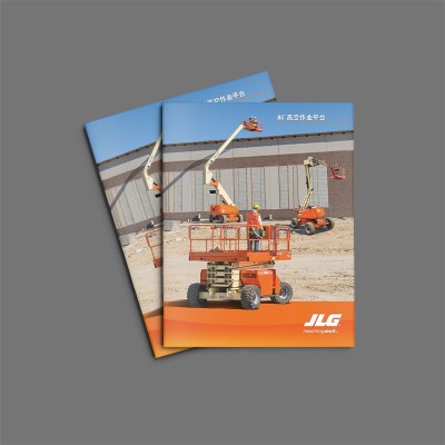
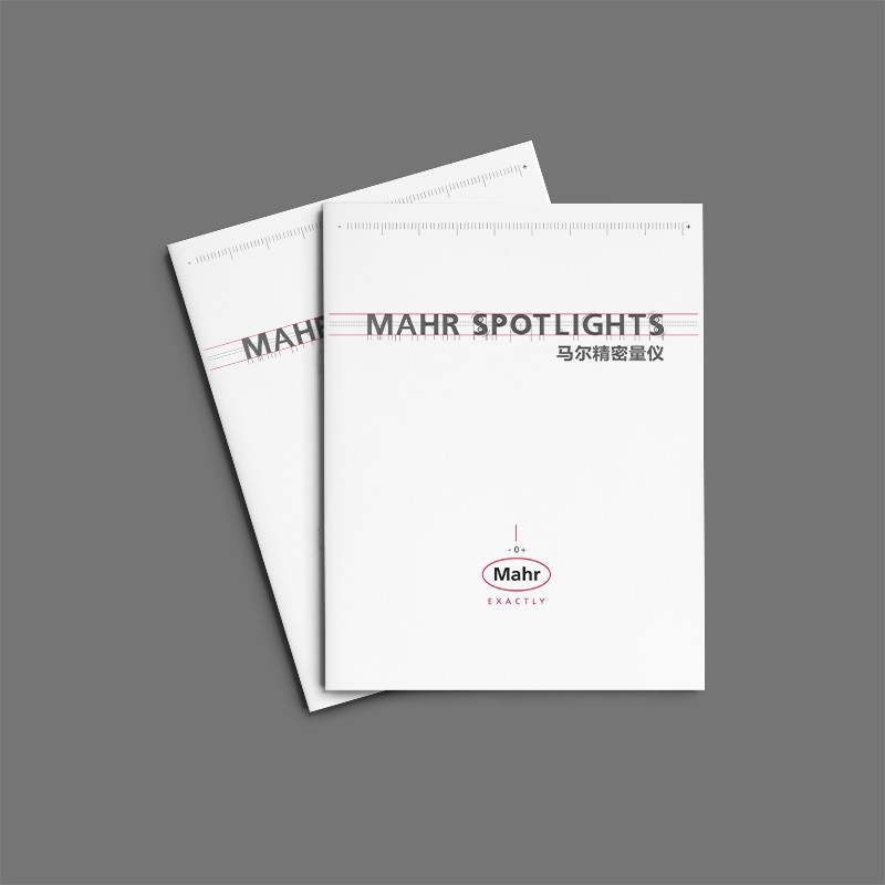
With the steady development of China's economy and the continuous improvement of its scientific and technological strength, the promotion of foreign-funded enterprises in the local market is also undergoing a transformation from technology to specialization. This product brochure design case of a foreign-funded energy company fully reflects this trend. From the perspective of the overall visual style, this brochure abandons the common technological design in the past, but adopts a more concise and atmospheric blue tone, combined with off-white tones to create a professional and stable brand image. At the same time, the designer also skillfully used traditional Chinese pattern elements, such as "fishbone" texture, skillfully integrated Chinese and western cultural elements, and realized localized visual expression.
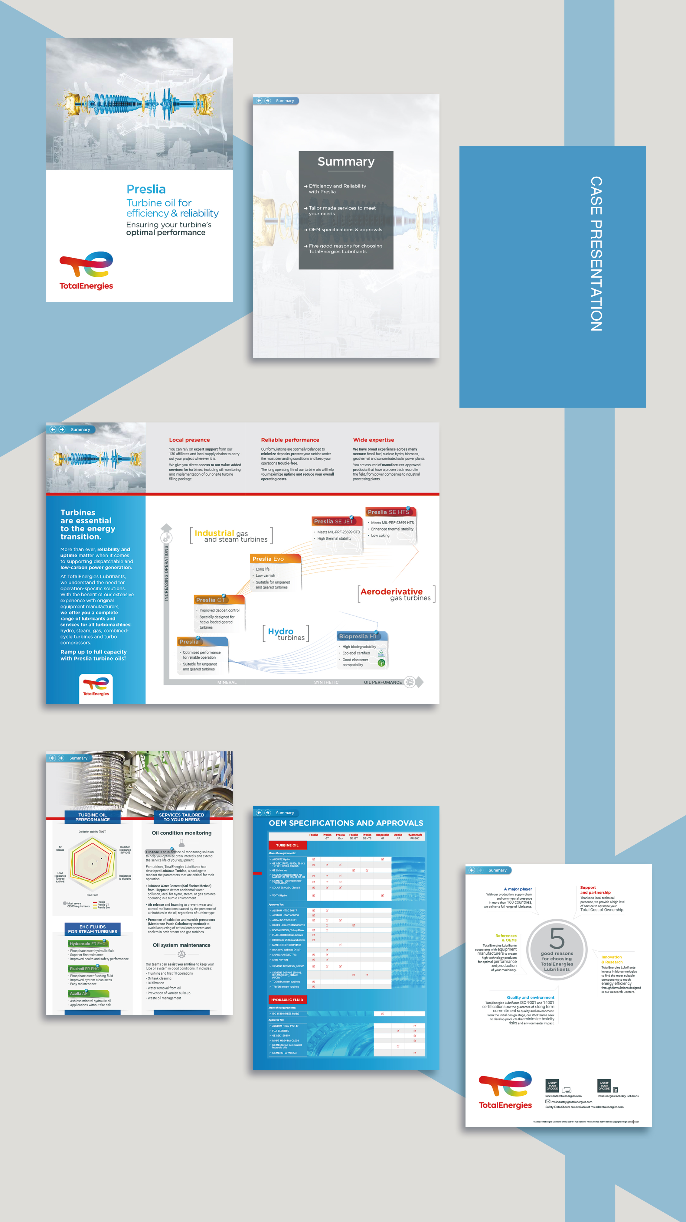
In terms of content design, the brochure comprehensively and systematically introduces the core products of the enterprise and their performance advantages, and visually displays them through rich charts and illustrations. Among them, in response to the special needs of the Chinese market, the designer also specially designed special topics such as "Oil condition monitoring" and "Oil system maintenance" to highlight the professionalism and applicability of the product in local application scenarios. This kind of content planning with in-depth details meets the concerns of Chinese users and helps to establish the professional image of enterprises.
In the printing and production process, the brochure uses high-weight matte pink paper, and bronzing technology is used to embellish the details. This not only improves the overall texture, but also reflects the company's precision manufacturing strength. In addition, the brochure also adopts bilingual typesetting, paying equal attention to Chinese and English content, fully taking care of the reading needs of local Chinese users. This refined design in paper material selection, process application and multilingual consideration further highlights the professional image of enterprises in the Chinese market.
The design of this product brochure fully integrates Chinese and western cultural elements, and achieves precise positioning in visual style, content planning and printing technology. This "national style" transformation not only enhances the professional image of enterprises in the Chinese market, but also provides a "localization" example for other foreign-funded enterprises to learn from. Facing the future, with the further upgrading of China's market demand, the design of enterprise internal magazines will surely develop in a more professional and personalized direction, injecting new vitality into brand communication.
The entire album is designed with a clear layout and a striking color combination that successfully presents the features and advantages of the "Presilla" product to the reader. The English version of this professionalalbum designIt not only reflects the company's brand image, but also provides strong support for the promotion and sale of products.


Scan code to add customer service WeChat
Scan attention official service number

