
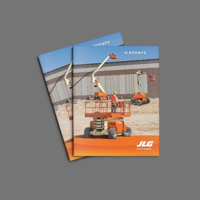
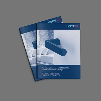
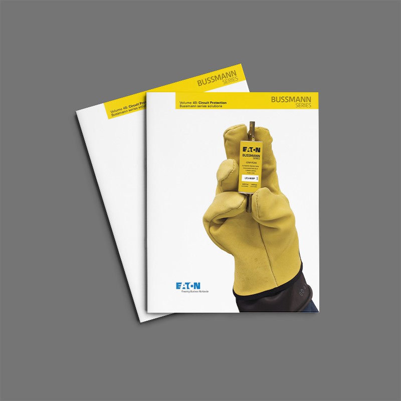
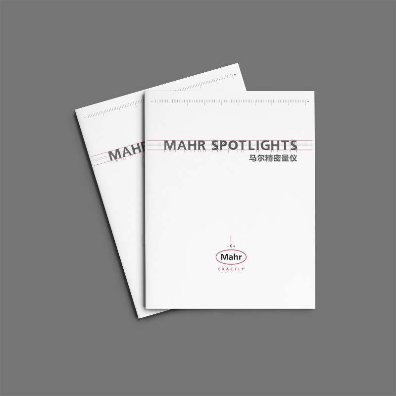
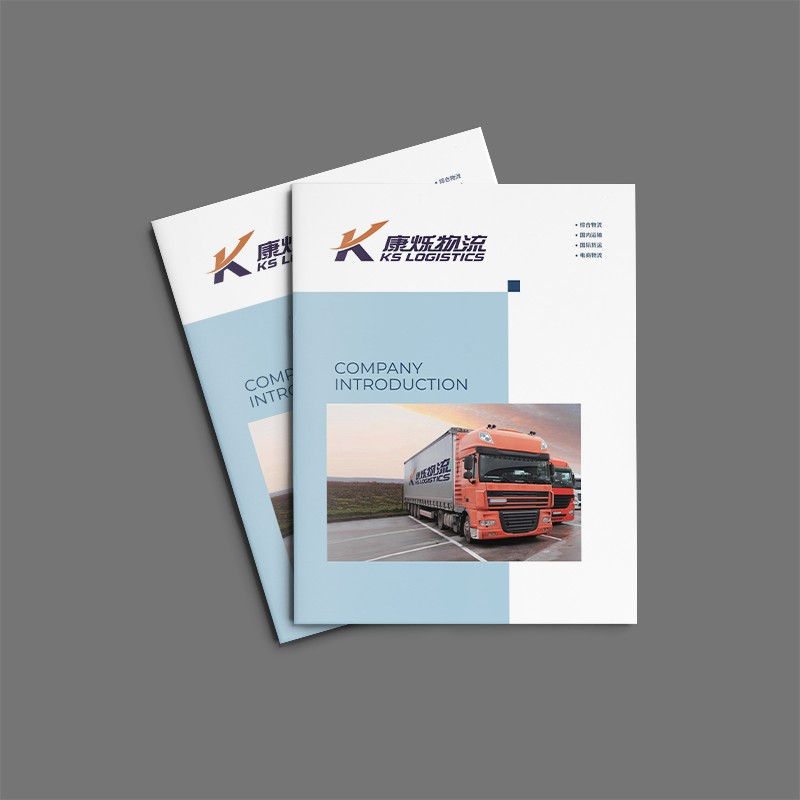
From the visual design point of view, this album uses blue as the main color, supplemented by text and graphic elements, the overall style is simple and atmospheric, in line with the corporate image recognition. Visual elements such as pictures, charts, and infographics are used in a variety of ways to make the entire report more vivid and intuitive. This design not only conveys the company's business, but also highlights Morgan's professional image as a leader in the industry.
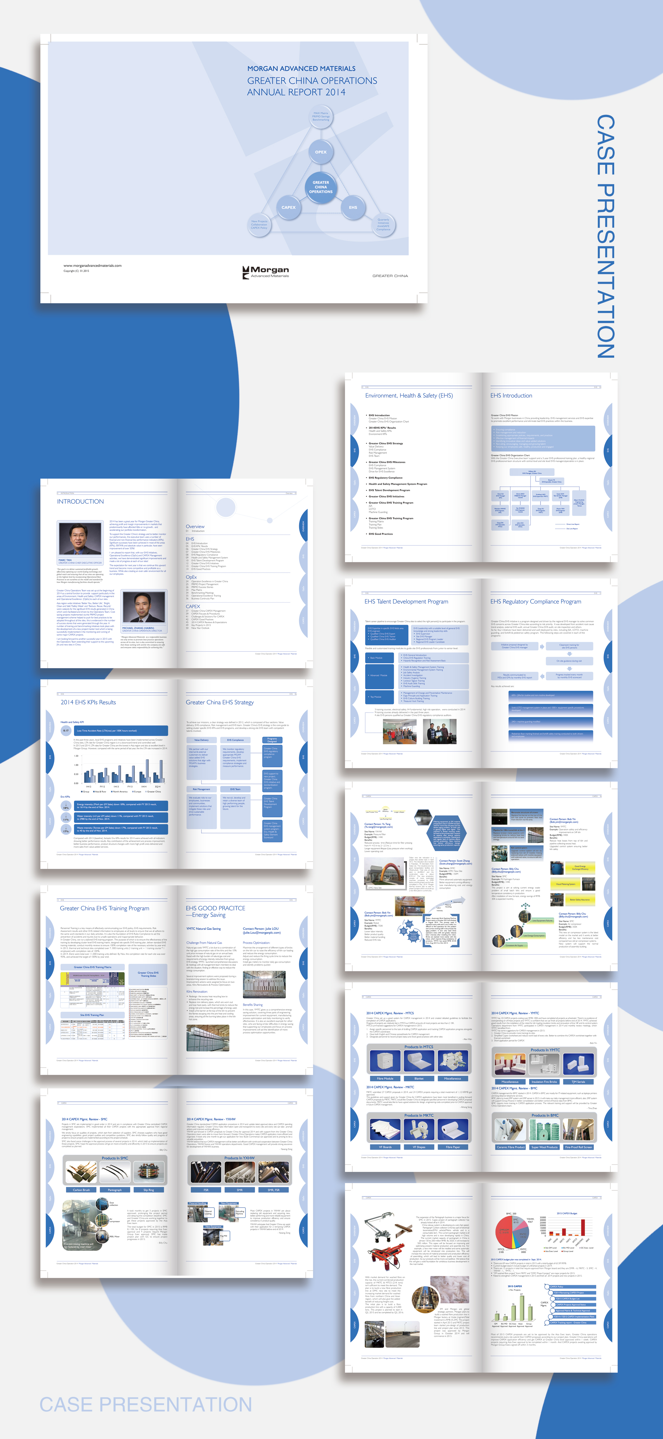
In addition, the report makes full use of both Chinese and English to facilitate communication between the company's multinational teams and partners operating in China. This international vision of design also highlights Morgan's competitive advantage in the context of globalization.
This China business report reflects professional standards in content arrangement, visual presentation, language application, etc., and provides a good case reference for the design of corporate publicity albums. Especially under the background of the increasing importance of the Chinese market, this kind of design thinking that pays attention to localization and internationalization is worth learning from the peer enterprises.
The whole design demonstrates the company's professionalism and rigor, and creates a relaxed and enjoyable reading atmosphere through simple lines and colors. This one.Brochure DesignThe chart is undoubtedly a successful visual communication, presenting the company's core values and annual results to readers in an elegant and powerful manner.


Scan code to add customer service WeChat
Scan attention official service number

