
In terms of overall color matching, the designer made full use of the contrast between fresh and elegant blue and pure white, presenting a simple and atmospheric visual experience. This design technique skillfully integrates the concept of "harmony between heaven, earth and man" in Chinese traditional culture, giving people a harmonious and calm feeling. At the same time, this color matching also reflects the current popular trend of China's domestic tourism market, making the album design closer to the target audience.
In terms of content presentation, this album is also excellent. The designer makes full use of the combination of words and images to accurately summarize the characteristics of different tourist attractions. The selected use of classic elements such as mountains, lakes, cities, etc. not only makes readers clear at a glance, but also arouses their inner yearning. In addition, the clear and easy-to-read font matching adds many highlights to the overall reading experience.
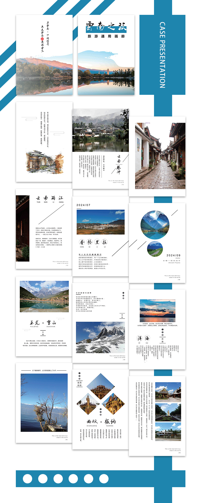
In terms of details, this work is equally unambiguous. For example, from the 24-page A4 album size, to the selected 160G coated paper, to the simple and elegant cover design, all reflect the professional quality of the design team. These sincere details undoubtedly present readers with a high-quality work of excellent quality.
This brochure is not only beautiful and informative, but also full of practicality. Its style fully reflectstravel albumDesignThe essence of .


Scan code to add customer service WeChat
Scan attention official service number

