
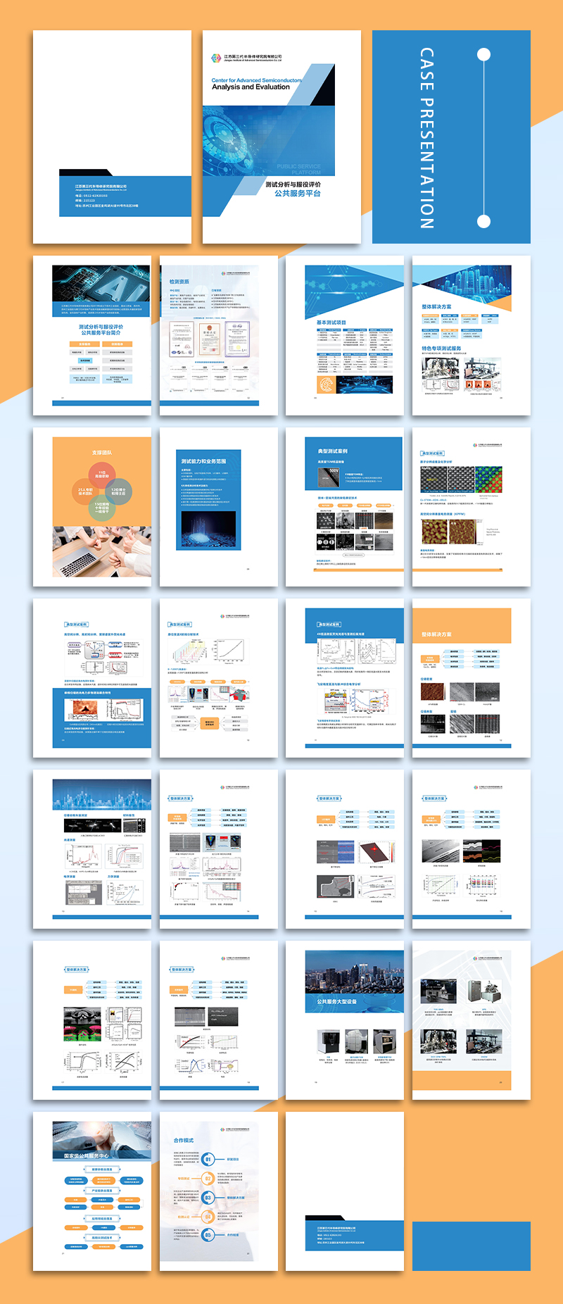
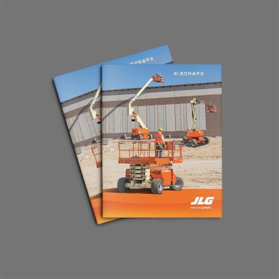
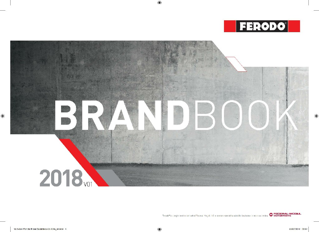
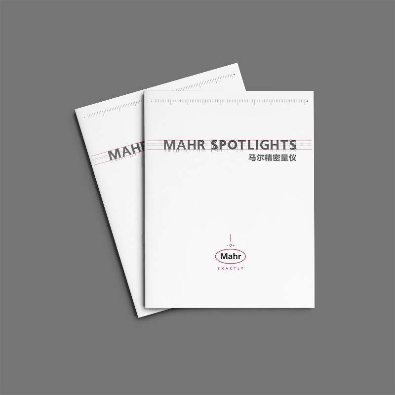
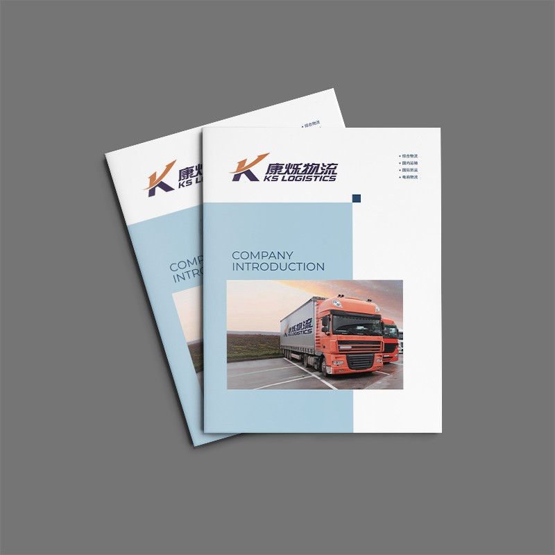
The entire album is dominated by cool blue-gray, with bright orange-red tones, creating a strong sense of technology and futurism. This edgy feel is further enhanced by dynamic geometric lines and gradient elements. This visual tone perfectly illustrates the company's corporate image as a pioneer in the field of new materials.
The rigorous and orderly grid layout lays a solid foundation for the content organization of the album. The information in each section is highly focused and has distinct levels, which greatly improves readability and information transmission efficiency. This organized design method reflects the company's professional level in technology and management.
The rigorous and orderly grid layout lays a solid foundation for the content organization of the album. The information in each section is highly focused and has distinct levels, which greatly improves readability and information transmission efficiency. This organized design method reflects the professional level of XYZ Company in technology and management.
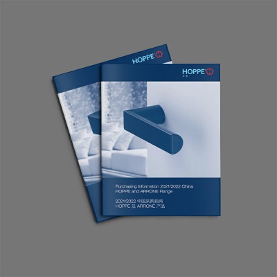
From color matching, graphic application to layout, every detail has been carefully carved. The overall visual presentation is unified and coordinated, giving people a professional and rigorous brand image. This great emphasis on details shows XYZ's persistent pursuit of brand building and product output.
The geometric elements of the company's LOGO are cleverly integrated into the entire album design and become a unified visual symbol. This brand visual cognition system runs through the whole process, which greatly enhances the recognition of enterprises in the audience's mind.
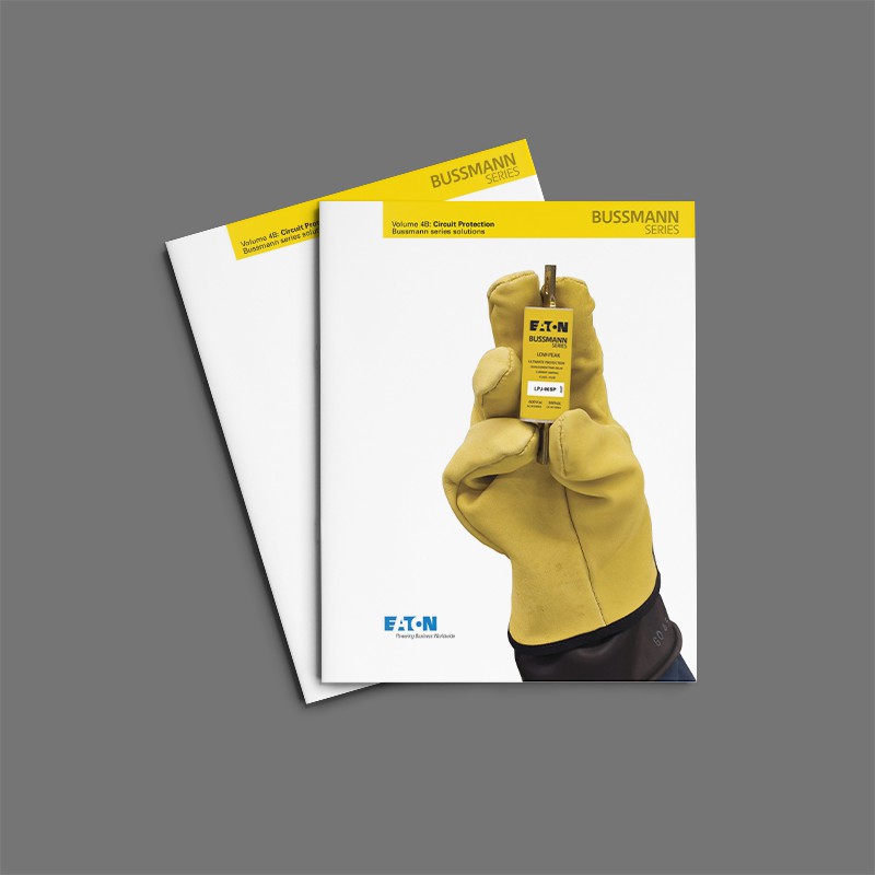
TheseMaterial Album DesignFine. Whether it's showing market trends, analyzing project progress, or introducing new products, these pages help users present information professionally and intuitively


Scan code to add customer service WeChat
Scan attention official service number

