
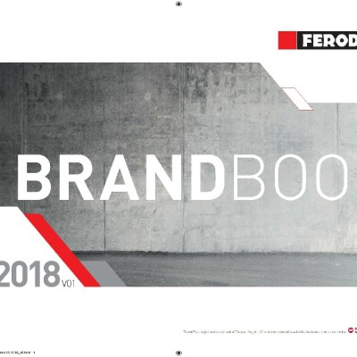
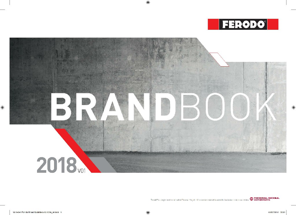
The whole album is dominated by a large area of bright red and cool gray, creating a strong sense of science and technology and avant-garde. With the design of geometric lines and gradient elements, the modern and dynamic image of the brand is cleverly shaped.
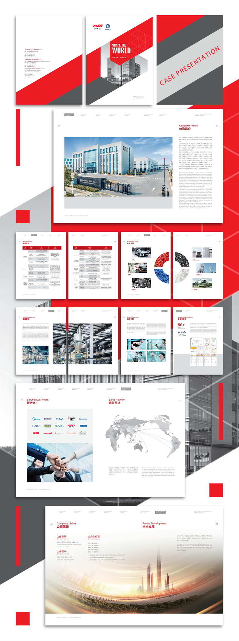
The album adopts a uniform grid layout, and the contents of each section are clean and well-defined. Unified layout design and information grouping make the overall visual order excellent, which is conducive to improving the readability of the content.
Different from the traditional way of text introduction, the album makes extensive use of dynamic charts such as pie charts and radar charts to present complex technical parameters and performance data in a vivid and intuitive way. This innovative messaging method greatly enhances the attractiveness of the content.
From header and footer, margin white space to color transition, every detail has been carefully designed. The overall visual presentation is unified and coordinated, giving people a professional and rigorous brand image.
The geometric molecular structure elements of the company's LOGO are skillfully integrated into the design of the entire album, becoming a kind of visual series. The continuation of this brand visual language strengthens the recognition and influence of the enterprise.
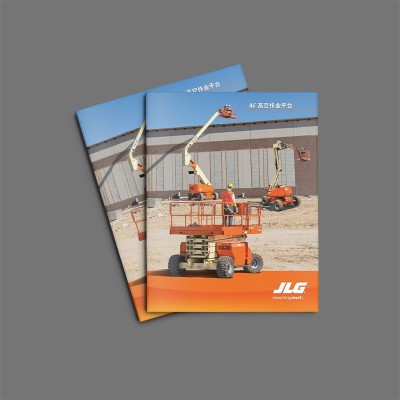
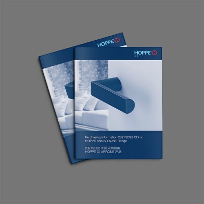
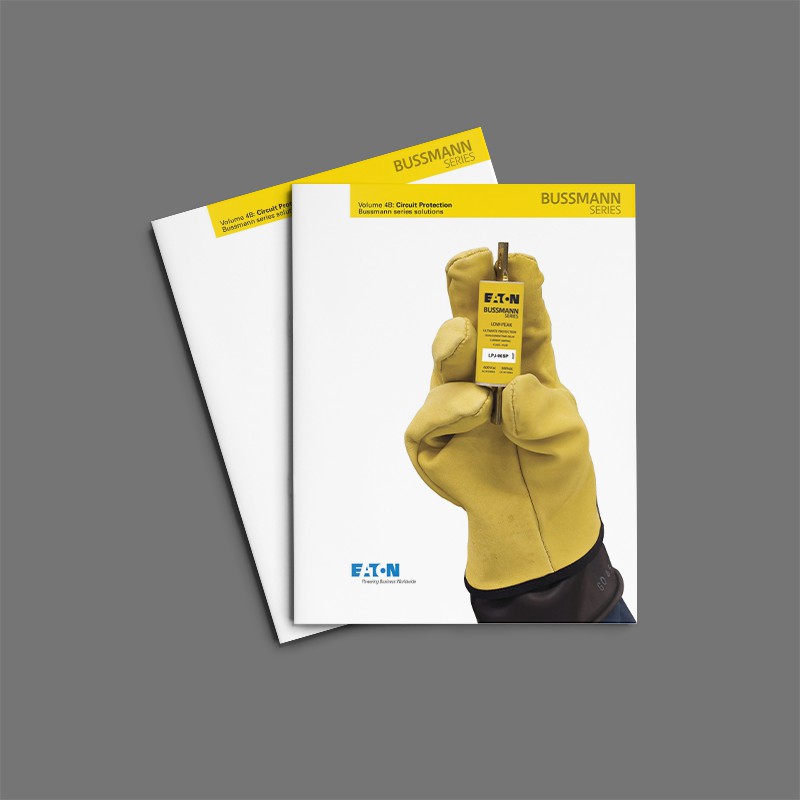
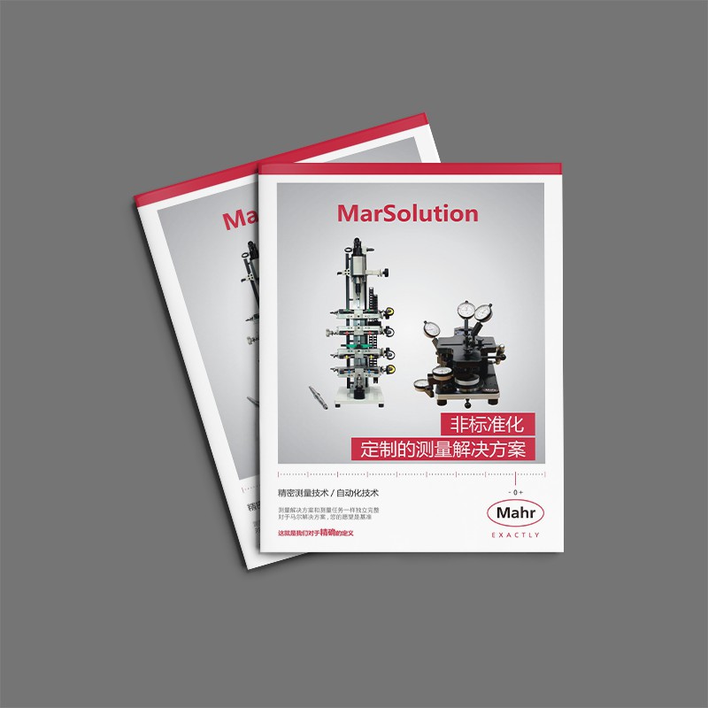
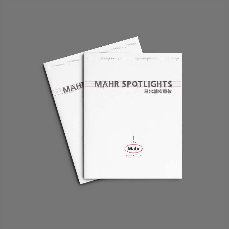
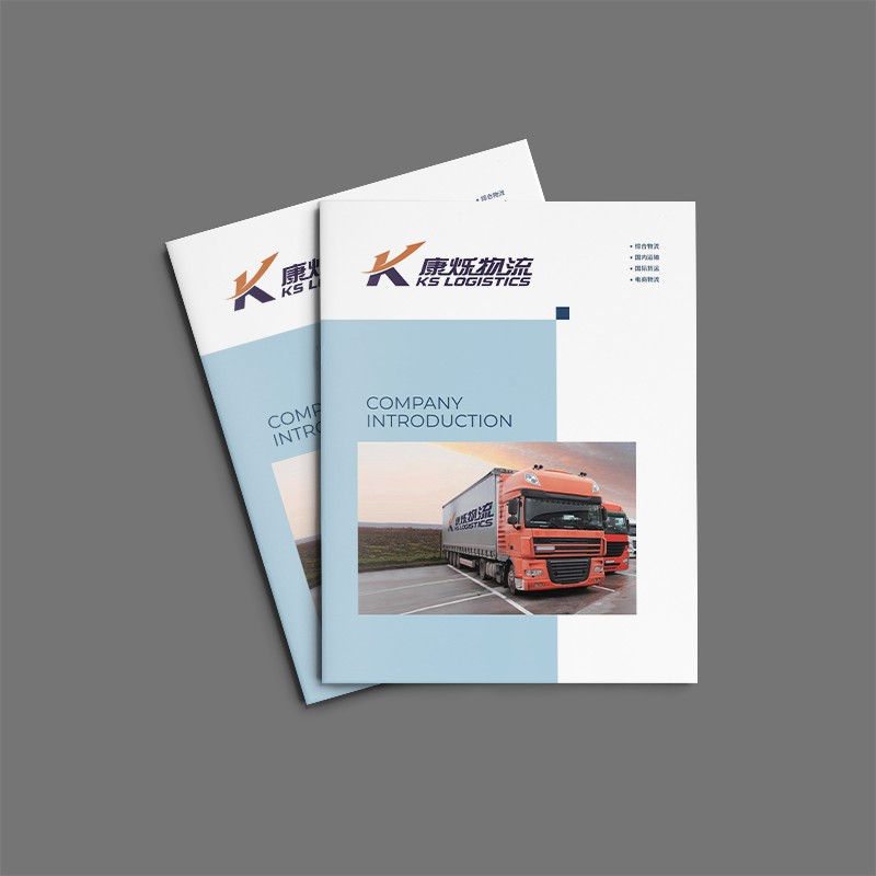
This brochure is clean and crisp in design, with just the right use of lines and shapes and a clear message. This is not only a brochure, but also a beautifulMaterial Album DesignThe work, from the visuals to the content, is impressive.


Scan code to add customer service WeChat
Scan attention official service number

