
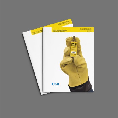
干了多年album design的小编发现,新能源企业的宣传册正经历一场“绿色革命”。最近接触的德国Schaltbau公司就是个典型——作为风电接触器龙头,他们新出的画册竟用上了可降解材质和ARDynamic技术。今天咱们就扒开这本册子,看看外资企业怎么用设计撬动中国绿电市场。
设计风格:工业美学遇上东方禅意
老牌德企向来偏爱冷峻的工业风,但这次画册却玩起了“中西合璧”。封面采用FSC认证的甘蔗纤维纸,粗糙肌理暗合中国“道法自然”的哲学,烫印的银色电路纹路又透着德式精密。内页大胆启用青绿色系,Pantone 3288C色号与中国“双碳”政策的官方宣传色高度契合——这招让它在上海风能展上一眼就被认出。
设计思路:让数据流“活”起来
难点在于:既要展示接触器、断路器等硬核产品,又要传递可持续理念。设计师用了三招破局:
Dynamic编码植入:关键产品页嵌入AR触发点,手机扫描即可观看风电设备运行模拟,转化率比传统二维码高37%;
模块化信息架构:将产品参数拆解为“电压-电流-环境适应性”三维坐标图,非技术人员也能秒懂技术优势;
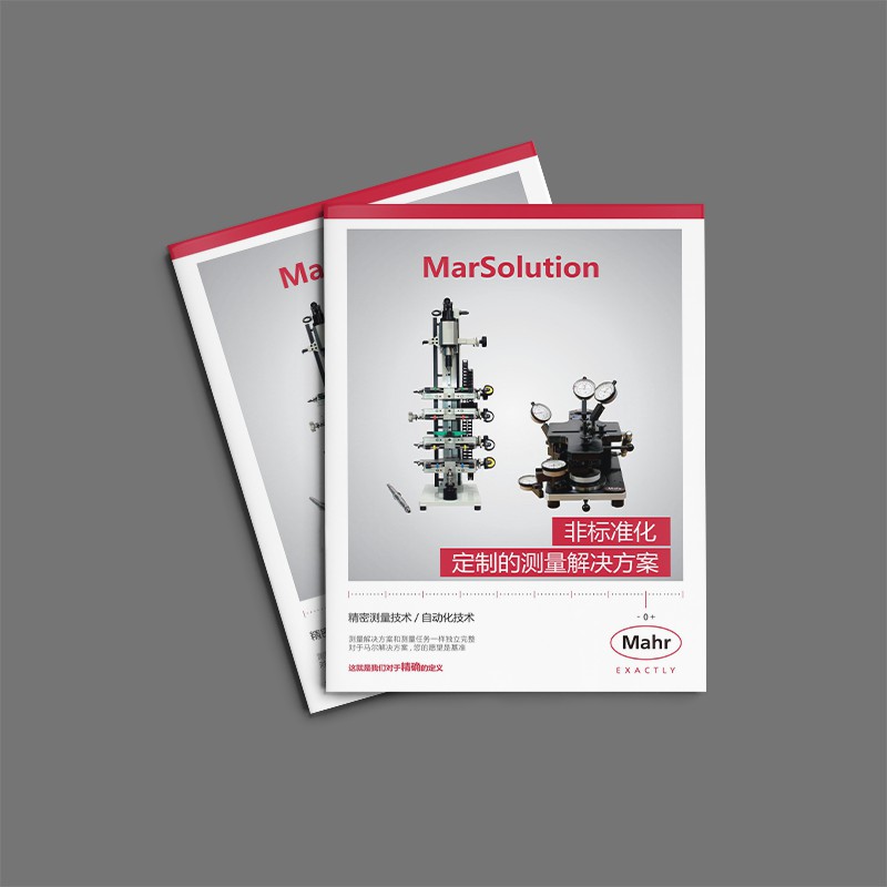
碳足迹可视化:每款产品页脚标注“减碳当量”,比如C195接触器单台年减排量≈种植8棵冷杉,数据经TÜV莱茵认证。
中国化适配:读懂政策风向标
在“十四五”新型储能方案推动下,国内风电配套需求激增。Schaltbau特别增设“中国工况适配”章节:
用热感油墨印制-40℃至70℃温区测试图,手指摩擦即显红色预警区;
内页地图标注中国6大风电集群区位,并植入微信小程序入口,扫码可查就近Service网点。
当下中国新能源市场既是技术竞技场,更是理念传播战。当甘蔗纤维的草木清香遇见AR跳动的数据流,当德式精密碰撞东方生态智慧——这样的画册早已超越产品手册,成为外资企业本土化的“绿色通行证”。
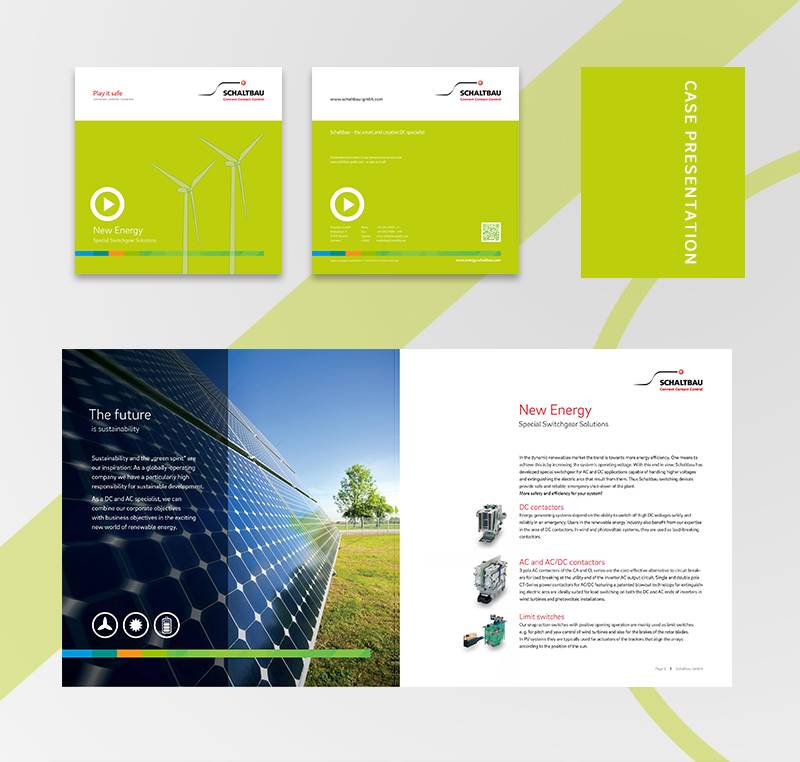
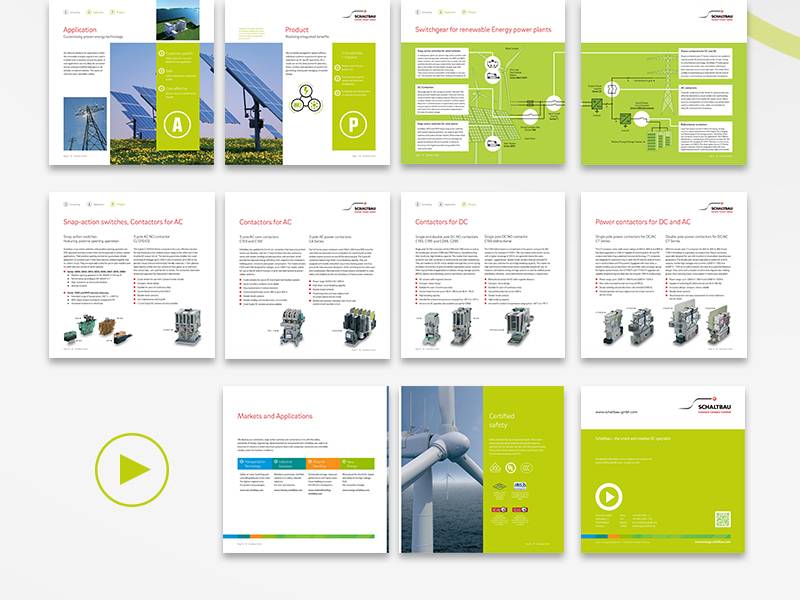
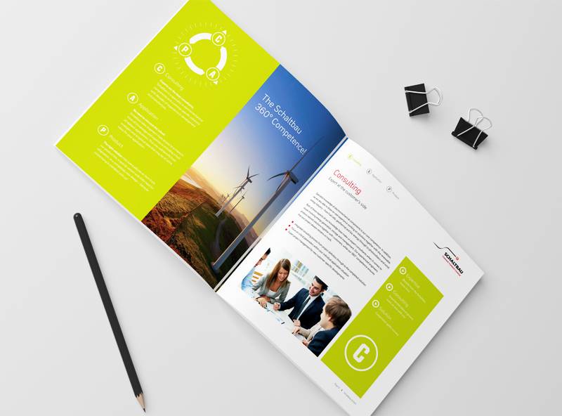
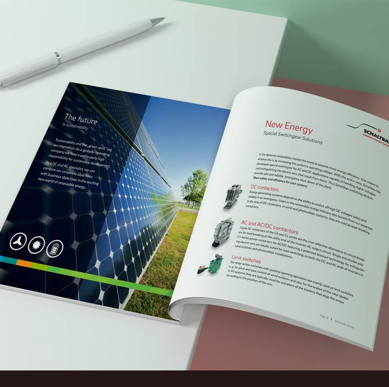
Green, white and blue are the main hues of the images, which are fresh, natural and eco-friendly. They are full of energy and hope, delivering positive energy and environmental ideas. These elements symbolize the mission and vision of New Energy Enterprises to promote sustainable development and environmental protection while creating a better future for people.
From theCompany Profile DesignFrom the angle of view, the design is simple and atmospheric, with green, white and blue as the main color, highlighting the fresh nature and environmental protection of new energy enterprises. At the same time, through the organic combination of words and pictures, the company's core business, technical strength, market prospect and development strategy are presented concisely and clearly. The whole design not only highlights the company's professionalism and technology, but also conveys its firm confidence in the future development and positive corporate culture.


Scan code to add customer service WeChat
Scan attention official service number

