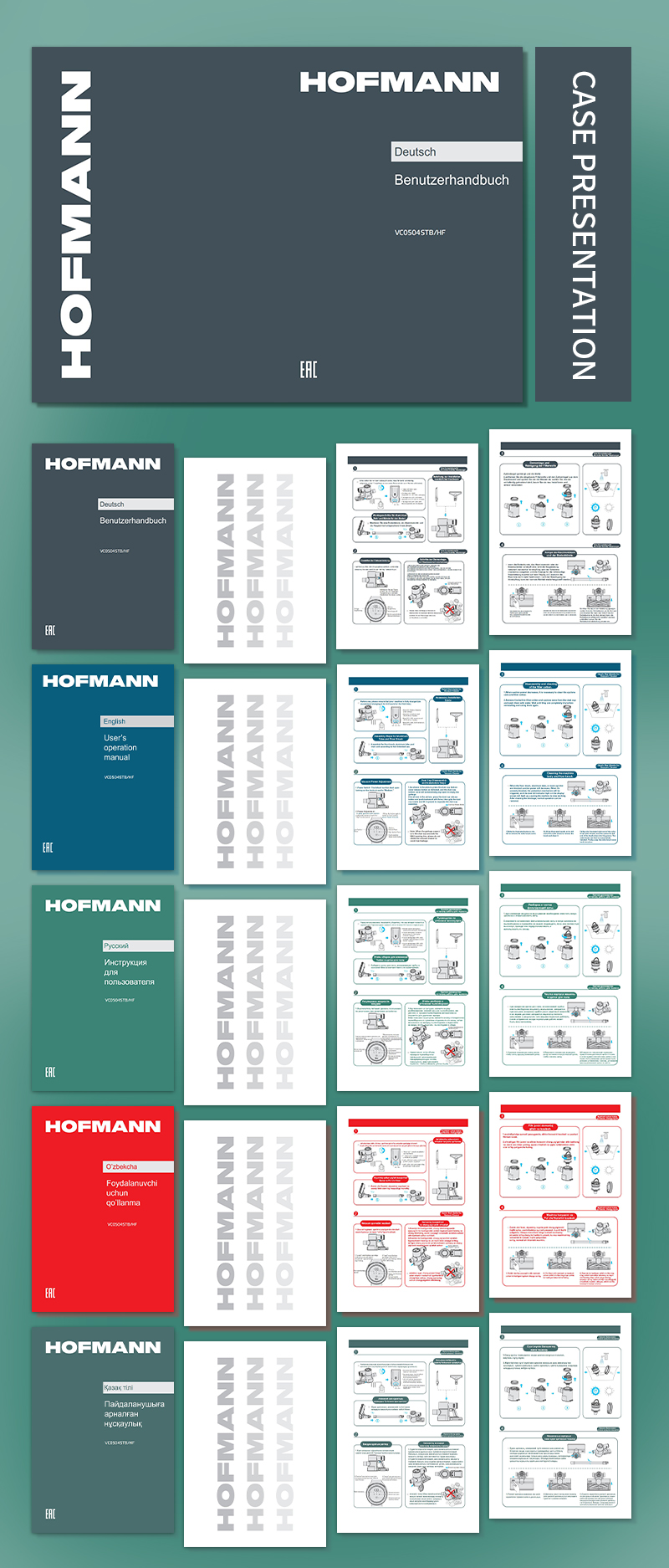
The design of this brochure is an example of the perfect blend of visual art and practical information. Out of the deep blue background, clear white text and bold red embellishments emerge, creating a professional and vivid picture. The layout of each page is carefully planned, from the eye-catching logo of "HOFMANN", to the juxtaposition of "DEUTSCHER BUNDESVERBAND" and "BEZIRK", to the clear division of "STANDORT", "PRODUKTION" and "LIEFERUNG". Every detail reveals the precise control and efficient delivery of information.

The text boxes below, with "HOFMANN" and "BEZIRK" as the core, provide detailed and easy-to-understand instructions around the topic of "BENUTZERHANDBUCH". The artful combination of these words and diagrams not only makes the complex operation process clear, but also makes this brochure a beautiful and practical work of art.
Throughout the design, it's not hard to see how the designerDesign of the instruction manualdeep understanding and original insights. Through a delicate combination of colors, layouts, text and graphics, they successfully present information that might otherwise be boring and interesting, allowing people to appreciate beauty while also easily mastering the knowledge and skills they need.
