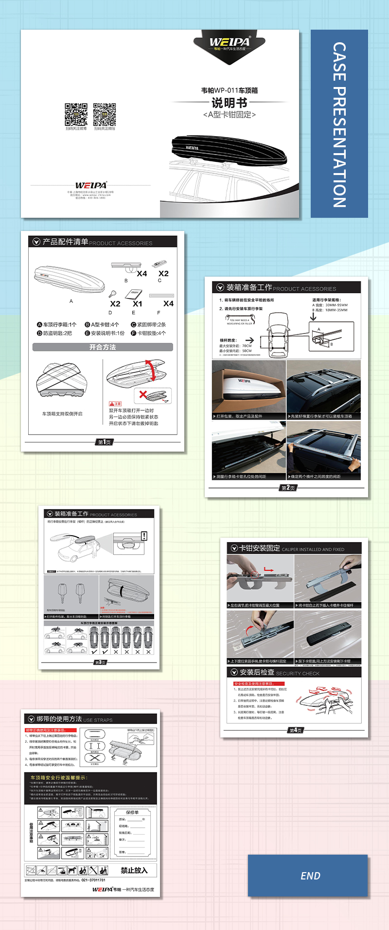
The brochure is designed as an exquisite work of art, combining product characteristics with aesthetics. Black, blue, grey and silver tones match to create a high-end and professional atmosphere, let people at a glance can feel the quality and style of the product. The cover "WEIBA" brand name and its logo are simple and generous, quickly locking the viewer's eyes and guiding the journey of discovery.

Inside the album, the product diagram on the left shows the black cylindrical objects of different specifications in an intuitive manner. The labels "X2" and "X4" clearly convey the diversity and flexibility of the products. The working principle diagram on the right is like a precise mechanical picture scroll, slowly unfolding the mystery of product connection, making people interested in the functionality and practicality of the product.
The text section, detailed and concise instructions, together with graphic presentation, make the complex installation steps easy to begin with even first-time users. In particular, the warm reminder of "Do not remove the key when the key is on" shows the designer's careful consideration of user experience.
Whole portionDesign of the instruction manualIt is not only a comprehensive presentation of product information, but also a perfect interpretation of aesthetics and practicality. It is like a bridge, connecting products and consumers, so that every turn of the page becomes a pleasant journey of discovery.
