
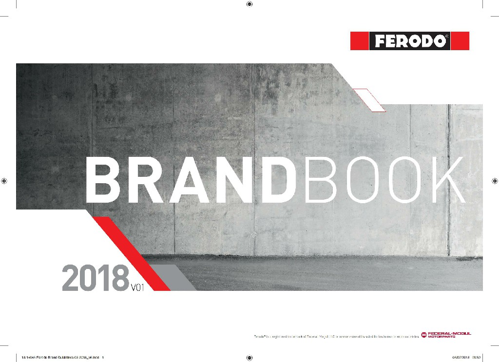
This English version of auto parts catalog design, with its unique visual presentation, leads us into a sophisticated and rich world of auto parts. At the beginning, the white text leaping against the black background and the graphic of the car parts interweave, not only instantly attracted the eye, but also cleverly explained the theme of the product.

Continuing our exploration, we were captivated by a series of carefully choreographed blue-framed tables. They are neatly divided into three columns, each of which carries important product information, from numbers to letters to professional symbols, all of which demonstrate the professionalism and diversity of products. It's not just a pile of data, it's the ultimate pursuit of quality and detail.
Finally, our eyes fell on the poster with a black background, which resembled an art painting, showing the charm of car parts to the fullest. The perfect fusion of text and image not only conveys the core value of the product, but also makes the English version of the product catalog design in practicality, adding a bit of artistic atmosphere. Overall, the design is not only a detailed catalogue, but also a double feast of visual and information, fully showingEnglish product catalog designof unique charm.


Scan code to add customer service WeChat
Scan attention official service number

