
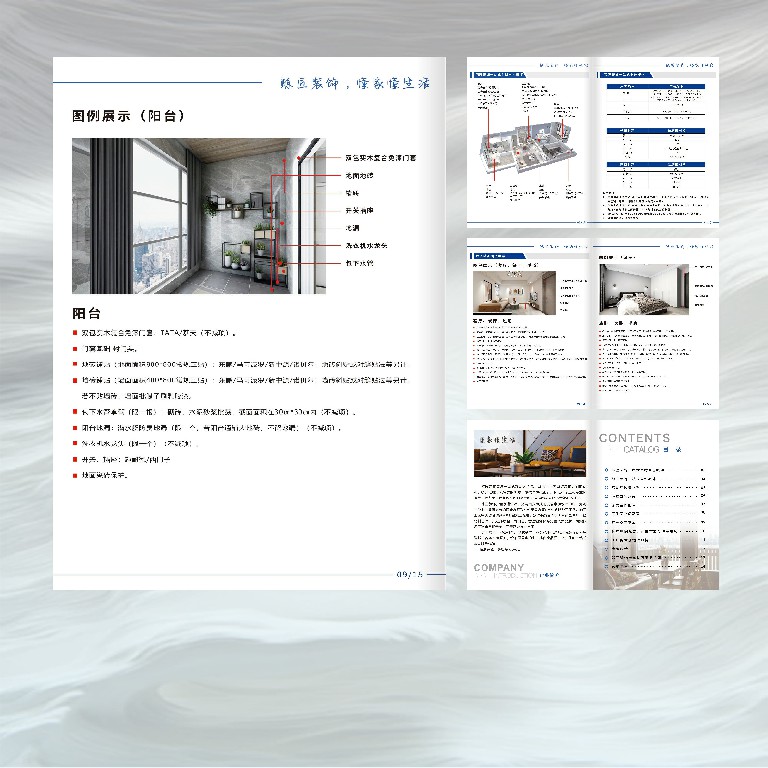
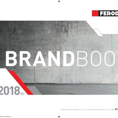
In the case, a "frameless line" grid system is adopted to strengthen the sense of content hierarchy through white space and column design. The main title uses oversized serif font (such as "Deluxe Package" in the case), with small-kerned English submarks to form a visual anchor point. This typesetting logic of "light and heavy contrast" not only conforms to Chinese people's reading habits, but also can quickly convey core information.

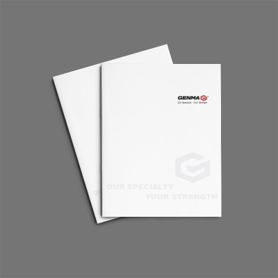
Abandon the highly saturated tone used in traditional corporate albums, and instead adopt the collision of gray powder and fog blue in Morandi color system, and reduce visual fatigue. With the local UV process, the texture contrast between matte and bright is formed on keywords such as "Xinli Xinre".
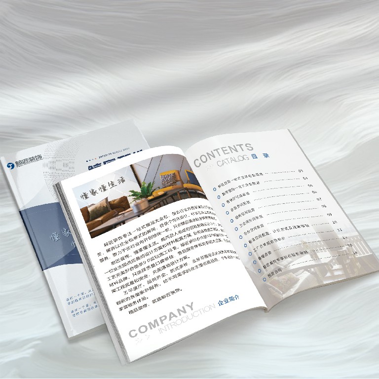
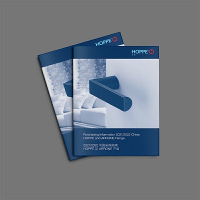
The cover is blackened with imported star-picked paper, and the inner page is made of 140g high-grade picture paper. This combination of "rigid on the outside and soft on the inside" materials not only ensures the durability of the album, but also enhances the delicate touch when flipping through. Especially in the "CONTENTS" page, hidden lock binding is applied to ensure the seamless connection of cross-page pictures
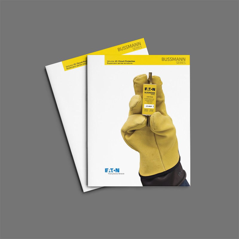
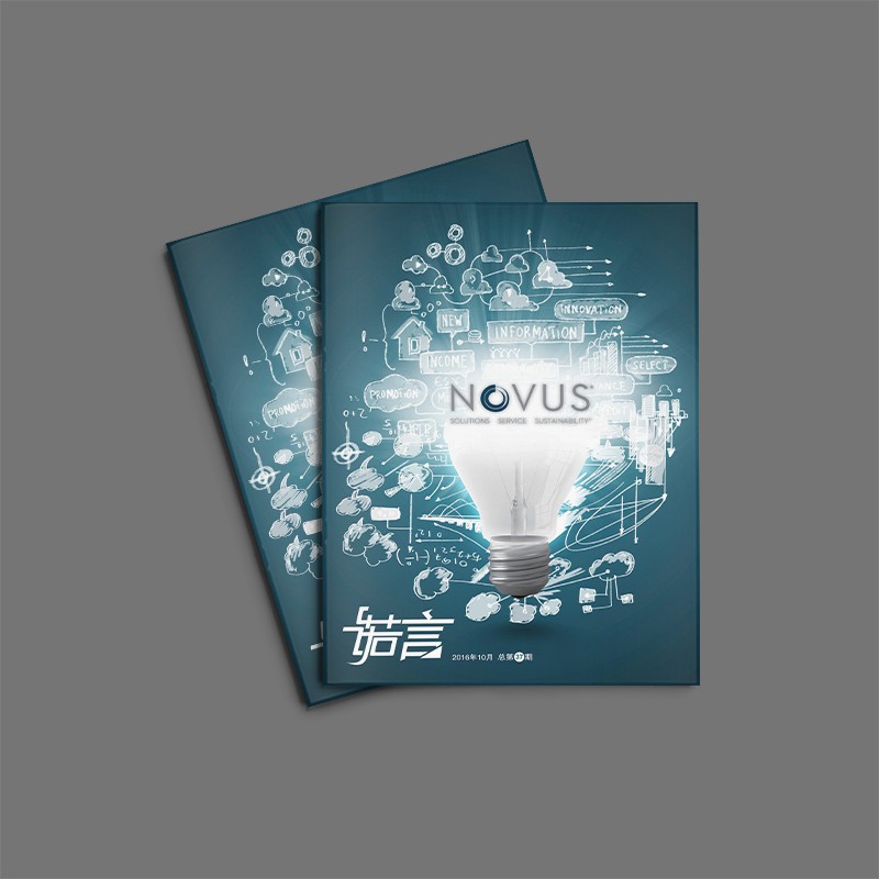
Corporate brochures are not only the carrier of product introduction, but also the "silent spokesperson" of brand image. An excellentalbum design, it is necessary to take into account both visual aesthetics and practical functions, especially in the post-epidemic era, consumers' emotional dependence on physical materials is increasing instead of decreasing.


Scan code to add customer service WeChat
Scan attention official service number

