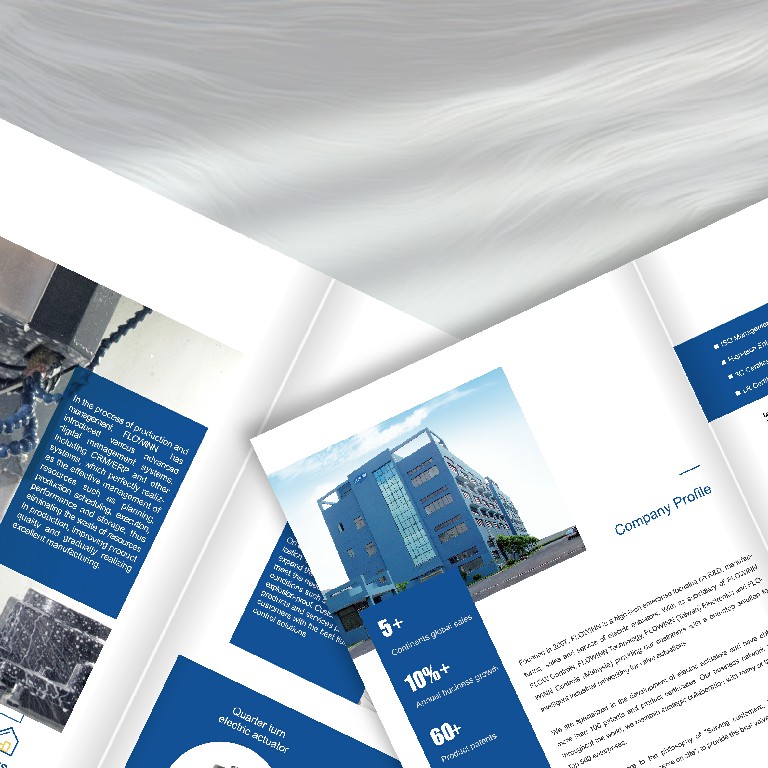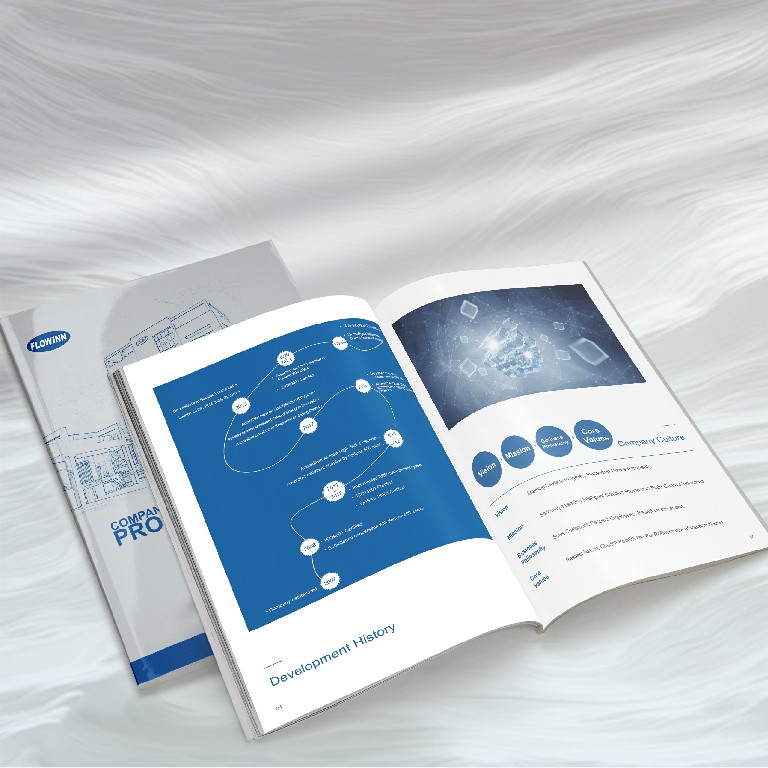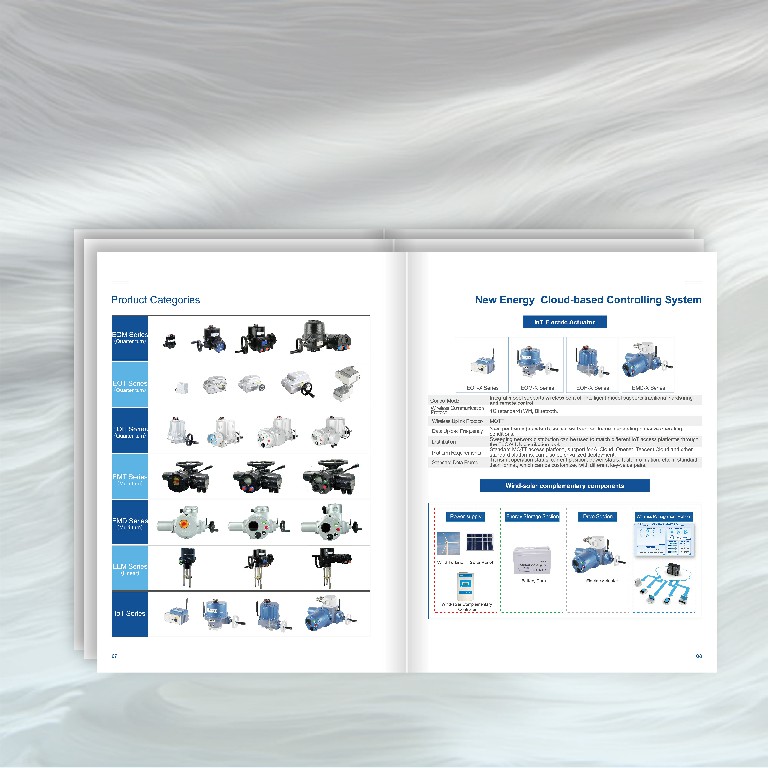
In view of the intensive technical parameters of enterprises (such as torque range, IP protection level), designers adopt modular typesetting, and assist reading through color block partition and icon. For example, the product series suitable for explosive atmospheres uses orange and black warning color shield icons to strengthen safety attributes, and the data tables use sans serif fonts to improve recognition. This design not only conforms to the reading habits of engineers, but also realizes the quick capture of complex content through "information noise reduction".

The main vision of the album uses a dark blue gradient background to simulate the technological sense of the industrial control panel, and is matched with product exploded diagrams and working condition scene diagrams (such as oil fields and water treatment plants). Especially in the "Application Fields" chapter, isometric perspective illustrations are used to present the application of equipment in medical, new energy and other scenarios, avoiding the rigid impression of "equipment stacking" in traditional industrial albums. In terms of printing process, key pages use partial UV process to highlight the product outline, and matte coating reduces reflective interference to ensure the practicality of reading outdoor scenes.

Combining the domestic "dual carbon" goal with the trend of intelligent manufacturing, the album focuses on strengthening the visual presentation of environmental certification (ISO14001, RoHS) and digital management (ERP, MES system). For example, the certificate icon is integrated into a timeline, which is juxtaposed with data such as annual business growth rate (10%) and number of patents (60) to intuitively convey compliance and growth. Soybean ink and FSC certified paper are used in the printing process, which is in line with the company's brand proposition of sustainable development.

To meet the needs of global customers, thisIndustrial album designThe Chinese-English bilingual design is adopted, and the text spacing is widened by 0.5 pt compared with the conventional one to improve readability. The inner page uses 157g matte pink paper, taking into account the requirements of picture color rendering and crease resistance; The cover is made of special paper with imitation cloth pattern, and the company LOGO is presented through embossing process to strengthen tactile memory points.
