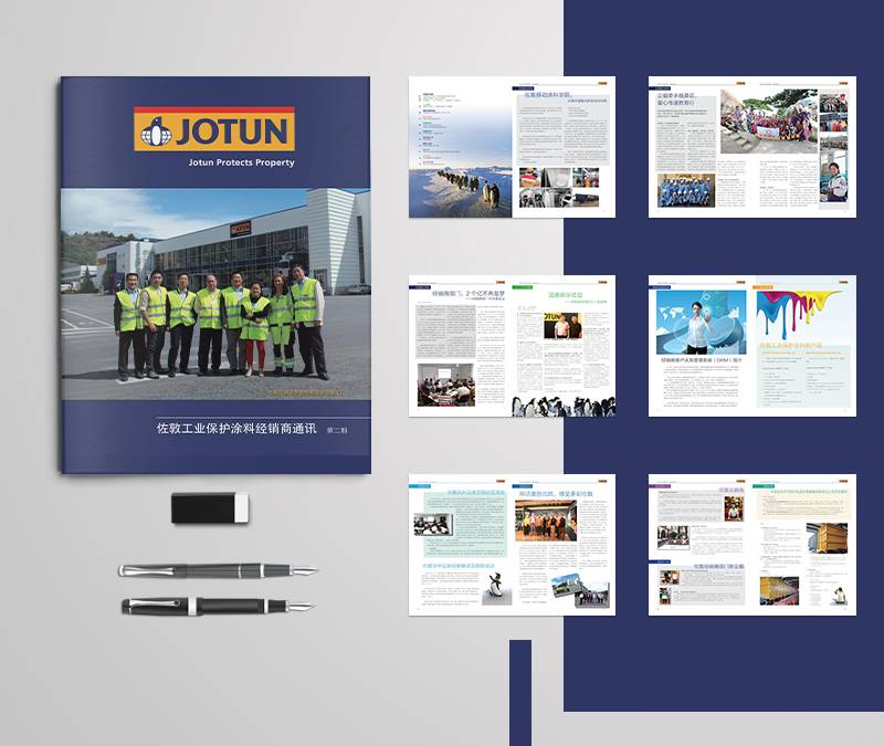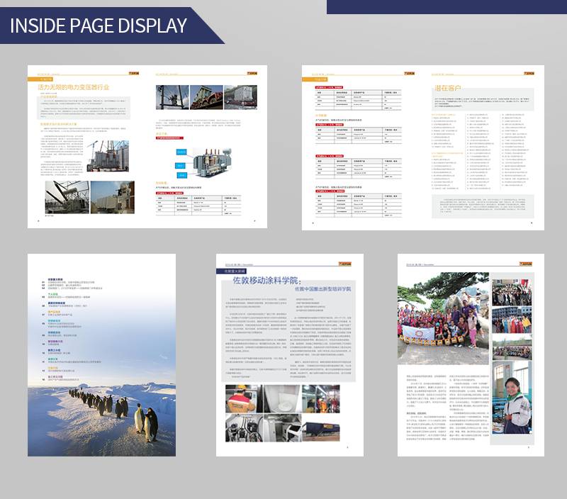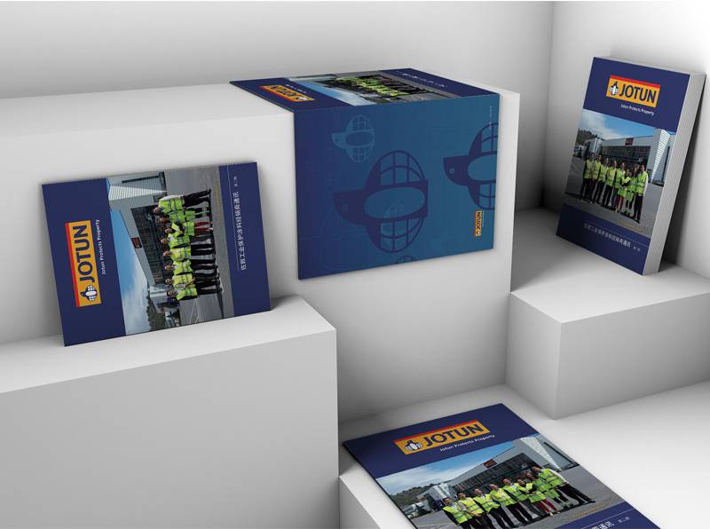


This group of pictures shows the design of a company's internal magazine, which conveys the essence of the company's product promotion manual and the company's culture to the fullest through clever typography and careful selection of materials.
The whole design style is modern and professional, with yellow and blue as the main tones, highlighting the company's professional image and philosophy. On the cover, the JOTUN brand logo is clearly visible, and the company's business license and logo in the background show the identity and reputation of the enterprise, enabling people to quickly understand the identity and status of the enterprise.
Inside the design, people in yellow vests and blue aprons are engaged in work or activity, and their images are powerful and show the professionalism and energy of the enterprise. These items, such as pens, notebooks and mobile phone chargers, demonstrate the high quality of products and services provided by enterprises, and highlight the attitude of enterprises to actively support social development.
The wholeEnterprise Internal Journal DesignIt not only reflects the brand image of the enterprise, but also displays the characteristics and advantages of the product, at the same time has very creative and aesthetic feeling, brings the readers a pleasant visual experience, and effectively enhances the influence and recognition of the enterprise brand.
