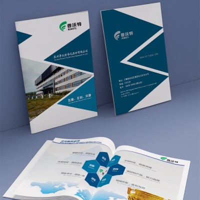
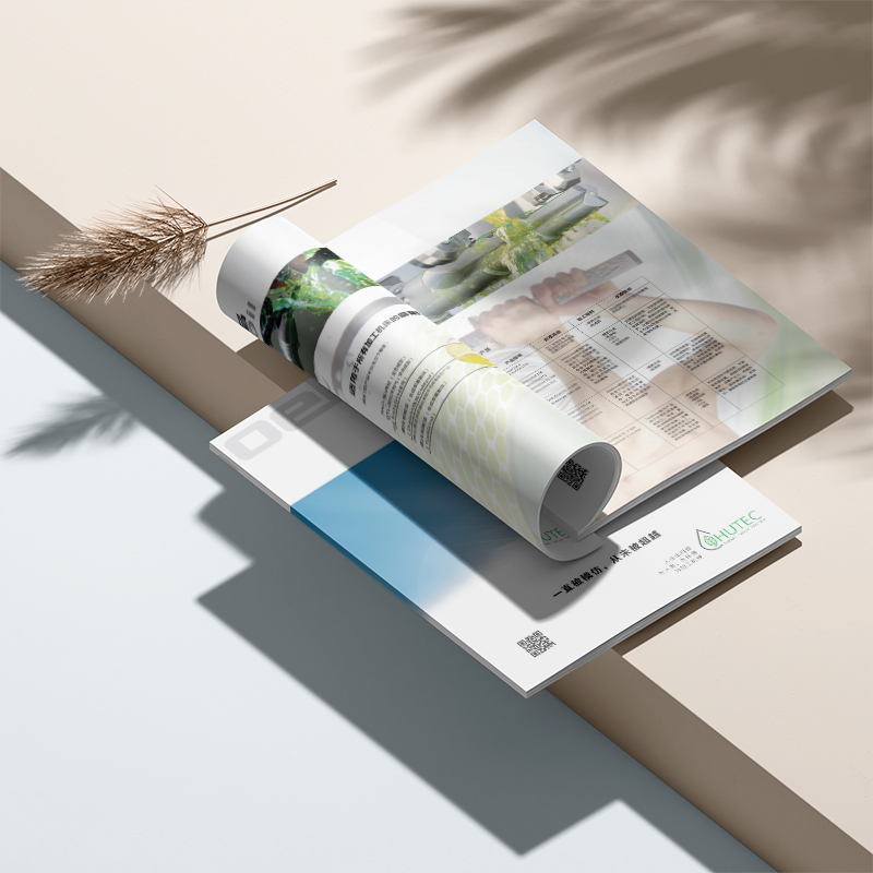
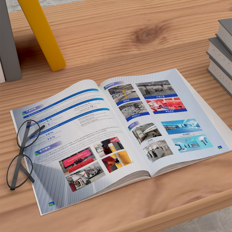
From the overall visual design point of view, this brochure mainly uses blue tones with smooth and atmospheric geometric elements to create a cutting-edge technology, environmental protection and energy-saving brand atmosphere. Various product information and technical parameter comparison tables are arranged in an orderly manner, making information communication more clear and easy to understand. At the same time, the high-quality printing materials and processes are used to infuse the overall visual feel with a superior sense of professionalism. This design strategy, which combines cutting-edge visual language with high-quality manufacturing techniques, will undoubtedly better demonstrate the brand value of the company. In terms of content planning, this album shows the company's core in the field of environmentally friendly industrial equipment.
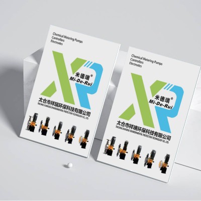
From the perspective of the overall visual design, this brochure mainly uses blue and yellow tones with smooth and atmospheric geometric elements, creating a brand atmosphere with cutting-edge technology, environmental protection and energy saving. Various product pictures, technical parameter comparison tables and other contents are arranged in an orderly manner, making information transmission clearer and easier to understand. At the same time, the careful use of printing materials and processes also injects an excellent sense of professionalism into the overall visual texture. This design practice, which combines cutting-edge visual language with high-quality manufacturing technology, can undoubtedly better highlight the brand value of enterprises. In terms of content planning, this album fully demonstrates the technical advantages in the field of environmentally friendly power equipment
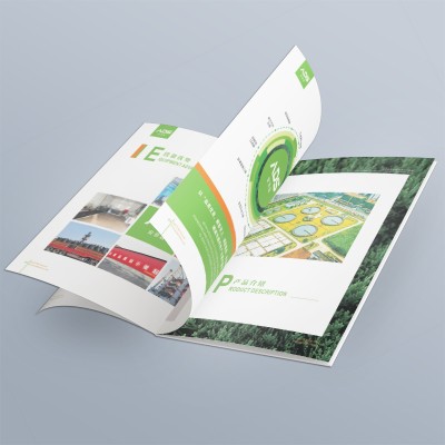
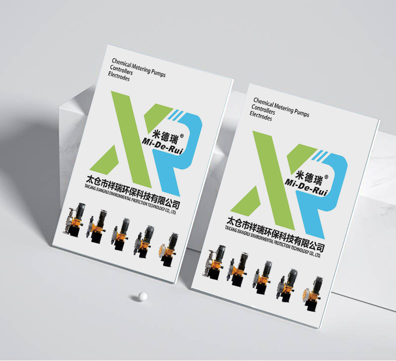
From the perspective of overall visual design, this brochure mainly uses green and blue tones with simple and capable geometric shapes to create a fresh, environmental-friendly, technology-rich brand atmosphere. Various product pictures and technical parameter tables are organized in a logical and logical manner, making information more clear and easy to understand. At the same time, high-quality printing materials and craft applications also give the overall excellent professional feel. This design strategy, which combines cutting-edge visual language with high-quality manufacturing techniques, will undoubtedly better demonstrate the brand value of the company. In terms of content planning, this picture book shows the company's environmental industry in a comprehensive way.
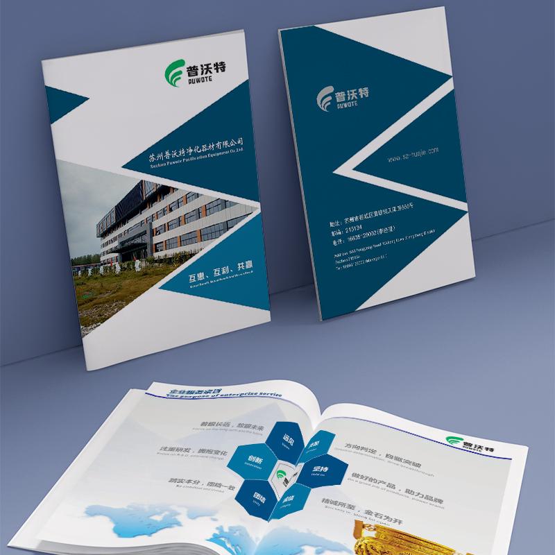
From the visual design point of view, this ADS business album mainly uses teal and simple geometric elements to create a natural environmental protection, technological future brand temperament. At the same time, a wealth of infographics, process flows and product classifications have been carefully choreographed to ensure the overall message communication is logical and organized. Particularly worth mentioning is that this album has put a lot of effort into printing materials and craftsmanship, giving the overall a sense of outstanding professional quality. This combination of cutting-edge visual language and high-quality manufacturing processes will undoubtedly better convey the brand value of the company. In content planning
Judging from the overall visual design of the album, it makes full use of blue tone and simple geometric elements to create a technologically pioneering and futuristic visual atmosphere. At the same time, rich information graphics, process details and application scenarios have also been carefully arranged to ensure the organization and logic of the overall information transmission. This approach of combining cutting-edge visual language with systematic content architecture can undoubtedly better convey the advantages of enterprises in terms of professional strength and technical advantages. In the printing and production process, this album has also made a lot of efforts. From paper materials to printing processes, they have been carefully selected and used to make the overall presentation
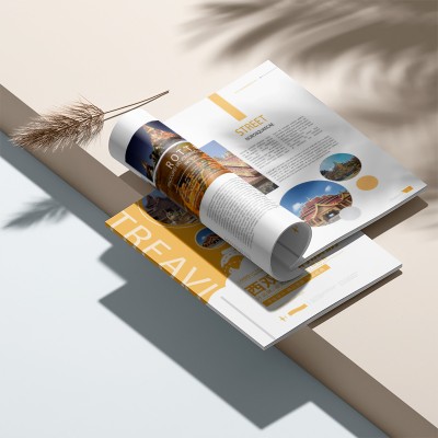
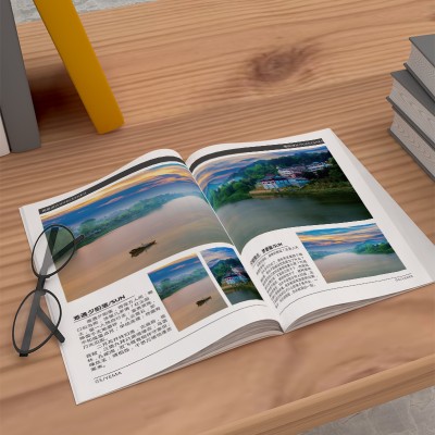
Being in a noisy city, I occasionally yearn for a quiet and peaceful paradise. The design of this tourism brochure just grasps this psychological demand and perfectly presents the natural scenery and culture to readers. From the perspective of visual design, the orange-yellow tone of this album is the main tone, which vividly conveys the enthusiasm and vitality of this tropical island. A large number of exquisite photographic pictures, combined with concise text descriptions, make readers feel as if they are in charming scenery. The illustrated layout not only improves the visual impact of the album, but also makes each layout full of design sense. In terms of content planning, this brochure covers history, culture, nature
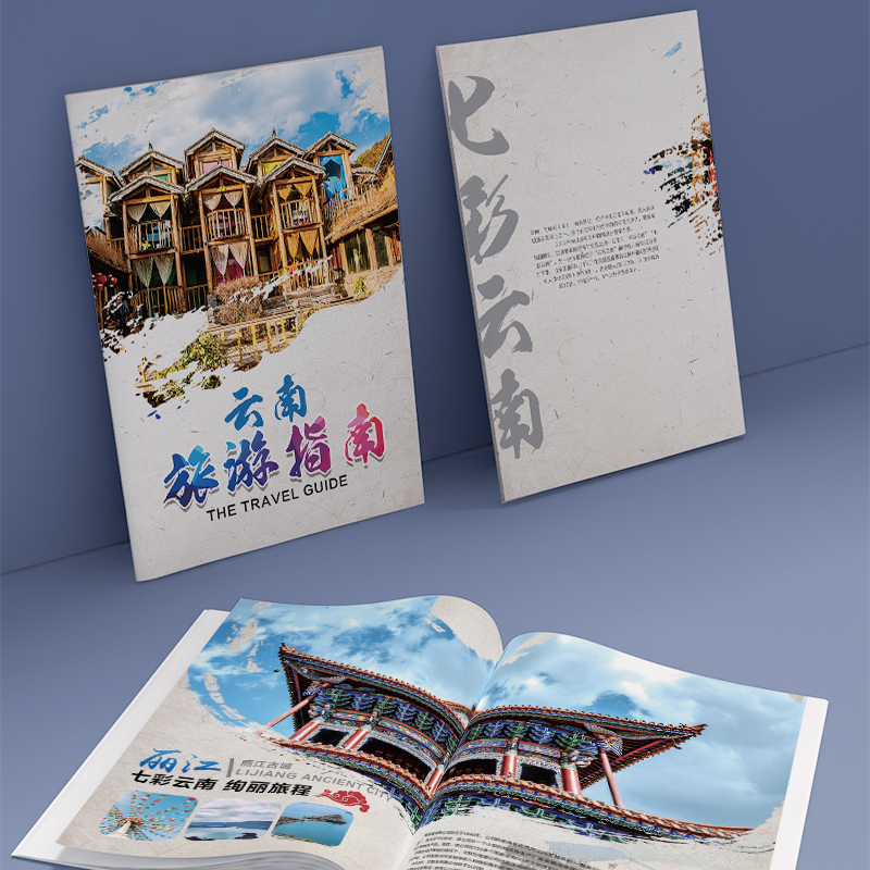
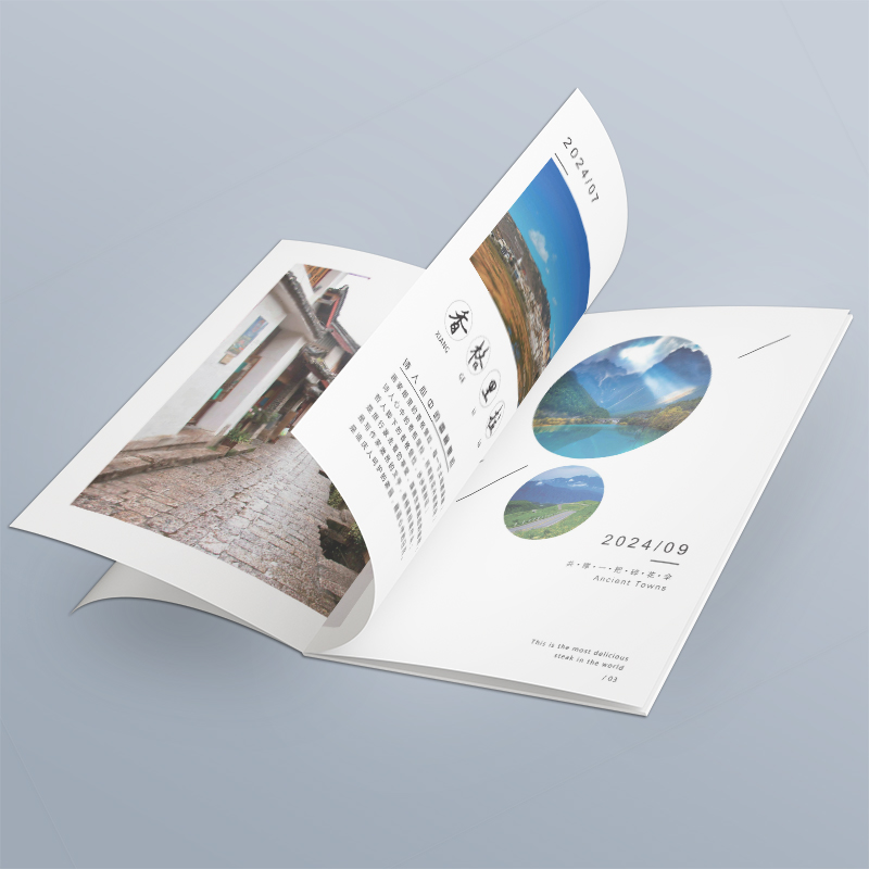
The whole album uses warm colors to create a comfortable and natural visual atmosphere. At the same time, the designer cleverly incorporates many real-life pictures, such as ancient city architecture, natural scenery, and so on, to vividly present the unique charm of Yunnan. In addition, the album also applies some simple and layered geometric elements, further enhancing the overall visual tension. This rich and diverse use of visual elements, so that the album presents a pleasing visual effect. In the layout design aspect, this album has achieved the content organization clear, hierarchical. The combination of words and images is well-ordered to convey information effectively and bring
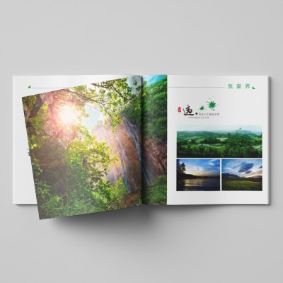
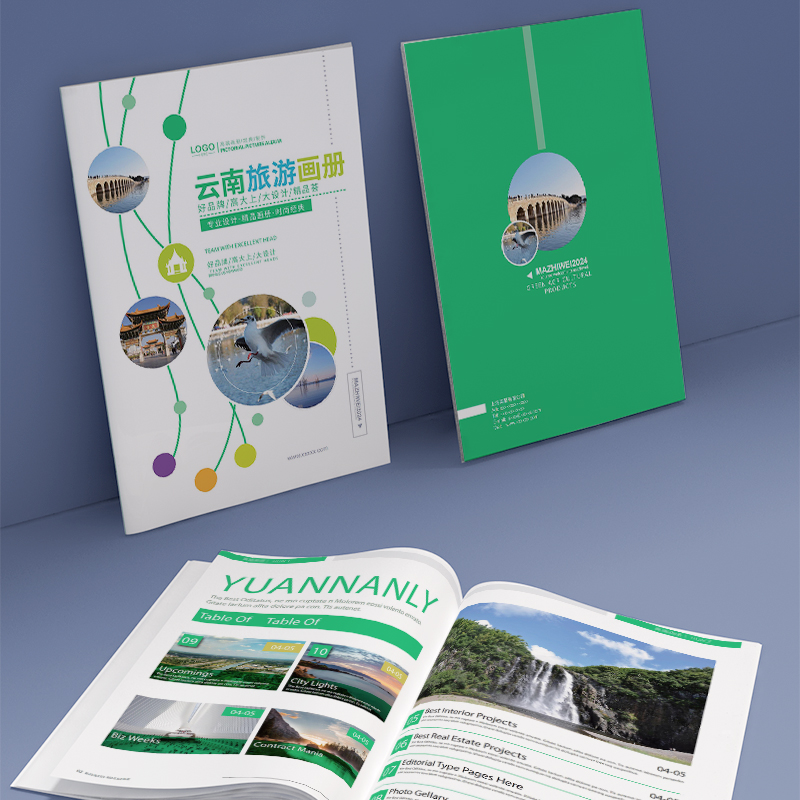
The album as a whole adopts fresh and natural green tone as the main tone, with simple and smooth geometric elements, creating a quiet and comfortable atmosphere. At the same time, the designer used a large number of design techniques such as circular icons and moire decorations, which not only strengthened the visual guidance of the album, but also added a rich sense of hierarchy. It can be said that this unique and coordinated visual language makes the whole album present an excellent aesthetic experience. In terms of layout, this album has a clear content structure and distinct layers. Proper use of words and images can not only effectively convey information, but also create good visual effects. It is particularly worth mentioning that
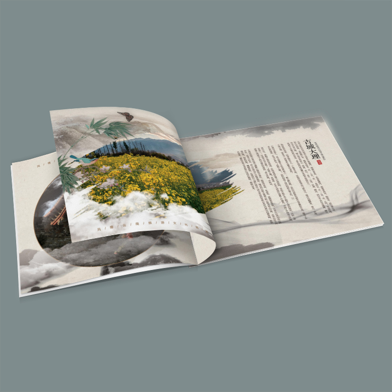
The album is based on deep and elegant ink tones, creating a quiet and precipitous artistic atmosphere. At the same time, the designer cleverly embellishes traditional elements such as ink patterns, landscape brush strokes and so on, so that the overall design exudes rich ink charm. This deep integration of Chinese traditional ink and wash culture undoubtedly gives the album a thick cultural connotation. In the layout, this album uses simple and atmospheric grid structure, between the various pages maintain a good sense of hierarchy and rhythm. At the same time, the designer is good at using large picture, small picture, text collocation, realizes the information orderly transmission. It is worth mentioning that the album also cleverly incorporates some
The album makes extensive use of deep and elegant ink tones to create a quiet and precipitated artistic atmosphere. At the same time, the designer skillfully embellished traditional elements such as ink patterns and landscape brushstrokes, giving the overall design a strong ink charm. This deep echo of Chinese traditional ink and wash culture undoubtedly gives the album a unique cultural connotation. In terms of layout, this album adopts a simple and atmospheric grid structure, and the sense of hierarchy and rhythm between each plate is properly controlled. At the same time, designers make good use of the combination of big pictures, small pictures and words to realize the orderly transmission of information. It is worth mentioning that the album also cleverly incorporates
The album makes extensive use of dark gray and light gray ink tones to set off a quiet and elegant artistic atmosphere. At the same time, the cleverly embellished ink patterns and brushstrokes give the whole a retro charm that combines classical and modern. The application of this ink and wash element not only highlights the profound heritage of Chinese traditional culture, but also makes the whole album full of cultural connotations. In terms of layout, this set of picture albums adopts a grid structure, and each layout maintains a good sense of hierarchy and rhythm. At the same time, the designer carefully used the combination of large pictures, small pictures and words to realize the orderly transmission of information. It is worth mentioning that the album is also interspersed with some decorations
From the visual design point of view, this brochure with elegant off-white tone as the main keynote, so that the overall picture presents a kind of quiet and simple feeling. Designers give full play to the charm of ink painting, cleverly use abstract ink elements to embellish everywhere, bring a kind of ink left marks of the book. At the same time, a large area of the use of high-resolution real-life pictures, and create a kind of warm and moving visual effect. This combination of ink and ink and photographs gives the brochure a perfect blend of traditional Chinese culture and contemporary life. In terms of layout, the brochure is equally impressive. Designers take full advantage of the meshed layout, in
From the visual design point of view, this album brings into full play the characteristics of traditional Chinese ink and wash painting, presenting scenery such as mountains and green waters, temples and ancient buildings with elegant ink brush strokes. This design not only makes the whole album more harmonious and unified, but also highlights the unique cultural beauty of China. At the same time, the album uses a lot of high saturation color landscape, with ink elements to form a stark contrast, make the overall picture more vivid and moving. In terms of layout design, this album is equally impressive. Designers will various kinds of pictures and text cleverly carry on the separation and combination, avoid single typesetting way, enhance the overall visual charm.
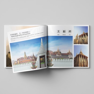
In terms of overall color matching, the designer made full use of the contrast between fresh and elegant blue and pure white, presenting a simple and atmospheric visual experience. This design technique skillfully integrates the concept of "harmony between heaven, earth and man" in Chinese traditional culture, giving people a harmonious and calm feeling. At the same time, this color matching also reflects the current popular trend of China's domestic tourism market, making the album design closer to the target audience. In terms of content presentation, this album is also excellent. The designer makes full use of the combination of words and images to accurately summarize the characteristics of different tourist attractions. Such as mountains,
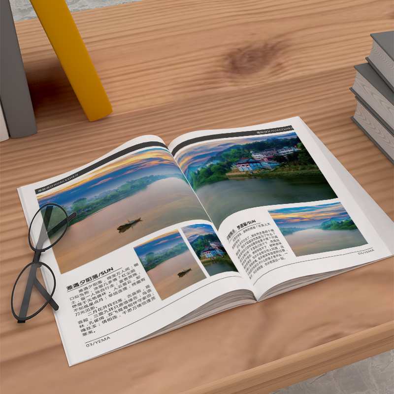
From the perspective of the overall visual style, this work makes extensive use of simple elements such as blank space and lines, so that the pictures of various scenic spots can be highlighted. At the same time, through the use of contrasting colors, such as the contrast between blue sky and white clouds and green vegetation, a visual tension is created. It is worth mentioning that the album cleverly adopts multi-view shooting techniques, such as bird's eye view and close range, to bring readers a rich sensory experience. These well-designed visual languages make the whole album look clean and refreshing, but still attractive. In terms of content presentation, this travel album has also made great efforts. The designer fully explored the characteristics of each scenic spot and chose
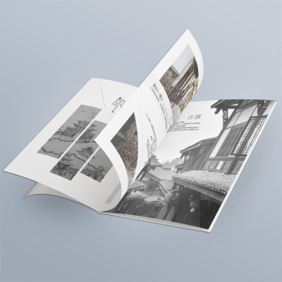
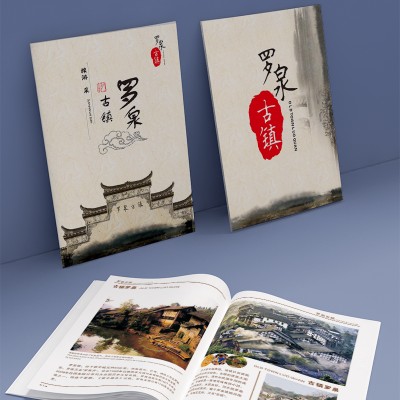
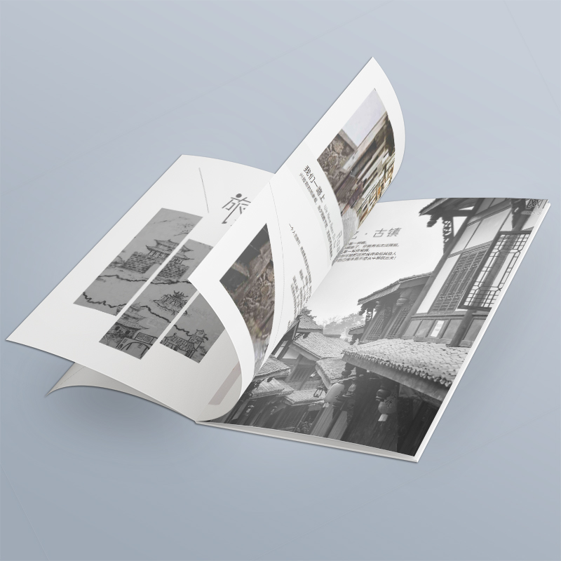
First of all, from the perspective of visual design, this manual fully absorbs the aesthetic preference of the current young group, using bright orange, yellow, blue and other contrasting tones to create a strong visual impact. In stark contrast, there is a large selection of black and white ancient town architectural photography, reflecting the vicissitudes and elegant cultural texture. This blend of modern colors and traditional elements makes this work unique. In terms of content, this manual is equally well done. The designer skillfully combines vivid pictures with concise description, and tells the ancient town's history, architectural features and humanistic customs.
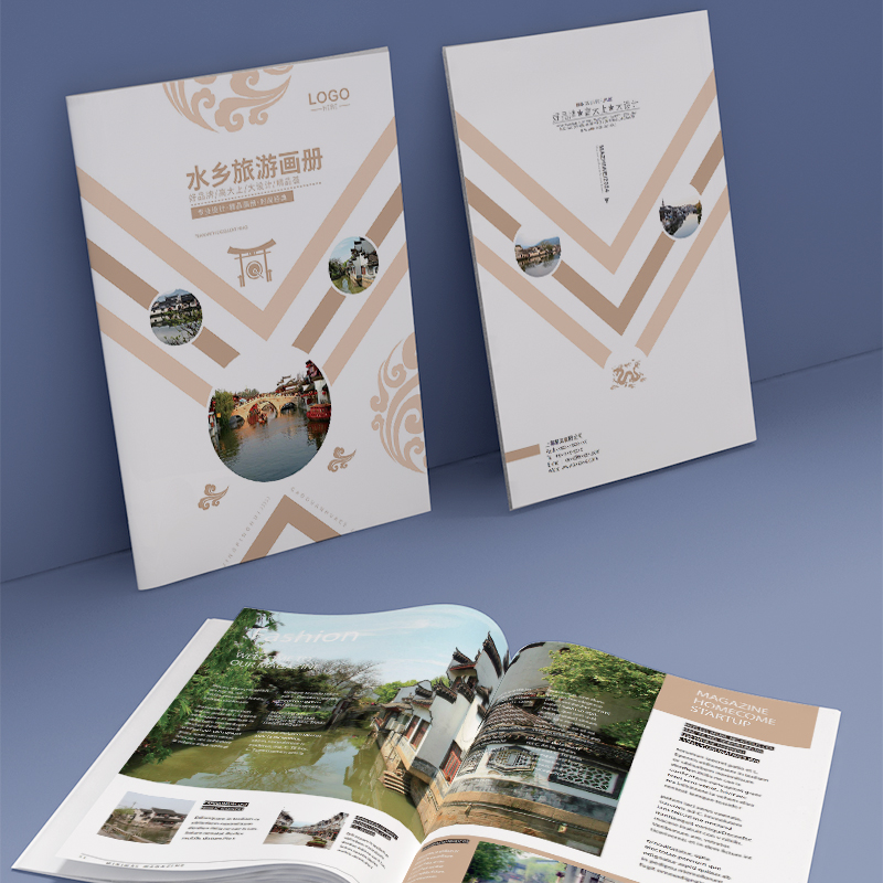
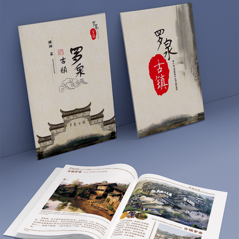
From the overall design style, this album follows the creative concept of Chinese landscape painting, with elegant off-white tones as the main tone, embellished with vermilion decorative elements, creating a quiet and profound artistic atmosphere. The eye-catching "National Treasure" seal pattern on the cover highlights the cultural value and historical thickness of this ancient town. The exquisite landscape painting-style illustrations on the inner pages skillfully integrate ancient buildings, beautiful mountains and rivers, pavilions and other elements, making people feel as if they were in beautiful ink paintings. This perfect combination of Chinese traditional art and modern aesthetics is undoubtedly one of the features of this album
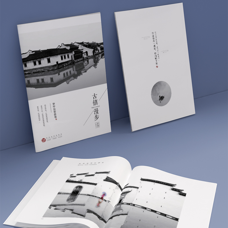
First of all, from the overall visual design, this album is like a flowing ink painting scroll. The main color is mainly elegant black, white and gray, embellished with red decorative elements, which not only echoes traditional Chinese colors, but also injects a sense of modern design. From the cover to the inner pages, each page is skillfully decorated with meticulous painting-like patterns to create a deep and elegant cultural atmosphere. In particular, the striking "Chinese style" and "ink and wash" characters in the middle seem to be the finishing touch of this picture scroll, leading readers into this exquisite visual world. Inside


