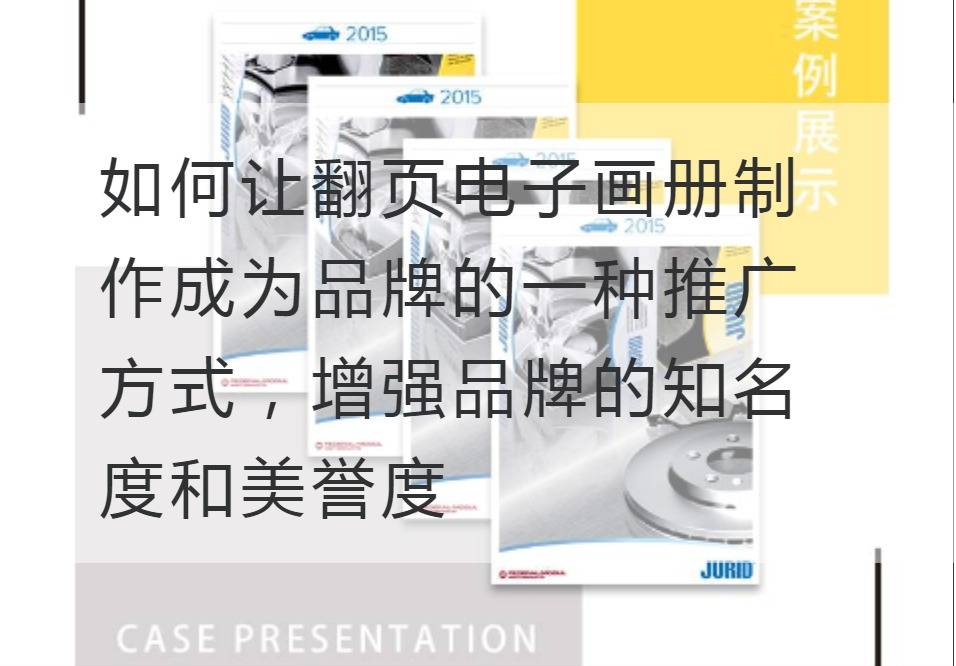
How to make the making of page-turning electronic album become a way of brand promotion and enhance the brand's popularity and reputation
In today's digital media era, brands are constantly looking for innovative ways to increase their visibility and reputation. This requires them to step beyond the classical marketing framework and re-examine and reconstruct the relationship between brand consumers. Today, page-turning electronic album production is becoming one of the new ways for brands to tap their own value, create a wonderful visual experience, and enhance brand awareness and reputation.
Page-turning electronic album is a high-end display form of products and services. Through dynamic effects and interactive design, customers can enjoy a visual feast while understanding the culture, concept and characteristics of the brand. Micro-detailed display, delicate and precise description, make the electronic album become the brand's "silent spokesman".

First of all, the page-turning electronic album can enhance the brand image. In the past, brands usually use paper albums to display and promote products. However, paper albums can't reproduce the details of products, and the dazzling pictures and descriptions can't form a deep-rooted brand impression. Through dynamic display and human-computer interaction, the page-turning electronic album allows consumers to enjoy the carefulness of the brand in a relaxed environment, enhances the brand image, and strengthens the brand memory of consumers.
Second, page-turning electronic albums can improve brand interaction. Traditional marketing methods often make consumers become passive recipients in brand promotion activities. By contrast, page-turning e-books use more advanced digital technologies, such as HTML5 , CSS3 and JavaScript, to make the interaction between brands and consumers more vivid and interactive. Consumers can perceive and understand the brand by clicking, dragging, sliding, etc., and thus feel the vitality and charm of the brand.
Furthermore, the page-turning electronic album helps to expand the brand's reach. Because the page-turning electronic album can be conveniently spread through the network, this makes the brand spread the scope greatly expanded. No matter where consumers are, they can access the brand's electronic albums through the Internet. Through thoughtful design and detailed description, the brand's influence expands rapidly.
However, making a page-turning electronic album is not an easy task. How to avoid the design of the album as an empty picture requires the brand to have a unique visual design concept and a series of technical parameters, such as page layout, color matching, interactive design, etc. This requires us to have a professional design team and precise market positioning, in order to create a unique, personalized electronic album in numerous brands.
In general, page-turning electronicsPicture album productionIt is a modern means of attracting consumers and enhancing brand image and influence. It presents brand characteristics in a unique way, changing consumers from passive receivers to active participants through dynamic display and interactive design, thus increasing brand awareness and reputation. In the future, this will become a popular way for more and more brands to embrace and adopt.
Recommended Reading:
New Age, New Printing: Innovations in Product Brochure Printing
Inspired by printed materials: The Ingenious Design of Product Promotional Album Printing
The power of spot color printing: Activate the charm of product brochure printing


