

What requirements should the printed picture of the brochure meet?
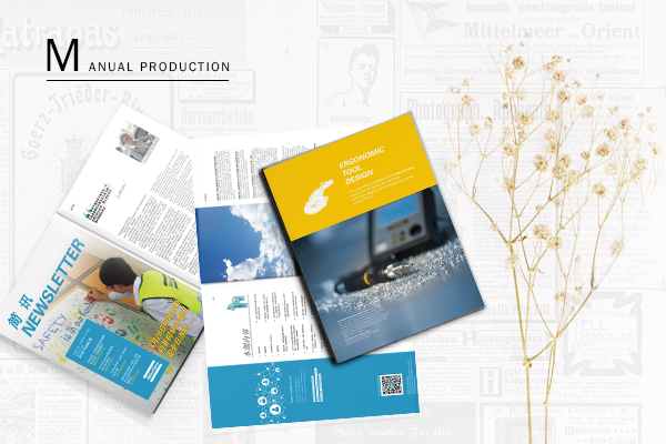
Although there are many kinds of brochures now, most of them are illustrated and written, because this form is more acceptable to the public. Since it is both pictures and texts, pictures occupy a very important position, must meet certain requirements. Today, let's learn what the brochure print image should meet.
Brochure printed pictures - high pixels and clear themes
After all, brochures are intended for customers and even more people to see and represent the company's image. Therefore, when adding pictures, pay attention to whether the pixels of the pictures are high. Only pictures whose pixels reach or exceed 300 DPI can have sufficient clarity during printing. To be able to see clearly. At the same time, when selecting pictures, do not choose the background too cluttered, no theme of the picture, otherwise people can not understand, also can not achieve the publicity effect naturally. When necessary, professional designers need to repair the film, the picture effect is optimal.
Printed pictures of brochures - the number of pictures should be reasonable
In a brochure, there must be more than one picture, but more than one. The number of pictures to choose should be determined according to the actual situation. But overall, print the brochure with the right amount of pictures. Too few pictures do not allow people to have a better understanding of the company's brand, image, culture, etc. But if there are too many pictures, it's not reasonable to make a deeper impression when reading.
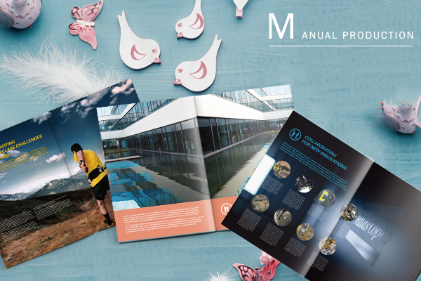
Print pictures of brochures - The positions and structures of the pictures should be designed reasonably.
When there are multiple images, the location of the images is also a key point. Properly arrange the pictures and copywriting. Place different pictures in the corresponding positions. Otherwise, the reading experience will be affected. And for the structure of the picture, can also adopt the creative design, the best form the effective layout, so that people can produce more intense visual feeling when reading.
Printed pictures of brochures - maintain sufficient authenticity
When printing a brochure, if you choose some exaggerated pictures for the sake of publicity effect, for example, seriously inconsistent with the physical product, even if you can catch people's eye in the first place, when you find that the pictures are inconsistent with the physical product, you will feel that you are being used by a routine, which is counterproductive. So it's also worth noting that the pictures selected in the brochure should still have a certain degree of authenticity, not too outrageous.
For anyPrinting of brochuresThe picture is all worth the effort. When selecting pictures, we must pay attention to the selection of high-quality, certain authenticity of pictures, to highlight the theme. At the same time, the number of pictures should be selected rationally. After the selection, the position and structure of the pictures should be designed so as to produce a more sophisticated brochure.
Recommended Reading:
Design Case of Industrial Supplies Promotion Album in Zhenkun's Electric Power Industry
Piab Automotive Industry Enterprise Application Brochure Design Case
Advantech Smart Healthcare Solution Brochure Design Case
The Case of Design of Industrial Supplies in the Coal Industry of Zhenkunxing

