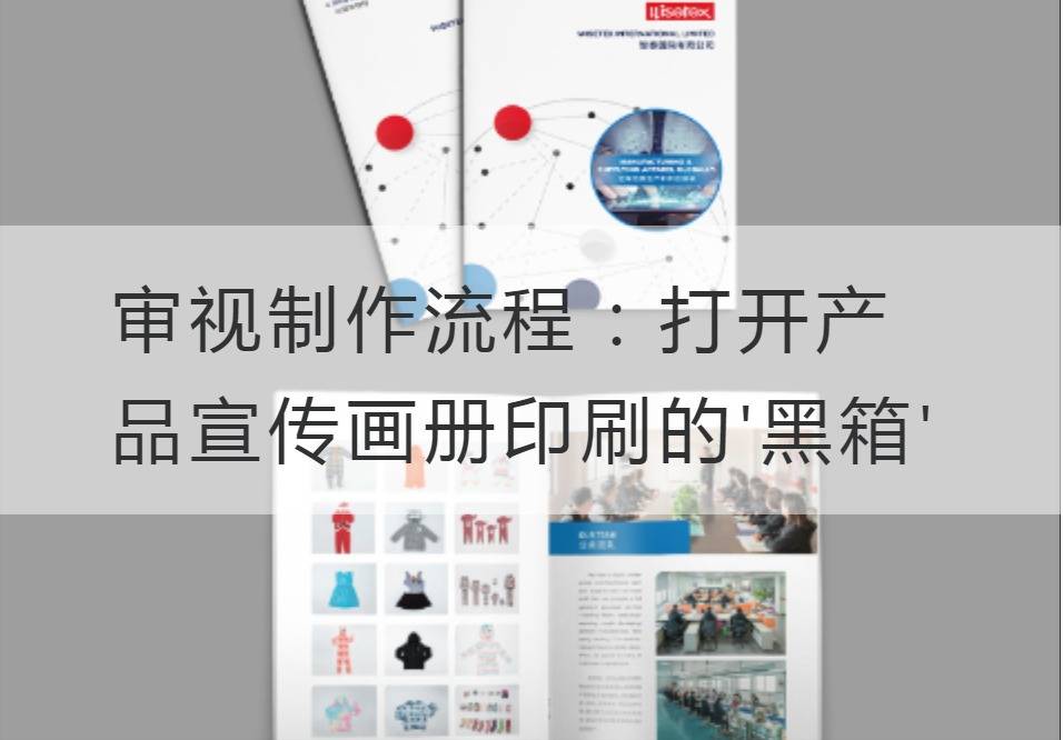
Review the production process: Open the'black box' printed in the product brochure
No one can deny the importance of brochures in product promotion. With its unique design and superb print quality, a beautiful album can attract the attention of potential customers and stimulate their desire to buy. However, behind this seemingly simple process lies what we call a "black box" production process. Let's unravel this "black box" together, peek inside the mystery.
First, let's talk about the design phase. Designers are the soul of the production process, and their creativity and skill will determine the quality and effect of the final album. They use a variety of design software and techniques to consider product positioning, target audience, and brand image. Color collocation, layout design and typographical style are all subject to repeated consideration and optimization. As the Tang poet Wang Zhihuan wrote: "Up the Stork Tower/During the day, the Yellow River flows into the sea. "Designers need to look at the whole picture like a stairway, capture the highlights of the product, and display it in an album to make the customer want to stop.

Next, we turn to the printing stage. Printing is an indispensable part of the production of albums. Only through fine printing can the designer's creativity be presented perfectly. Technical terms such as "CMYK Color Mode", "Preparation to Print", "Linear Correction", etc. are frequently used during this process. The CMYK color mode ensures that the album truly reproduces the colors the designer wants to express, while print preparation and linear correction ensure the quality and accuracy of the final print. As Du Mu once said: "The world is humiliated, and it hurts itself. "It is only through a professional printing process that albums stand out and shake people's hearts.
The dark scenes, however, are never far away. Since ancient times, in order to gain an advantage in the competition, merchants often take some illegitimate means. The printing industry is no exception, with some unqualified printers cramming defective albums to customers, claiming that the quality is perfect. Such a scam brings to mind Du Fu's famous line: "The thief never steals the price, but stands on the golden platform. "These irresponsible printers, seeking only temporary gain, ended up at their own expense, losing their reputation and the trust of their customers.
Therefore, as customers, we need to review the production process to ensure that the albums we get really meet expectations and are of good quality. We can learn about the process of making the album by visiting the printing plant, checking the printing process and the suitability of the materials. At the same time, maintain close communication and collaboration with partners to ensure seamless connection between design and printing to minimize errors.
In this digital age, if we want to open the "black box" of album production, we need to examine it with sharp writing style and modern sense combined with the professional terms and technical parameters of related industries, and expose the complexity and opaqueness in it. At the same time, we should also introduce readers into this complex production process with infectious words and appropriate colloquial expressions. As Du Mu wrote in Autumn Evening: "The silver candle is cold in autumn, and the small fan is fluttering the fireflies. "It is only through our supervision that the light of the album can spread over the earth.
As we look at the production process, we find one fact: Album making is not a simple piecework and printing, but a sophisticated technique. Only through repeated deliberation and continuous innovation, can accurately express the uniqueness of the product. Only the joint efforts of designers and printing technicians who aspire to pursue excellence can make the album become a powerful weapon for product promotion.
Let's open this "black box" and look atProduct brochure printingEach step of the production process injects more care and professionalism into the birth of each album. Because only in this way can we create truly exciting works that make our products unique in the market.


