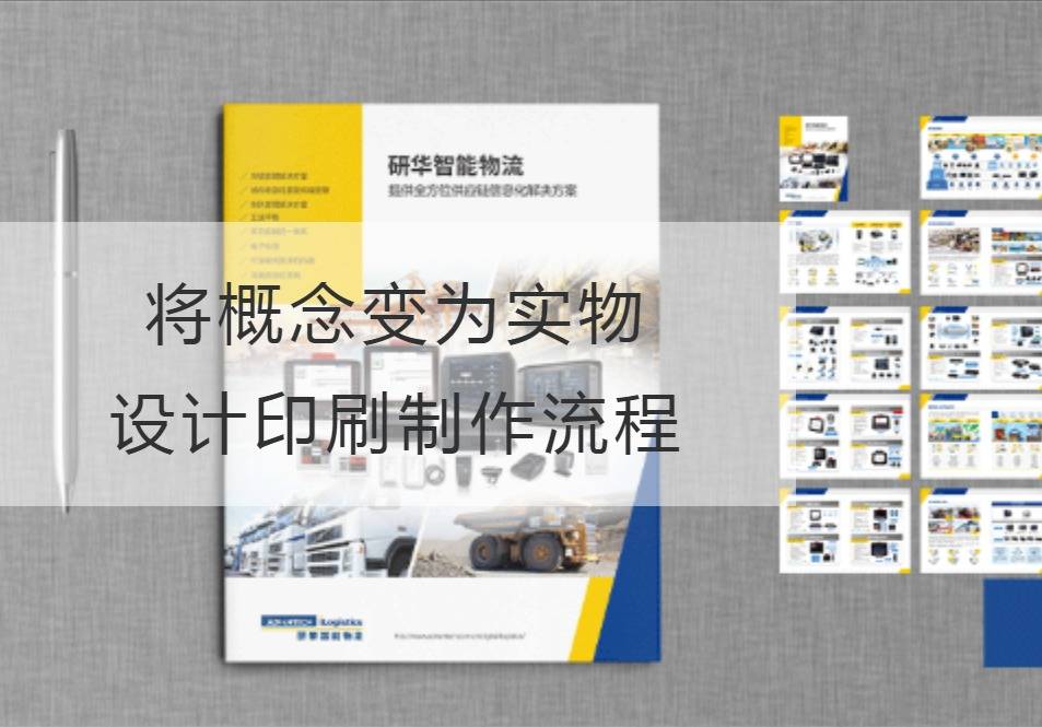
Transforming concepts into objects: Design, printing and production process
Design is a delicate and fun process that transforms ideas and ideas into objects. The printing process is one of the ways to make these designs objective. Whether traditional graphic design or modern digital design, all need to go through a series of steps to become the finished product. This article will introduce you to the relationship between design and print production and the production process.
First of all, design is a core link. Designers need to understand the needs and goals of their clients and turn them into visual representations through creativity and expertise. The choice of color, graphics, fonts and layouts are important considerations during the design process to ensure that the final piece effectively conveys the message and resonates with the audience. At this stage, designers use a variety of tools, from traditional paper-and-pencil sketches to modern design software, to help designers realize their concepts.

Once the designer has finished the design, the next step is the printing process. This step is the process of translating the design into the actual product. The first is the preparation, which includes selecting the right printing material, setting the design size and color pattern. The designer then needs to convert the design file into a format that the printer can handle, usually PDF or other common image file formats. This is to ensure accurate reproduction of the colour and detail of the final print.
Next comes pre-print production. This phase includes proofreading design documents and generating samples for review. This ensures that the final print is free of errors or distortions. At the same time, some special printing needs, such as bronzing, gravure printing and screen printing, also need to be dealt with at this stage. The purpose of this section is to ensure the accuracy of the design documents and to prepare for subsequent printing.
Then there's the printing and production process. This includes setting the printer's parameters, such as color, speed and pressure, to ensure optimal printing results. During the printing process, the designer is required to monitor the quality of the print to ensure that the print is consistent with the design document. After printing, post-processing, such as cutting, folding and binding, is required. The purpose of these steps is to turn the design into a physical object and make it available to the customer or target audience.
Finally, there is quality control and delivery at the later stage. Designers need to check the print carefully to make sure there are no errors or imperfections. If any problem is found, it needs to be corrected in time. Once the quality of the print is confirmed, the designer delivers it to the customer or target audience. This can be done by courier, e-mail or other appropriate means.
In summary, turning concepts into objects requires a design and print production process. Designers need to be creative and professional to translate concepts into design documents. The print production process requires steps such as preparation, pre-print production, printing and production processes, and post-quality control and delivery. Through these steps, we can transform the design into a tangible product that achieves our goals and communicates the message. Whether it's graphic design or digital design, design and printing are essential steps.Design, printing and productionThey are closely related to each other and work together to promote good visual communication.
Recommended Reading:


