

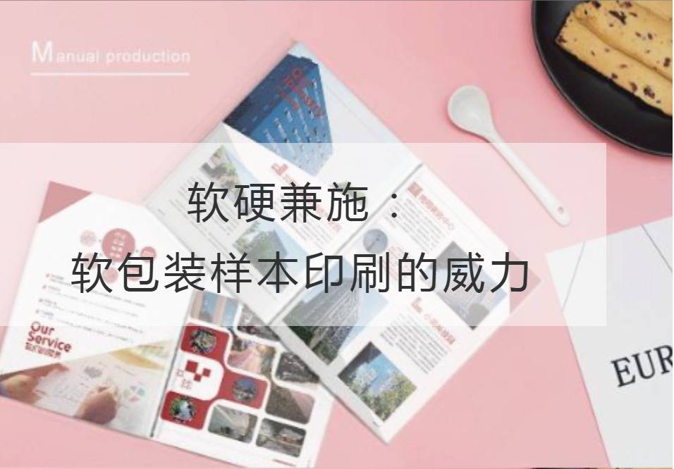
Both soft and hard: The Power of Flexible Packaging Sample Printing
In recent years, flexible package sample printing has shown its unique charm different from traditional hard package printing in the fast-developing printing industry. The flexible packaging sample printing has attracted the attention of many manufacturers because of its excellent flexibility and wide development prospect. Both in texture and function, the printing of flexible packaging samples brings infinite possibilities for advertising, product packaging and brand promotion.
One of the primary advantages of flexible packaging sample printing is its superior visual effect. With the synergistic effect of printing technology, flexible packaging sample printing can present fine texture, rich color and stereoscopic feeling, which makes the product stand out in the fierce competition market. Whether in food, cosmetics or electronic products, flexible packaging sample printing can attract consumers' attention to products through delicate patterns and dazzling colors, and then stimulate their desire to buy.
In addition to the visual seduction, flexible packaging sample printing also has excellent functionality. The flexible packaging sample printing can ensure the quality of the product, at the same time, take into account the convenience and environmental protection requirements. With the increasing importance of environmental protection and sustainable development, soft packaging sample printing has replaced the heavyness and waste of traditional hard packaging with its softness and lightness. In addition, the high-grade materials and craftsmanship used to print flexible packaging samples effectively maintain the freshness and longevity of the product, giving consumers confidence in the purchase process.
Both soft and hard can be completed. The power of flexible packaging sample printing lies not only in its unique appearance and function, but also in its complement and complement each other with hard packaging printing. Traditional hard packaging printing, with its stability and firmness, endows the product with the function of protecting and transmitting information; And flexible packaging sample printing uses its increasing innovation, endows the product with unique design and image sense. Both soft and hard, so that the product in the market grasps the greater initiative, achieves the overall promotion of the brand.
The rise of flexible packaging sample printing is inseparable from the technological innovation of printing industry and the promotion of market demand. With the development of digital printing, digital printing and post-press processing, the quality and efficiency of flexible packaging sample printing have been improved significantly. At the same time, with the increasing demand of consumers for personalized and differentiated products, the customized solution provided by flexible packaging sample printing is meeting the trend of the market.
The author quotes Li Qingzhao's poem, "Longyang County Qingcao Lake." The gentle and soft "green grass lake" in the verse is implicitly combined with the flexible characteristic of soft package sample printing. Through the combination of elegant poetry and printing technology, it seems to bring us into a vast lake, in which all kinds of soft package samples dance in the breeze. The soft packaging sample printing is as quiet and beautiful as the grass lake, and the soft texture is like the ripples of water, giving a light and pleasant feeling.
All in all, flexible packagingSample printingWith its excellent visual effects, excellent functionality and combined application with hard packaging printing, it shows its power. As a forward-looking printing technology, flexible packaging sample printing plays an important role in advertising, product packaging and brand promotion. In the future, with the continuous development of technology, we have reason to believe that flexible packaging sample printing will maintain its dazzling light in the printing industry, creating a more colorful consumer experience for us.
Recommended Reading:
Brochure Printing: Secrets to Efficiently Transform Customers
Creating a New Era of Album Printing: Technological Breakthrough and Innovative Design
Interpretation of the Multiple Charm of Publicity Album Printing from a Professional Perspective
Cross-border thinking: Integrate brochure printing into industry marketing

