

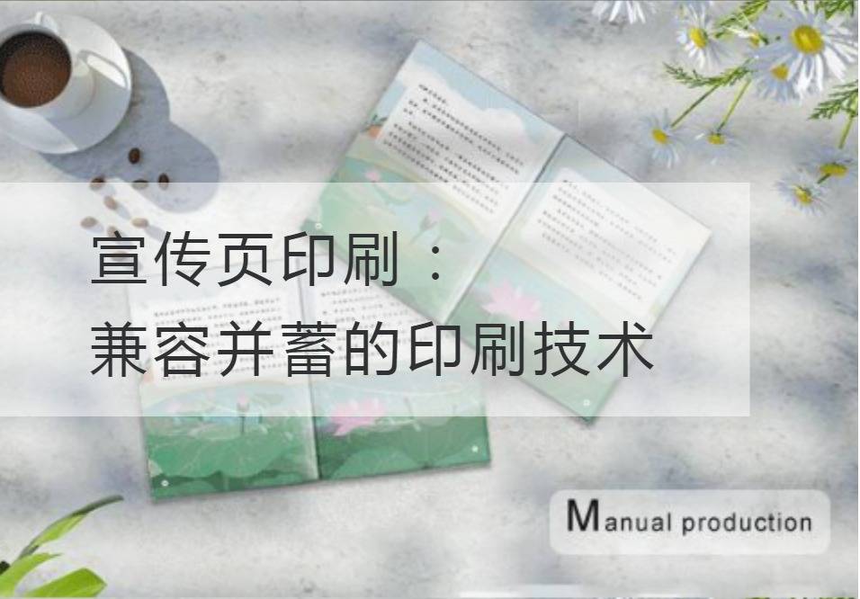
Printing of the leaflet: Inclusive printing technology
Today, in the era of information explosion, every enterprise is eager to show its brand to the world through the promotional page. And the continuous progress of publicity page printing technology is the key to create a gorgeous publicity page for enterprises. All-inclusive printing technology not only meets the enterprise's pursuit of fine print, but also keeps pace with the times and keeps up with the pace of science and technology.
Printing of promotional pages has long since ceased to be that monotonous, bland way of printing. Nowadays, printing technology has broken through the traditional shackles and embraced the tide of modern science and technology. Today, we can not only use traditional smooth, matte, glossy paper types, but also select more special textures, foils and cold perms for a richer variety of printing results.
And in the inclusive printing technology, the digital printing technology in the propaganda page printing application can not be ignored. The speciality of digital printing technology is that it does not require plate making and can be printed directly. The use of this technology makes small-batch printing more affordable and also offers a wide variety of design options for leaflet printing. Moreover, digital printing can also realize personalized printing. Only one digital printing machine can be used to design the personalized printing scheme according to the customer's demand, which is more in line with the demand of the market.
At the same time, interactive printing technology has added to the appeal of leaflet printing. While traditional printing is presented statically to the reader, interactive printing allows the reader to participate more interactively. Using special responsive materials and sensing technology, readers can interact with print by touching, shaking, scanning, and more. The application of this technology greatly enriches the form of publicity page, and makes readers feel the fun of interaction while getting information, and is more easily attracted by printed matter.
Of course, there is also a factor that cannot be ignored in the printing of promotional pages, and that is environmental protection. With the increasing importance of environmental protection, the demand for environmental protection printing is increasing. Nowadays, the technology of environmentally friendly printing has also made great strides. The use of environmentally friendly inks, paper and printing materials can not only reduce the impact on the environment during the printing process, but also ensure the quality and effect of the printed matter.
As the poet said: "Once I leaned on the verandah, and left the green lamp faint. With its sharp style of writing and gorgeous words, the printing technology of the propaganda page is based on professional terms and technical parameters, and aims to create an all-inclusive printing technology. Through the combination of traditional and modern artistic expression forms, meet the market demand and achieve the promotion of brand image.
Anyway,Printing of the leafletTechnology is an important tool for enterprises to display brand and spread value. The ever-developing and all-inclusive printing technology provides more choices and possibilities for all kinds of enterprises. In the future, we can look forward to more innovative printing technology applications, more diverse leaflets to the public. Let's embrace all-inclusive printing technology and create more beautiful, contemporary leaflets to open a new chapter in brand communication.
Recommended Reading:
Beauty is in the details: How to create exquisite design prints
Design printing and user experience: Make consumers fall in love with your products
Design and printing breakthrough: How to stand out in a competitive market
The beauty of design and printing: Uncover the creativity of designers

