

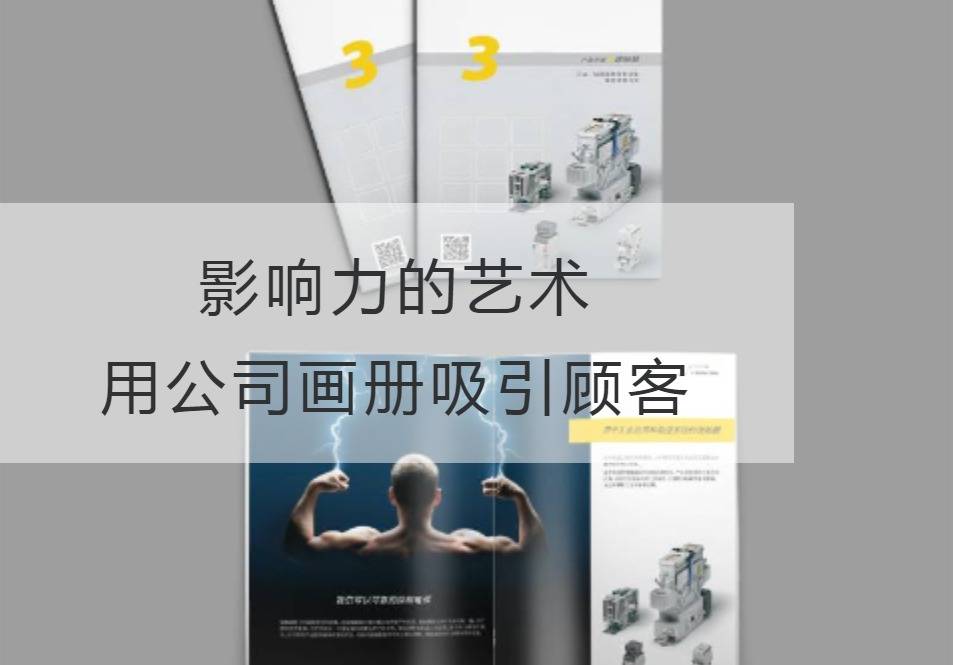
The Art of Influence: Engage customers with company albums
In today's fiercely competitive business world, how to highlight their unique advantages and attract more customers has become the goal of enterprises scrambling to pursue. And a beautiful company picture album, is undoubtedly the best carrier to show the strength of the enterprise, enhance the influence. Let me take you on this influential artistic journey and reveal the secrets of it.
A great corporate album is like a fascinating piece of art, capable of piqueting the interest and emotional resonance of potential customers through masterful design, in-depth unique content, and just the right amount of visual communication. In order to achieve this effect, we must make full use of professional terminology and technical parameters to demonstrate the strength of the enterprise, so that customers can see.
First, design is the key to successfully engaging customers. A great corporate album must have a modern feel and a sharp writing style to multiply its appeal. Through the ingenious layout design, the use of color and text typesetting, we can show the enterprise's core competitiveness image in the picture album. From the choice of colors to the use of fonts, every detail can reveal the company's brand image and company culture, thereby winning the favor of potential customers.
Second, the content appeals to the customer's feelings. A good company picture book should be more than a catalogue of products and services, it should be an engaging storybook. Through the narrative way, we can integrate products and services into customers' daily lives, so that customers can truly feel the use and advantages of products and services. Only when the customer is infected by the picture book, touched by emotion, they will subconsciously look to our business, express the desire to buy.
In addition, the application of technical parameters is also an important link. Especially in the picture book of technology-based companies, potential customers are more concerned about the performance of their products or services. Therefore, the technical parameters in the album should clearly show the characteristics and advantages of the products. Through the use of charts, data and images, we can draw customers' attention by giving them a clear view of what makes our products different.
To sum up, an excellent company album is not only a simple promotional material, but also a powerful weapon for our company to enhance its brand influence. Through the exquisite design, the emotional resonance with customers and the appropriate presentation of technical parameters, we can stand out in the fierce business competition and attract more customers. As Du Fu said: "Listen to thunder in silence", a beautiful company album will serve as a bridge between us and potential customers, ignite creative sparks, and convey strength and potential.
Influential art requires precise design, infectious content and the right use of technical parameters to enableCompany Picture BookAttract customers and increase corporate influence. It's a challenge to be reckoned with and requires designers and marketers to work together. On the way of pursuing influence, combining art with practicality and showing the unique charm of the enterprise is the true way of success. Let's work hand in hand to create an artistic journey that belongs to our influence in the company's album.
Recommended Reading:
Work miracles: An extraordinary way to carve the design of a newly registered company brochure
Design craze: Detonate the passion energy of furniture company brochure design

