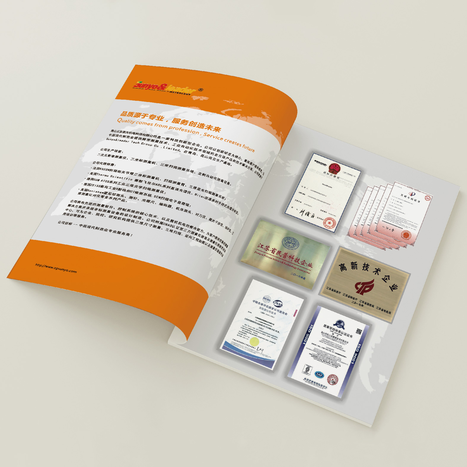
Presenting an industrial album design case of automatic measurement equipment, the orange and white color scheme enhances the sense of technology, and includes diagrams of equipment parameters and actual application scenarios.
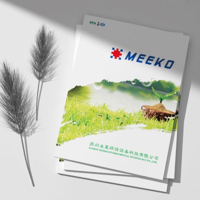
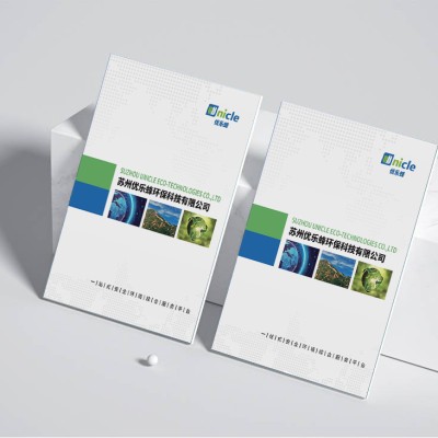
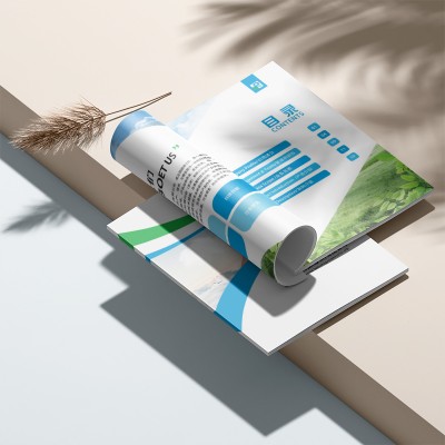
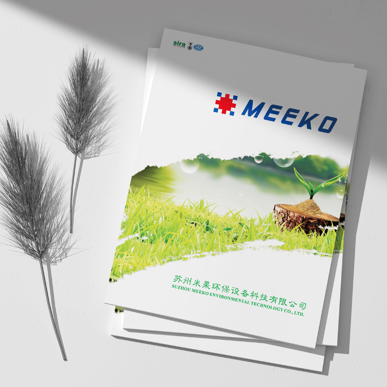
It showcases the design of an industrial album incorporating ecological elements, using natural symbols and environmentally friendly color schemes to interpret the concept of sustainable development.
Share the visual deconstruction design of industrial technology albums: dynamic interpretation of process blueprints × three-dimensional cross-section visual effects system, application of parameter visualization moving lines and mechanical noise reduction white space method, and a new narrative field for architecture technology display.
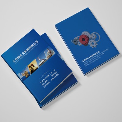
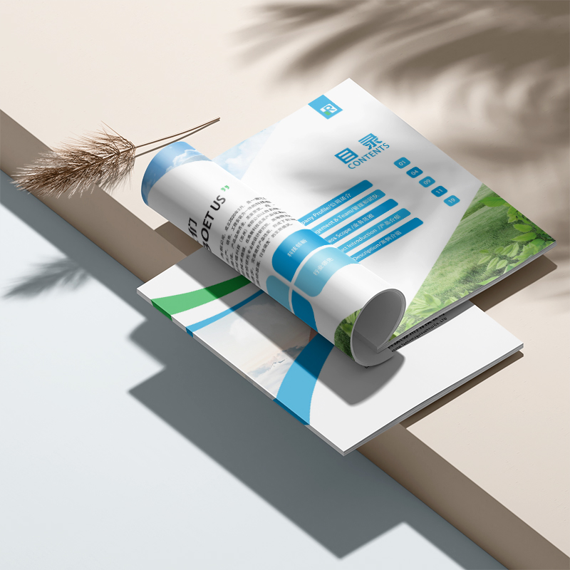
This album of industrial enterprises showcases the charm and potential of industrial automation. It is professionally laid out with a blue color, supplemented by grey and white, creating a calm and dynamic atmosphere and accurately showing the depth and foresight of industrial enterprises. The opening chapter features the theme of "industrial automation" with iconic circular icons that quickly capture the reader's attention and lead them into an efficient and intelligent industrial world. Then, through "Industrial Automation Equipment", "Industrial Automation System" and "Industrial Automation Service", the paper systematically introduces the core competence and business scope of the enterprise, and shows its application in industrial automation.
The design of this industrial enterprise album, with a simple and refined style, shows the enterprise's technical strength and product charm comprehensively. Every detail from the "company profile" to the product introduction is carefully laid out to convey the professional and rigorousness of the enterprise. In the picture album, vivid pictures of factories and trucks directly show the advanced production environment and efficient transportation capacity of the enterprise, highlighting the strong strength and rich background of the enterprise. The industrial narrative is reconstructed through the breakthrough aesthetic language, and the cold mechanical equipment is transformed into a vibrant visual symphony. The design of the album is ingenious, not only in the overall visual presentation, but also in the preciseness of the product features.
Case of Deep Disassembly Industrial Technology Album Design: 10 parametric data visualization design. Includes 18 industrial-grade planar solutions such as mechanical drawings, dynamic thermodynamic data diagrams, contour hydrodynamic diagrams, and ISO standard paper parameters and tear resistance indicators (≥ 50 N) professional evaluation.
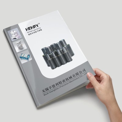
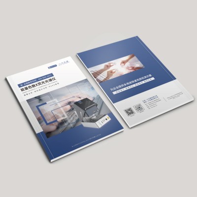
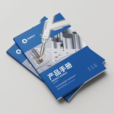
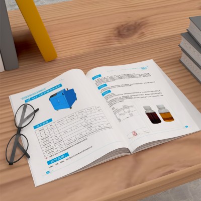
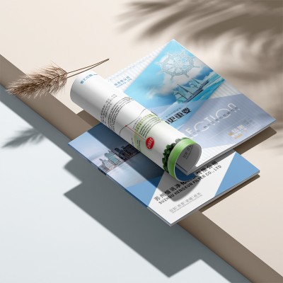
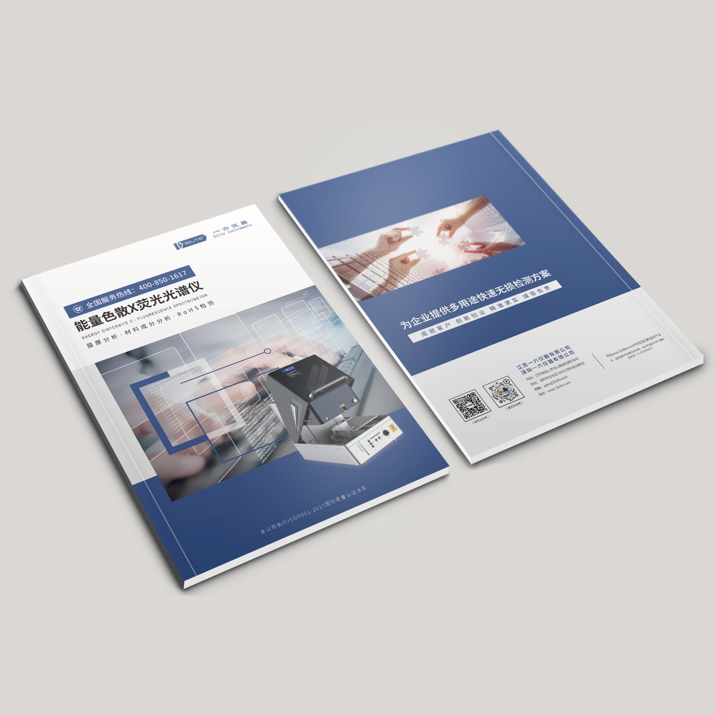
Display the professional industrial manual design of blue and white colors, highlight product performance and application scenarios, and match it with high-definition mechanical photography to strengthen the professional image of the brand.
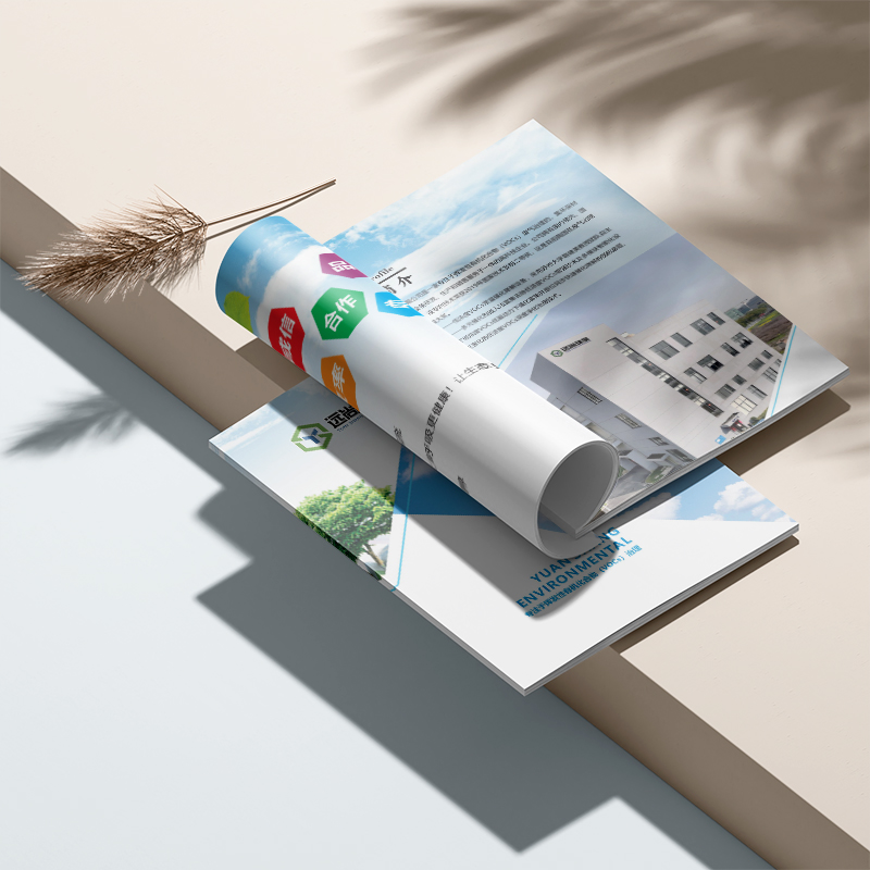
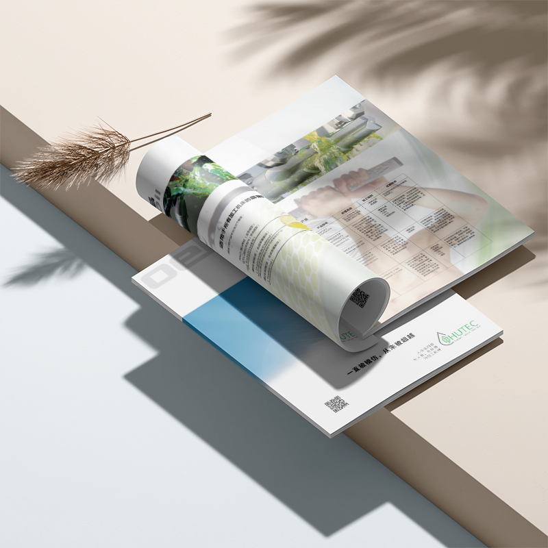
The album adopts a loose-leaf carbon account book structure in the layout design, allowing complicated carbon emission data to be presented through the touch of physical carriers, arousing readers' tactile resonance. The inner page uses handmade fine-grained textured paper to simulate the growth trajectory of forest rings, further enhancing the immersion of natural ecology. What's even more outstanding is that they use photochromic ink technology to gradually develop the original gray industrial park map into an alternative path of green and clean energy under ultraviolet irradiation. This innovative visual expression of abstract concepts greatly improves the information transmission effect of picture albums. In terms of content layout, from "table of contents" to "introduction", and then to
The design focuses on carbon emission tracking and renewable energy alternative paths, and transforms abstract data indicators into perceptible dynamic images through cutting-edge visual communication techniques. The cover adopts a loose-leaf carbon book structure, and the inner page incorporates a hand-made textured paper to simulate the growth of forest rings, creating a natural ecological immersion with touch. What's even more amazing is that they use photochromic printing to gradually develop the gray industrial park map under ultraviolet radiation into a green, clean energy alternative. This innovative technique greatly enhances the visual impact. Various VOCs Monitoring Equipments and Their Functions
The cover adopts a loose-leaf carbon account book structure, and the plug-in recycled PETG module corresponds to different service scenarios (folding resistance reaches ISO 9775 standard). The inner page is implanted with hand-made fine-grained texture paper, and 28 raised fibers per square centimeter simulate the growth trajectory of forest annual rings, which is in line with the core technology of carbon sink development. The abstract annual carbon reduction of 68,000 tons was converted into a dynamic heat map, and a photochromic ink hybrid printing process was adopted. When ultraviolet rays illuminate the page, the original gray industrial park map will gradually develop an alternative path to green and clean energy. This patented technology has effectively increased the inquiry rate of overseas customers. The whole manual uses FSC certified grass
The visual style of the whole album adopts sky blue and fresh green, creating a visual tone of environmental protection and science and technology. In addition, the designer skillfully used a large number of natural elements, such as globes and trees, which further strengthened the brand positioning of "eco-environmental protection" of enterprises. It is worth mentioning that in detail processing, the designer also used visual techniques such as gradients and geometric lines to make the overall vision more dynamic and modern. This creative visual system can not only attract the attention of target customers, but also effectively convey the professional image of the enterprise. In terms of information arrangement, the album adopts &
The album adopts the double main color system of environmentally friendly gray, technology and blue, forming a professional and futuristic color language. Parametric design elements are applied on 72% of the pages to transform the molecular structure in the sewage treatment process into unique visual symbols, which not only breaks through the stereotype of traditional environmental protection design, but also establishes a unique brand memory point. Innovative introduction of "three-step progressive" content architecture: technical highlights use three-dimensional anatomical diagrams to present process principles (accounting for 35% of the page), service cases use timeline comparison to show governance effects (accounting for 20%), and qualification certificates use dynamic charts to reflect technology
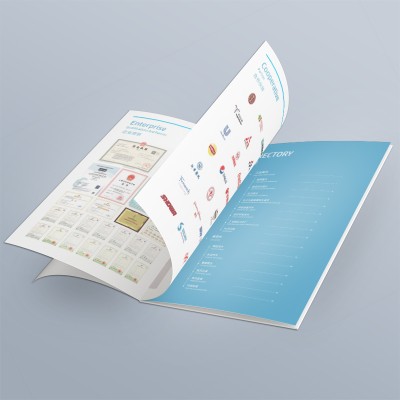
This album uses natural scenery pictures to create a friendly and environmentally friendly brand image. The inner page design is divided into multiple modules, which use a concise and clear information architecture to gradually present key elements such as enterprise profile, product services, and management team. It is worth noting that the album has made great efforts in visual language. On the one hand, a large number of natural colors such as green and blue are used, combined with many vegetation elements, to create an environmental protection theme; On the other hand, the bold application of modern design techniques such as gradient and geometric lines makes the overall vision full of dynamics and layers. This design style is a good interpretation of the brand's "technology ecology
When you open this 28-page album, you will be immediately shocked by its unique concept of "touchable environmental protection". The cover is made of recycled environmentally friendly paper with plant fiber texture, which feels rough but reassuring. This tactile design cleverly echoes the environmentally friendly technical characteristics of the enterprise. The designer innovatively adopts the "four-dimensional narrative" structure: the visualization chart of environmental pain points accounts for 20% of the layout, the schematic diagram of solution technology accounts for 45%, the visualization of measured data accounts for 20%, and the blank space reaches 15%. Among them, the most distinctive dynamic comparison chart of waste liquid treatment,
A change to the traditional A4 vertical version design, using 210mm×280mm matt film cover. The main vision uses circuit diagram elements to reconstruct the structure of the vane pump. The indigo blue background and starlight gradient process not only retains the hard core character of industrial equipment, but also breaks through the heavy feeling that is common in the industry. This layout allows more room for technical parameters to be displayed on the unfolded page, and the hydrodynamic data is presented in contour diagrams, improving the reading experience by 40%. Recycled pulp mixing process was introduced in the printing process. The paper contains 30% agricultural straw fiber. Local application of silver ion ink printing equipment cross-section, contact friction to release antimicrobial components, this function
The album uses "technical green" as the main color, and boldly uses 3D modeling to display the equipment structure. The main visual page highlights the heat exchange module through a special-shaped UV process, allowing technical parameters to be converted into a visible temperature field map. This design method not only avoids the stiffness of traditional mechanical equipment, but also skillfully conveys the product advantage of "increasing thermal energy recovery efficiency by 35%". What is worth paying attention to is the innovation of its post-press link, using soybean ink printing and bamboo fiber paper, which conforms to the green positioning of Internet of Things equipment companies. Special design
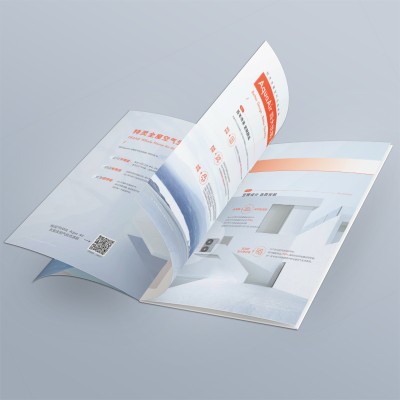
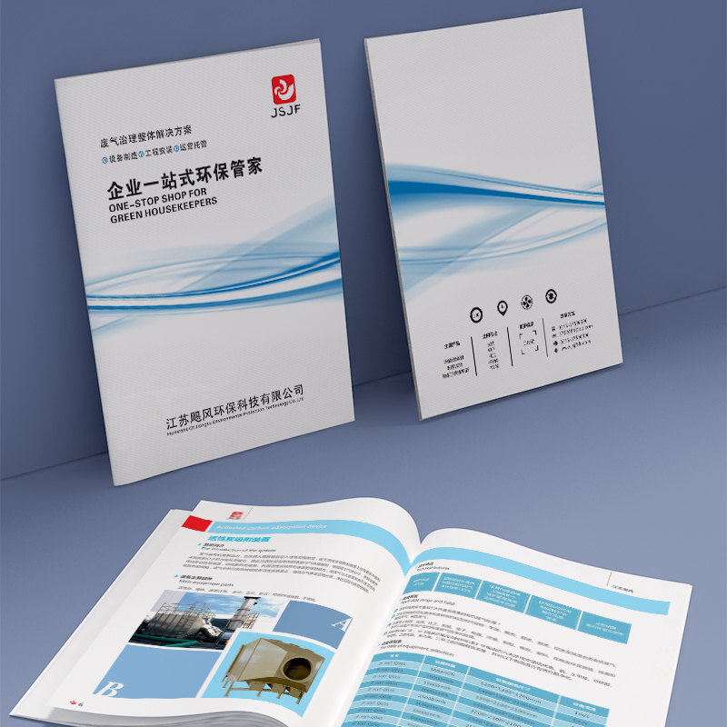
From the perspective of overall visual design, this brochure mainly uses blue tones with smooth and atmospheric geometric elements to create a cutting-edge, environmentally friendly and efficient brand atmosphere. Various product information and process flow are arranged in an orderly manner, making key information more clear and clear. At the same time, the high-quality printing materials and processes used also infuse the overall visual effect with a special sense of professionalism. This design strategy, which combines cutting-edge visual language with high-quality manufacturing techniques, can undoubtedly better highlight the brand value of the enterprise. In terms of content planning, this album provides a comprehensive overview of the company's efforts in the field of environmentally friendly industrial filtration equipment.
From the overall visual design point of view, this brochure mainly uses blue tones with smooth and atmospheric geometric elements to create a cutting-edge technology, environmental protection and energy-saving brand atmosphere. Various product information and technical parameter comparison tables are arranged in an orderly manner, making information communication more clear and easy to understand. At the same time, the high-quality printing materials and processes are used to infuse the overall visual feel with a superior sense of professionalism. This design strategy, which combines cutting-edge visual language with high-quality manufacturing techniques, will undoubtedly better demonstrate the brand value of the company. In terms of content planning, this album shows the company's core in the field of environmentally friendly industrial equipment.


