The design of this product manual skillfully integrates product characteristics and aesthetic concepts, with black, blue, gray and silver as the main colors, showing a high-end and professional brand style. The cover design is simple and elegant, and the brand name and logo are eye-catching, leading readers to explore products. The internal layout of the album is clear. Through intuitive product diagrams and working principle diagrams, combined with refined text descriptions, people can easily understand product features and operation steps. The illustrated display method makes the manual not only a carrier of information, but also a beautiful work of art.
Explore the mysteries of the intelligent control world, starting with this carefully designed control system product manual. The cover is based on deep blue, and the white text leaps on the paper, which is simple and solemn. The layout of the inner pages is well proportioned, with pictures and texts, simplifying the complex installation and operation processes. From the quick installation guide to the operation manual, every detail shows ingenuity, which not only conveys the information comprehensively, but also adds interest to reading. Whether it is technical specifications or safety information, it is readily available to ensure worry-free operation. This is not only a technical guide, but also a dual enjoyment of vision and soul.
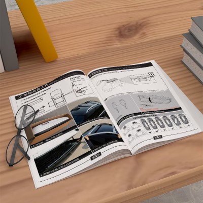
The design of this product manual album is mainly black and white, and the cover design is simple and impactful. The sharp contrast between black and white highlights the perfect fusion of Japanese sophistication and modern simplicity. The internal layout of the album is clear and the information layers are distinct, so that readers can easily obtain the required information. The product information area on the left is detailed and accurate, just like the ID card of the product; The operation guide area in the middle is illustrated and illustrated to guide users to understand the product in depth; The safety warning area on the right always reminds users to pay attention to safety, and the design is thoughtful.
With a touch of fresh blue as the keynote, the product manual design not only shows the depth of science and technology, but also incorporates the warmth of life. The cover is concise and powerful, the layout of the inner pages is clear, the circuit diagram on the left smoothly shows the internal logic of the product, the text in the middle introduces the product eloquently, and the specification sheet on the right strictly presents the performance parameters. The overall design is both professional and easy to read
Blue and orange gradient stripes are used to divide the functional areas, and the actual product shots and three-dimensional schematic diagrams are displayed correspondingly. QR code association video guide, precautions Use red and yellow collision color blocks to strengthen memory.
It adopts blue-gray technology color system with orange highlight prompts, and compares the parameter chart with the operation diagram on the left and right side. The core functional area uses color block focus, and the installation steps are guided step by step through the encoding system.
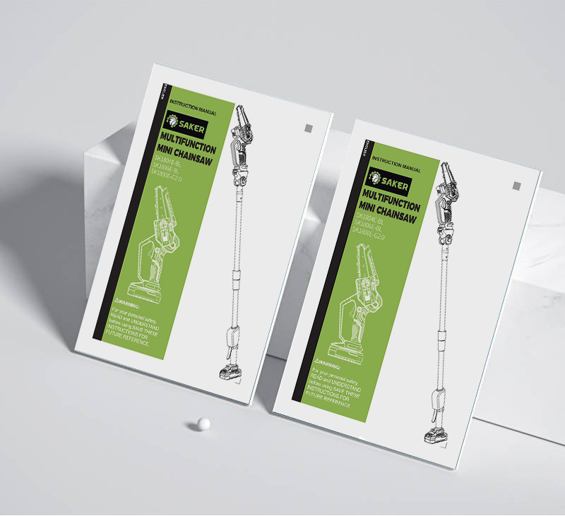
The refreshing color scheme of green and white is adopted to reduce reading fatigue, and the full view of the equipment and the exploded view are displayed in contrast. Chapter icon navigation improves consulting efficiency, and key control points are equipped with dynamic arrows to guide action paths.
Use blue and white contrasting colors to build a clean interface, and use red emphasis boxes for key information modules. Charts and charts are arranged according to the golden ratio, and the rapid positioning of multi-layer information is realized through ICON annotation system.
It presents scientific and technological texture with a cobalt blue tone, and integrates the structural explosion view and parameter comparison table. The core functions enhance guidance through step-by-step flow diagrams, warning sign systems and red and black contrasting colors.
The case uses platinum color scheme to highlight the international texture, and integrates chart annotations and three-dimensional disassembly drawings. The key data are distinguished by color blocks, and the bilingual layout design is combined to realize the visual transmission of complex information.
The manual adopts the main color of deep sea blue combined with real-life application illustrations, and integrates a 12-specification parameter comparison table and a three-dimensional anatomical view. The key operation steps are guided by color gamut layering and icons, and are matched with four language comparison instructions to meet the needs of global use.
The English version of the case uses vitality yellow to enhance the movement characteristics, and uses three-dimensional explosion diagram with serial number annotation to visually show the component structure. The gear parameter comparison table and installation calibration diagram are integrated, and the functional modules are distinguished by color levels to realize the visual presentation of technical documents.
The English version of the tool manual adopts the fresh green main tone to enhance the sense of professional protection, and the 7 major operation steps are combined with the component decomposition diagram to form a knowledge matrix. Modular typesetting integrates safety identification system and accessory parameter comparison table, and realizes hierarchical information retrieval through color block coding.
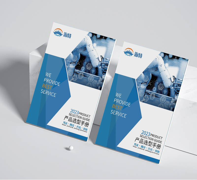
The case uses the main tone of blue and white to establish a refreshing visual hierarchy, and realizes quick navigation through the HPC/IOT technology module icon. Use infographics and data visualization to display product parameters, and analyze technical solutions with real-life equipment images to create a professional and easy-to-read technology product selection guide.
The case uses blue-green contrast color matching to establish a sense of order in technical documents, and constructs a systematic explanation process through twelve sets of standard function icons. Using the dual interpretation method of parameter comparison histogram and situational application flow chart, the design includes detailed explanation of equipment operation and functional level architecture diagram, which is suitable for the production of high-end technology product catalogs.
The case uses the main color of blue-green gradient with a white background to clearly present the technical parameters of the equipment. Integrate core data comparison tables of eight categories of products, implant operating status diagrams and maintenance periodic tables, and design includes multi-angle product displays and parameter visualization charts, which are suitable for industrial equipment catalogs and technical guides.
The case adopts a three-color combination of brown, gray and orange to display the industrial equipment selection guide. The core parameters of Smartbus and R series are clearly marked, equipped with schematic diagrams of eight sets of equipment combination solutions, embedded parameter comparison tables and module disassembly diagrams, and are suitable for equipment selection catalogs and industrial equipment procurement guidelines.
The case adopts the high-end color scheme of dark blue and champagne gold, highlighting the professionalism of medical equipment. It completely displays the technical parameters and non-invasive treatment advantages of the magnetic wave therapy instrument. It is implanted with five international certification marks and six sets of treatment effect comparison charts. It is equipped with step-by-step instructions on the operation process. It is suitable for medical device product manuals and clinical promotion materials.


