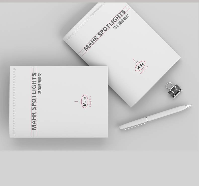
Company album typesetting design, title, text, with what font, how many fonts?
Company Album Typesetting Design Guide
I. Title Design
The title is an important part in the design of an album. It can attract the reader's attention and guide the reader to read the text. When designing the title, we should consider the company's brand image and target audience, while paying attention to the visual effect and readability of the title. Here are some suggestions:
Font selection: Different fonts can be selected based on the company's brand image and target audience. Generally speaking, simple, modern fonts are more suitable for companies in industries such as technology, fashion and innovation, while traditional, elegant fonts are more suitable for companies in industries such as traditional, high-end and luxury. In the font typesetting, we can use bold, slant effects, increase the visual impact of the title.
Font size: The title size should be larger than the text size, typically between 18 and 28 pounds. If the title is in an important position on the page, you can increase the font size as appropriate. Titles should be placed in the top half of the album or in the middle of the page to capture the reader's attention.
II. Text Design
The text is an important part of the album design, which needs to convey information clearly and concisely, while paying attention to the readability and beauty of the text. Here are some suggestions:
Font selection: The font of the text should be different from the font of the title. You can choose some easy-to-read fonts, such as Microsoft Yahei and Song Ti. If the company does not purchase the corresponding copyright fonts, you can use some free commercial fonts, such as Siyuan fonts. These fonts may be slightly inferior to copyrighted fonts in terms of visual effect, but they meet basic typographical needs.
Text spacing and line spacing: Word spacing and line spacing should be appropriate for the reader to read easily. If the text is too long, you can use bold key sentences or set different colors and font sizes to distinguish them. At the same time, care should be taken not to appear overcrowded or empty situation, to avoid affecting the visual effect and readability.
Paragraph Format: Paragraph formatting should be consistent so that readers can quickly navigate through the text. Typesetting can be done by indenting the first line, and paying attention to the spacing and length of paragraphs to avoid overcrowding or empty spaces.

III. Other Precautions
In addition to the title and body, there are some other things to note.:
Color Matching: Color matching should be in line with the company's brand image and target audience, while paying attention to the visual and psychological effects of color. You can use some warm or cool colors to create a different atmosphere and emotion.
Matching between pictures and text: Pictures and text should work together to convey information and enhance the visual effect. Pictures should be clear, concise, and representative. Pay attention to the size and position of the picture to avoid affecting the readability and visual effect of the text.
Margins and header and footer: The margins and headers and footers should be consistent to enhance the overallness and professionalism of the album. Margins should be moderate to avoid overcrowding or empty spaces. The header and footer should contain the company name, logo, and contact information so that readers can understand the company overview and contact information.
To sum up,Company Picture BookTypesetting design should pay attention to the title, text font selection, font size, text spacing and line spacing, color matching, picture and text matching, page margin and page header and footer, etc. When selecting fonts, consider the copyright of fonts. If the company does not purchase the corresponding copyrighted fonts, you can use some free commercial fonts to meet basic typographical requirements. At the same time, we should pay attention to the overall sense and professionalism of the album to convey the company's brand image and information.


