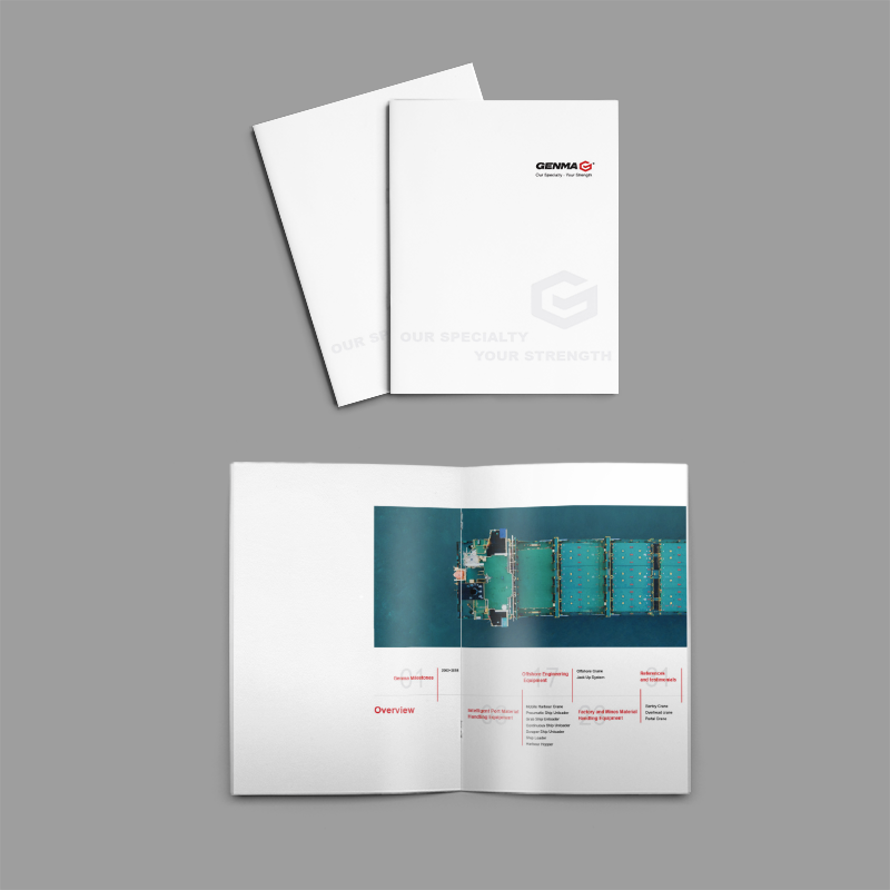
The printing process of the brochure design company: Selection and integration of printing colors and dots
Printing is an important link in the design of the publicity album. The selection and integration of printing color and dot directly affect the quality and effect of the album. As a promotional album design company, we need to know the printing color and dot knowledge, select the right printing process, improve the quality and effect of the album.
Print color refers to the color displayed on a printed matter.
Commonly used colors in printing are CMYK Quad and Pantone Spot. CMYK four colors refer to cyan, yellow, magenta and black colors, which can form hundreds of colors by superimposing in different proportions. Pantone Spot Color is a special color that gives the exact color the designer wants. When selecting the printing color, we need to select according to the design requirements of the album and the requirements of the printing process. If the album color is single, you can choose to use the Pantone spot color. If the album colors are complex, you can choose to use CMYK four colors. In the printing process, it is necessary to strictly control the accuracy of the printing color to avoid color distortion and affect the quality and effect of the album.

Dots are tiny dots on printed matter.
In printing, commonly used dots are AM and FM. AM dots are an equidistant lattice. The size of the dots remains unchanged, and the distance between the dots remains unchanged. FM dots are a variable-distance dot matrix. The size of the dots varies according to the color depth and the distance between the dots also varies. In the selection of outlets, we need to select according to the design requirements of the album and the requirements of the printing process. If the picture album requires obvious printing texture, you can choose to use AM dots; If you want a fine print, you can choose to use FM dots. In the printing process, attention should be paid to the dot size and distance control, avoid the appearance of too large or too small dots, affect the quality and effect of the album.
In printing color and dot selection and integration, the need to note the following points.:
1. Select appropriate printing colors and dots according to the design requirements of the album and the requirements of the printing process;
2. Control the accuracy of printing colors to avoid color distortion.
3. Control the size and distance of outlets to avoid too large or too small outlets;
4. Pay attention to the integration of colors and dots to ensure the balance and harmony of the picture.
In short, the selection and integration of printing colors and dots isPublicity album designWe need to carefully consider and prepare before printing. Only by selecting the right printing process, strictly controlling the quality of color and dot, can we create high-quality brochures that show the professional level and strength of our design company.
Recommended Reading:
Where to print brochures? How to choose a printing company?
The difference between brochure and album printing is very different.
What should I pay attention to when the smart brochure is supplied by the printer?
What do you need to do well in high-quality business brochure printing?


