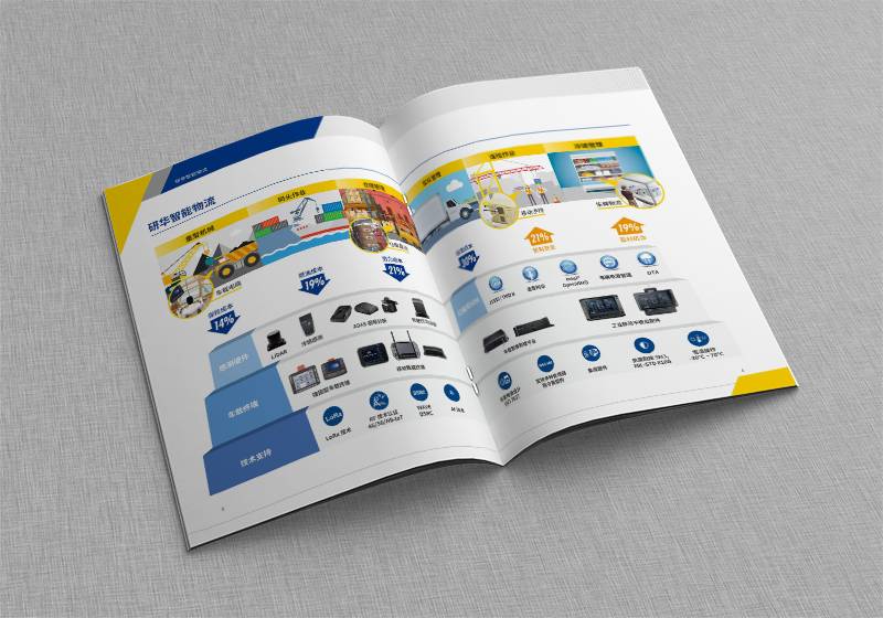
What fonts are usually used for PS album production?
PS album is a very important publicity tool, and the choice of font is very important. Different fonts can convey different feelings, which ultimately affect the actual effect of the album. So, what fonts are commonly used in PS album production?
For PS album production, sans-serif font is one of the common fonts. I'm sure a lot of people have heard of the term, and it can help the makers create a clean, clear design style. Especially for designers who want to be simple but have too many fancy fonts, sans-serif not only meets their needs, but also improves the readability of the album. In fact, if you've ever encountered a situation where your eyesight deteriorates when you look at the text, then I believe your need for clear fonts must be even stronger.

Another common font is ellipsoid (oval-serif ). Compared to sans-serif, they look more elegant and soft. If you're looking for a more warm and elegant design style, this typeface is perfect. At the same time, ellipsoid font is also very suitable to make some artistic control of the relatively strong album.
If your design needs to show a flowing, or pure handwriting style, consider using cursive fonts. The fonts look emotional and the message is very direct. Whether making festive, romantic, or lively lyrical type of albums, are very practical. Of course, if you find this typeface too old-fashioned, you might as well use a variety of trending fonts.
The last type of font to be aware of is special fonts. This is especially true of fonts that are very unique in their design and have a wide selection of colors. For example, cartoon font, regular script and so on. These fonts are easy to pair with a large number of graphics to create a very unique visual effect. At the same time, they are also great for making some light, fun, high-quality picture albums.
Of course, in addition to the fonts listed above, there are many other fonts you can choose from. It takes a good sense of design, intuition, and some knowledge of dry goods to produce an eye-catching picture book. In choosing fonts, designers need to pay attention to parallax, consider the industry of the album content, and also need to consider the target user group of the album, so as to combine various factors, so as to better select suitable font applications, and produce higher quality and more satisfactoryPicture Album。
Recommended Reading:
Color-leaf and album printing companies from a global perspective
Hardcover Album Printing Company: The Best Choice for Brand Building


