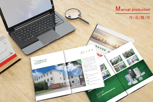
Processing details of font spacing in albums
It is a very important job to deal with the details of font spacing when making an album. Many people may underestimate the complexity of this work, but in reality, if mishandled, it can have a huge impact on the entire picture book. At this time, gorgeous words and sharp style of writing is essential.
First of all, for the processing of font line spacing, we need to pay attention to the relationship between font and line height. In the picture book, the font and line height must have a proper proportion so that the reader can read comfortably and naturally without feeling tired. If the font size is too small and the line height is too high, the text may appear crowded, affecting the reading experience. Conversely, if the font is too large and the line height is too low, it may result in insufficient text clearance, resulting in a feeling of tightness, which can also affect the reading experience.

Second, we also need to pay attention to the layout of the fonts. In the album, the typesetting position has certain requirements, with the picture, the text and other elements to complement each other. Overcrowded fonts can make the album look incongruous and make the entire album look messy and unwatchable. Overspread fonts can weaken the visual feel of the album, looking both insipid and inconspicuous. Therefore, before designing the album, we need to carefully consider how to arrange the position of the font, so that it is integrated with the elements such as drawing, text, background and so on.
Finally, we would like to highlight the choice of fonts. In the album, the choice of font is very important, is a part of determining the overall popularity of the album. Different fonts have different styles and characteristics. Some fonts are suitable for formal and professional occasions, such as Song Ti and Bold Ti; And some fonts are more suitable for use in fashionable, relaxed, fashionable occasions, such as Microsoft ya black, italics and so on. Therefore, before designing an album, you need to carefully select appropriate fonts and design fonts in terms of color, size, and thickness to suit different scenarios.
To sum up,Picture AlbumThe processing details of font spacing in are very complex and need to be taken seriously. When processing font line spacing, we need to pay attention to the ratio between font and line height, layout position, and font selection to ensure that the overall style of the album is beautiful and consistent. Therefore, the flamboyant rhetoric and sharp style of writing are not really the most important points of this article, more important than them is to deal with the font spacing to avoid all problems as much as possible.
Recommended Reading:
How to set the size of the brochure
How to Carry out the Work of Picture Album Typography and Printing


