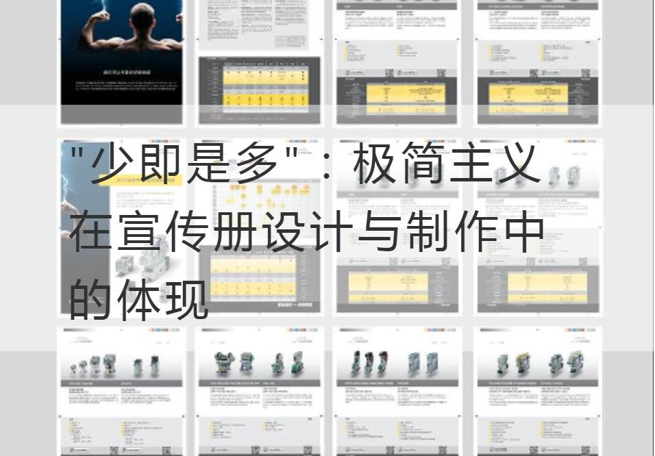
"Less is More " : Minimalism in Brochure Design and Production
In today's era of information explosion, people face a lot of text, pictures and advertising every day, which distracts people from the ever-changing information. However, it is in this context that more and more people are pursuing a simple and powerful design style that highlights a unique, pure message. Minimalism has become a concept in the design and production of brochures, which contains the "less is more" design principle.
"Less is more" is a design style that seeks simplicity, elegance and directness, delivering the message with the least elements and the simplest style. In the design of the brochure, the first thing to do is to start with the typesetting. Concise, bold typography increases readability and allows readers to focus more on the core information. Choose a simple font with a large font size to highlight key information and make it clear. In addition, the use of contrasting black and white or a small amount of bright color collocation, can also create a strong visual impact.

At the same time, visual elements should be carefully selected and laid out in minimalist brochure design. Instead of overusing pictures and diagrams, opt for high-quality images and simple icons that convey the message clearly. Through reasonable blank layout and balanced proportion, the visual elements present the ultimate simplicity and balance, making the whole design more beautiful and comfortable.
In addition, minimalism takes into account the hierarchy and layout of information in brochure design. Through reasonable block and title setting, the reader can better understand the importance and sequence of information. Important information is placed at the heart of the layout so that readers can get the information they need as soon as they go through the brochure. The transitions between different content should be smooth to avoid the feeling of complexity.
The minimalist brochure design also needs to pay attention to the color selection. Mild, muted shades give a comfortable and intuitive feel. Avoid too garish or too bright colors to distract the reader. Key messages can be highlighted in sharper, brighter colors to enhance the taste and visual appeal of the brochure.
The use of high-quality paper in the production of brochures is also part of minimalism. Make the brochure more texture and stability by choosing the right paper and thickness. At the same time, the use of modern technology and special printing methods, such as bronzing, embossing and texture coating, can increase the uniqueness and visual impact of the brochure.
Anyway, minimalism inBrochure Design and ProductionThe embodiment of the is not only to convey information concisely, directly and efficiently, but also through careful design and layout, so that the whole brochure presents a simple and perfect style. Through the concept of "less is more," people are able to understand and receive information more attentively, thus enabling better communication with propaganda. Minimalist brochure design is not only a design idea, but also an art of conveying information.
Recommended Reading:
Details determine success or failure: Perfect corporate album printing technology
Carefully planned: Strategic Thinking in the Company's Album Printing
Rebrand: The Power of Humanized Company Album Printing Design
Bring fresh blood to the company's album printing: Latest Trends and Technologies


