

Making Method of Furniture Enterprise Brochure
Modern furniture industry is increasingly competitive, furniture enterprises need to promote brand influence and market competitiveness through brochures. Furniture enterprise brochure is an effective channel and an important spokesperson for propagandizing enterprises and their products, so we need to pay attention to the production method.
1. Target audience
Brochure is a tool to convey enterprise information and promote products. Therefore, you need to identify the target audience first. Determine the style, content, and format of the brochure based on the targeted audience for better publicity. For example, brochures aimed at high-end customers need sophisticated design and content, while brochures aimed at young people need more stylish and lively elements.
2. Design a reasonable layout.
A good brochure must have a reasonable layout and design structure that maximizes the information and characteristics of the enterprise and makes it easier for the audience to understand and accept. For the layout design of the brochure, it is necessary to arrange the layout and structure of the contents from the perspective of the audience, so that the readers can read more comfortably and easily.
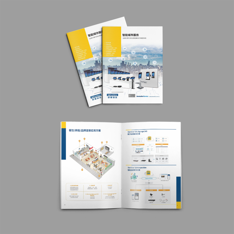
3. Finely selected pictures and copywriting
Picture is one of the important elements of creating a beautiful brochure, and it is an effective means of visualizing corporate image and product characteristics. Therefore, when designing brochures, we need to carefully select pictures, and select high-quality, clear, beautiful and appropriate pictures to show the product and corporate image. At the same time, it is also necessary to carefully organize the copywriting content so that the audience can understand the enterprise's development history, business philosophy and product characteristics.
4. Highlight enterprise characteristics and competitive advantages.
Each business has its own characteristics and competitive advantages that need to be highlighted in the brochure. We can highlight the characteristics and competitive advantages of the enterprise by citing customers' praise, industry depth, product quality assurance and creative design, so that the audience can better understand the enterprise.
5. Build a brand image
Furniture enterprise brochure is an important representative of brand image, it needs to have certain visual impact and artistic value. Therefore, focus on the brochure design, layout, pictures and text to establish the brand personality and image, so that the audience can clearly understand and remember the corporate image and product characteristics.
As an important propaganda tool, furniture enterprisesBrochure ProductionWe need to pay attention to detail and strive for perfection to highlight the characteristics and advantages of the enterprise, build the brand image and attract more consumers to pay attention to the enterprise and products.
Recommended Reading:
How to do more atmospheric group album design?

