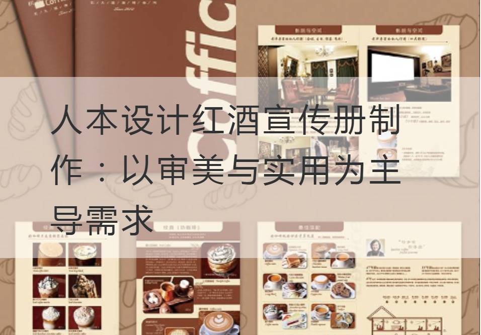
Humanistic Design Red Wine Brochure Production: Take aesthetics and practicality as the leading demand
At the crossroads of the world, we seek to blend the beauty of the original with the beauty of the new creation. We hope that the torrent of design is driven not by shallow popularity, but by the unique code of humanistic design. Today, we will take the wine industry as an example to illustrate the concept of human-oriented design - to create a wine brochure that combines aesthetics and practicality.
First of all, what we want to emphasize is the pursuit of aesthetics. In the design of red wine brochures, we want to combine style, color, image and illustration perfectly to present the beautiful flavor of red wine. We imagine the flow of light and the dance of grapes to create different designs. To correspond to the diversity of red wines, we use color contrasts to create a visual impact that captures the eye and conveys the characteristics of the wine through unique typography. The curving lines and the flowing light and shadow on the design pattern hold the theme of feasting the guests to the intoxication. It's a brochure that calls tasters to indulge in through visual conversations.

At the same time, we cannot ignore the usefulness of the brochure. It should not only arouse people's taste buds, but also have effective information transmission function. We focus on a fine level of information and transparency when communicating the core content of the wine, such as the type, origin, brewing method, taste, alcohol content and price. Through extended reading, QR codes, and even embedded AR technology, brochures can connect the bridge, even the platform, between consumers and wine. We use well-designed typography to make it easy for consumers to access the information they need while enjoying beautiful pictures. Whether it's photography, illustration, graphic design, or copyrighted copywriting, it's all actively intertwined with the wine industry to provide an in-depth reading experience.
In humanistic design, we always remember that aesthetics and practicality are two inseparable entities. Aesthetics provide appeal, practicality provides usability of the content. The combination of the two reflects the charm of design, which is a fusion of architecture and art, and reflects the brand value of the enterprise and the expectation of consumers.
Moreover, by focusing on customer image, content complexity, end goals, and communication channels, we can go deep inside our customers and customize a unique wine brochure for them. We use user stories, deep insights, and continuous experimentation to create designs that are full of new surprises.
The application of human-oriented design in the production of red wine brochures takes aesthetics and practicality as the leading demand, and provides new possibilities for corporate brands. In the design of the page, we're looking for a balance of visual impact and information compatibility to give wine a new lease of life and the tasting experience begins its journey from the first page of the brochure. Gorgeous vocabulary, strong brush strokes, superb professional skills, this is the way we outline wine brochures, this is the way we transmit humanistic design ideas. Despite the challenges, we will take the wine brochure to the next level with great skill.
In this era of information rápida, the demand for aesthetics and practicality has become more and more prominent. Humanistic design concept is the bridge to meet this need, it combines art, technology, and business requirements perfectly to achieve the ultimate effectiveness of design. In the future, we will continue to explore and practice this human-oriented design thinking, so that people can enjoy wine while also feelingBrochure ProductionA visual feast.


