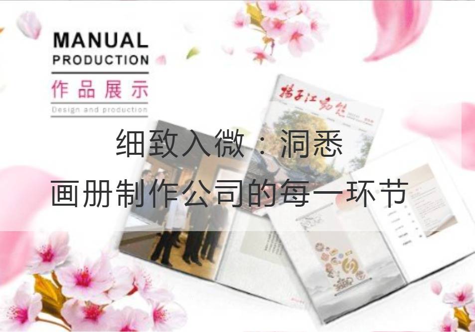
Nuance: Insights into every step of the album production company
Album production, at first glance, may seem like a mundane job. However, a thorough understanding of the internal links of the album production company, you will find that there is an outstanding combination of art and technology. Picture album production company, like a Changhong TV, thousands of clues, from the pre-planning to the post-printing, each link needs to be carefully carved, just to present a "live" picture album.
First of all, the first key link in the production of the album is planning. In the planning stage, each album needs to go through a careful design and planning, capture the customer's requirements and ideas, and then through the designer's inspiration and skill application, "point stone into gold" like to create a unique creativity. The success of this segment depends on the planning team's keen insight into market trends and accurate understanding of the preferences and needs of the target customers.

Next comes the design process, where designers are like painters splashing ink, using various design software, image processing tools and color theory to transform abstract concepts into visual images. Look closely at the details of each page, you can find every picture and every layout design contains the designer's efforts and creative spark. They believe that "magic strokes" often begin with inspiration, while nuances are the best testament to professional skills and artistic talent.
However, beautiful design alone is not enough, and the printing process is also crucial. The success of an album often depends on the perfect printing process. The reducibility of color, the choice of paper and the fineness of printing are all important factors to be considered in the printing process. Fortunately, modern technology has greatly improved the quality and efficiency of printing. Today's technology, such as inkjet printing and digital platforms, have made the albums more expressive and colorful. It is the continuous breakthrough and innovation of printing technology that brings a wider development space for the production of albums.
Finally, the sales segment is the album production company as brilliant as the bright moonlight. The sales team needs to fully understand the background and features of the album to successfully bring the products to the market with a unique sales approach. Good communication skills and good listening skills enable sales personnel to communicate effectively with customers to find the most suitable solution for album production. Only through meticulous service, can we win the trust of customers and create greater influence.
Under the close coordination of so many links, a picture album can radiate eternal charm. As the ancients said: "The water is long flowing and people drink it together, and the things simmering slowly are more fragrant. "Album production is also the same, only every small link gets reasonable scrutiny and careful carving, can present the perfect finished product.
The nuance is the key for album production companies to lead the industry. From planning to design, from printing to sales, every link requires a great deal of effort to present this small but magnificent work of art. Only in this way can the album production company stand out in the fiercely competitive market and win the favor of more customers.
The subtleties contain infinite power, as Wang Zhihuan wrote in his book "Stork Tower": "During the day, the Yellow River flows into the sea. "In the pursuit of excellence, we will continue to improve ourselves,Album Production CompanyIn order to push the production of the album to a higher state, create more beautiful and wonderful works.
Recommended Reading:
Jump Design: Graphic Album Design Company Shows You the Power of Art
How to Create an Eco-brand for Hardware Picture Book Design Company
Electronic Album Design Company: The Road to Design in the Digital Age
Future-oriented traditional album design company, the leading stars in the design field


