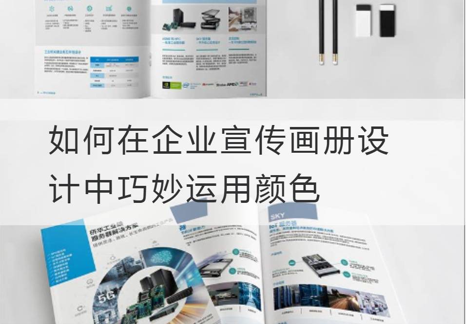
How to Use Color Skillfully in the Design of Enterprise Publicity Album
In the business world in full swing, the quality and speed of information delivery determine whether a company can gain a foothold in the fiercely competitive marketplace. In this, the image of the enterprise propaganda album design is like a sharp sword, infinite power. And the secret that leads us to break the norm and subvert the general view of business is the dazzling "colors".
The use of color is crucial in the corporate brochure, a vast and magical field with endless possibilities. The choice of colors, shades, contrasts and blends can inspire the idea, value and even the spirit of the whole brand, so that people can see the strength and intrinsic value of the company at a glance.

First, we need to understand that color has its innate character and emotion, giving people conceptual and emotional associations. For example, red evokes enthusiasm, energy and decisive battle, blue feels deep, intellectual and professional, green represents nature, health and ecology, and black is elegant, high-end and mysterious. Your brochure has a clear and unique emotional tone.
Secondly, the designer needs to excavate and manipulate the "spiritual connotation" of color skillfully. This requires us to refer to the principles of color psychology, like a conductor, to select, combine and interweave various colors to create a visual symphony. For example, warm colors are radical, positive emotions, while cool colors are calm, calm feelings. The proper use of these two colors can create a beautiful visual effect while making the brochure both eye-catching and easy to accept.
And then, we're going to set the tide, not follow it. Each era has its representative color, which is determined by the aesthetic orientation of the public and the current popular culture. The futuristic style, for example, uses bold bright colors and metallic textures that are technological and innovative. Designers need to grasp the pulse of the times sensitively, will fashion color elements into the brochure design, so that it reveals the unique atmosphere of the times.
Finally, technical parameters are an element that must be noted. Each color has its own Pantone value, or PMS value. This value is critical for color accuracy, which directly affects the uniformity and professionalism of a corporate brand. CMYK is a four-color printing representation of color in printing, including cyan, magenta, yellow, and black, whose proportions and blends directly determine the color effect of the print. Proper use of PMS values and CMYK ensures that colors are perfectly interpreted both in concept and in practice.
Wings fly in the color world of designers, dominating the visual rhythm, plucking the perceptual strings. They know how to converge multicolored light on the paper at hand, gushing out the soul of the enterprise. The end is such a sharp and gorgeous, full of artistic sense of corporate propaganda album, like a vivid awakening picture scroll, with a deep sense of modern aesthetics.
Publicity album designIt's not just technology, it's an art, a way of deep communication that awakens perception with color and touches the mind with design. Therefore, we need to use color carefully, can the enterprise spirit, taste and style portray incisively and vividly, let each page is like a gorgeous and vivid picture, direct to the soul of consumers.


