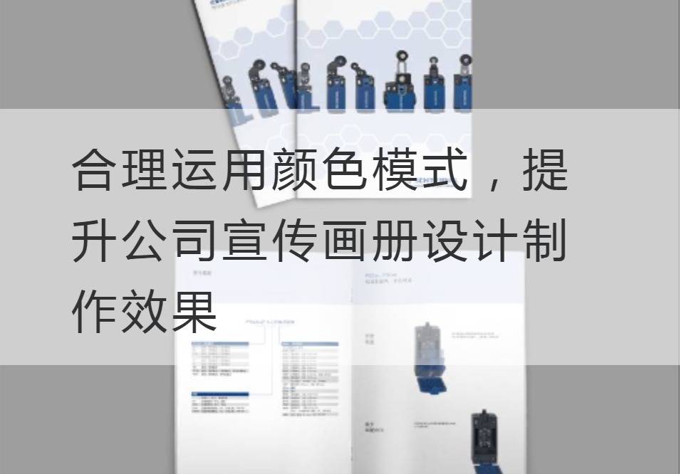
Properly use color patterns to improve the design and production effect of the company's brochures.
In the modern world, first impressions and visual appeal are essential to successful branding. In the initial contact, the use of color patterns is an important factor in determining attractiveness and expanding influence. Innovative companies have noticed that they can significantly enhance the production of their brochures through sharp and gorgeous visual designs and modern color patterns.
Before we get into the application of color mode, we need to read the basics of color technology parameters. The concept of "color gamut" is usually used to describe the range of brightness, purity and hue of a color. "Chromance" measures the purity or saturation of a color. Understanding these basics will allow us to apply color patterns better.

When designing an album, we need to consider two common color modes: RGB and CMYK. The RGB (red, green, and blue) mode is used to combine colors in addition mode. It is mainly used for light-emitting display devices such as TVs and computer screens. CMYK (cyan, red, yellow and black) mode is a subtractive combination of colors, mainly used in the printing field. When the color output medium is paper, we prefer to use the CMYK color mode for design.
No matter which color mode we choose, we need to master the matching and matching of colors. The theory of "color error" and "color management" plays a key role in this link. The purpose is to adjust color parameters to ensure color consistency and accuracy in the final output. Color Management System (CMS, Color Management System) is a technology used to adjust, control, and ensure consistency of color representation between different devices. Only in this way can we create a visual impactful, dynamic and vibrant brochure.
In addition, we also need to remember that in the design process, color is not just a decoration, it is a means of communication. Color has an impact on one's mood and understanding. Blue, for example, often conveys a feeling of deep, tranquility; Verdant green shows a vibrant, natural atmosphere; Yellow is reminiscent of sunshine, optimism and positivity. Through the rational color collocation, the reader can be visually guided to produce the emotional and emotional response consistent with the brand positioning.
To sum up, the production of the company's brochure, color is one of several powerful tools to build brand influence. To understand the scientific application of color theory, familiar with color management system, love to use flexible innovative thinking, can produce a perfect brand image, and have strong attractive publicity album.
The market competition in the future is destined to be the age of visual marketing. Only by using the color pattern properly, can we use the color pattern in this ever-changingPublicity album designOn stage, improve brand awareness and enhance the influence of the company.
Recommended Reading:


