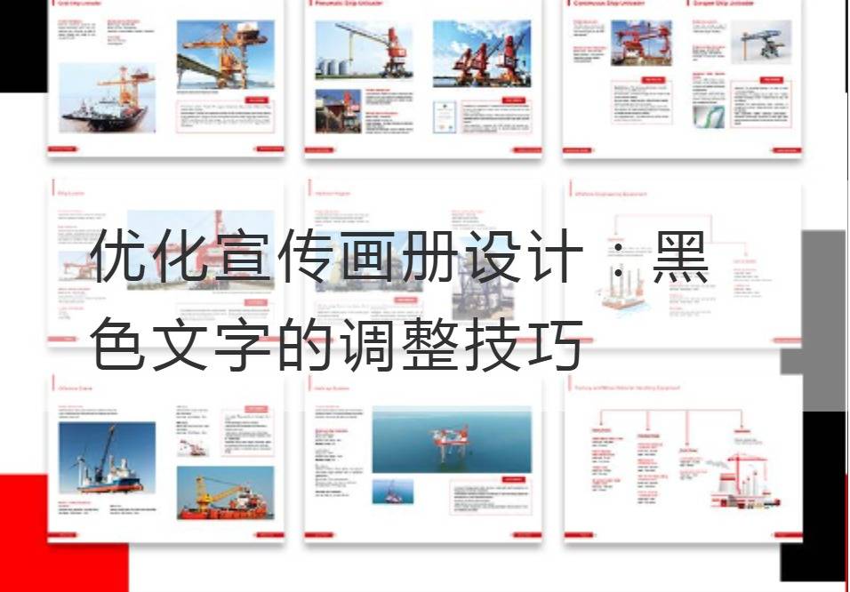
Optimize the brochure design: Adjustment Techniques for Black Text
Brilliant color collision, bright and vivid, this is the three-dimensional picture book design world, but in this delicate and rich visual feast, thick and steady black always occupy the vital position. Black, the most influential non-tonal color, is powerful and deep, the mystery of the universe, the fragrance of history, the light of wisdom, all found expression in black. However, how to effectively use black text in the design of the picture album, in order to improve the effect of information transmission, has become the core problem that we want to discuss.
First of all, what needs to be made clear is that the black text carries on the subject of the album profound thinking, is the soul of the album design. As a design element, black text should be cleverly integrated into the overall framework of the design album, with the cultural depth and charm to attract the viewer's eyeball.

However, the first step in optimizing the adjustment technique of black text in the design of the album is to define its role. Black text is a unique multimedia information dissemination tool, should make full use of its visual attraction and perceptive ability, become the bridge between the subject and the audience.
In the actual design process, the common black characters change skills for the change of font shape, contrast of lightness, space allocation, and color collocation. Well-designed glyph adjustment can make the text more dynamic and visual tension, and the enhancement of lightness can improve the text's recognizable degree. Space allocation techniques create rich visual layers, compact and choreographed effects in the album pages. Color collocation can make black text and other color elements of the album reflect each other, achieve harmonious visual effect.
In addition, different materials and textures can affect the visual effect of black text. For example, smooth paper can emphasize the sharpness and clarity of text, while frosted paper or other textured materials can make black text appear calmer and plainer. Therefore, the selection of materials and textures should also be considered when making design adjustments to black text.
This is an abstract and delicate design process, need to consider a lot of factors, but as long as adhere to the people-oriented, to transmit information for the purpose of the principle, can be easily done. In the process of optimizing the design of the propaganda album, we regard black text as the product of digestion and thinking. It needs to adapt to the form of the album, convey profound and unique information, and connect the designer's idea and the audience's mind.
There are no set rules at all when it comes to black text adjustments. Is the compact arrangement of calm and steady, or the jump layout of easy and easy; Whether it's a radial layout centered on the axis or a straight-line layout dominated by lines depends entirely on the subject of the album and the emotion you want to convey.
Whatever the black text of your design changes, always remember that the essence of design is to present complexity in the most elegant and concise manner possible. Focusing on the user, optimizing the design of black text, making it become a bridge between brand and consumer feelings, is the real success.
The black text adjusted by professional technology is like a black hole in the design world. It not only has a powerful attraction, but also has the unique charm of turning light into darkness and information into sensing. No matter in any design environment, the carefully designed black text can lead the audience to the depth of the album with its depth and invigorating temperament. In this, the natural nature of the black text has transcended the simple visual feeling and touched the core of our emotions.
Summarize and optimizePublicity album designThe adjustment technique of black text, in particular, is both technical and artistic. To understand the power of the black text, to use the design skill ingeniously, to make the black text play its unique artistic charm in the design of the album, we can successfully touch the reader's heart and make the work more powerful through the black text.
Recommended Reading:


