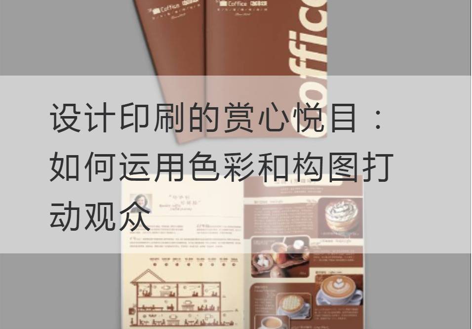
Designing Print for the Eyes: How to Use Color and Composition to Impress Audiences
Printing design is an art, which is not only a visual feast, but also a kind of emotional transmission. Symbolizing the perfect combination of creativity and technology, the print design must take color and composition as the soul, touching the heartstrings of the audience.
In print design, color is the most dazzling wizard, capable of captivating with its colorful palette. The choice and collocation of color directly affects the viewer's visual feeling of the work. For example, bright and bright colors will bring a sense of joy and energy to the audience, while soft colors will convey a warm, comfortable mood.
However, color is not simply stacked on the screen, it requires careful control and combination. On color collocation, should pay attention to the double balance of contrast and harmony. The use of contrasting colors can increase the level of the picture, so that the audience has a strong interest in the work. And the use of harmonious color can render a kind of soft, harmonious atmosphere, give people a sense of intimacy and comfort.

Apart from color, the design of the composition is also a factor that can't be ignored. Composition determines the layout and visual focus of the picture, and determines where the viewer's eyeballs flow. When it comes to compositional design, simple and vibrant styles tend to attract the attention of the audience more easily. Through reasonable white space and elements arrangement and combination, the picture presents an overall and organized effect.
In composition, there is an important principle called the golden section. This principle relies on mathematical rules to divide the picture into interrelated details, making the composition more layered and harmonious. At the same time, using the diagonal as the guide line in the composition, can enhance the motion of the picture, and guide the viewer's line of sight.
In addition to color and composition, print design also needs to take into account the technical terms and technical parameters of the relevant industry. These technical terms are not just simple statements, but also understanding and respect for the audience. The use of professional nouns can show the designer's professional accomplishment and industry awareness, so that the audience can trust and appreciate the work more. The application of technical parameters can improve the texture and quality of the printed matter and make the audience feel professional and fine.
Finally, the print design must be infectious. Art works are not just about showing beauty, but also about conveying emotions and ideas. Through the designer's breakthrough innovation and unique point of view, the design works can arouse the audience's empathy and reflection. With proper colloquialization, the designer can awaken the audience from the tedious life and make them more interested in print design.
Anyway,Design PrintingThe perfect blend of color and composition must be combined with the professional terms and technical parameters of related industries to give the work a higher value. Only through the perfect combination of these elements can you really touch the heartstrings of the audience and make them marvel at your design work. Let us experience the visual feast of print design together, enjoy the magic of color and composition.
Recommended Reading:


