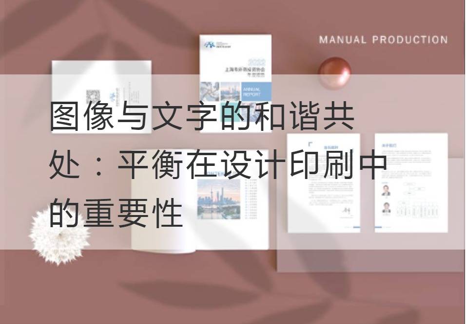
Harmonious coexistence of images and words: The Importance of Balance in Design and Printing
In today's information age, vision and words go hand in hand, becoming the important means of transmitting information and communication. Whether it is advertising design, commercial propaganda or book publishing, the harmonious coexistence of images and words is indispensable. They are interdependent and complementary to each other, bringing a new visual impact and message-transmitting effect to the work. And in the process of design and printing, balance is extremely important, it determines whether the work can attract people's attention, arouse people's resonance.
First of all, the balance between image and text in the design is the key to successful creation. Images can convey information and express emotion intuitively through their unique shape, color and composition. Through its powerful description and logical arrangement, the words can give people deep understanding and thinking. The balance between the two creates a perfect visual reading experience. Too many images can make the work appear confusing and cluttered, and too many words can make the work boring. Only by blending the two just right can the reader be attracted at a glance and have the curiosity and desire to explore the works.

In addition, balance is also reflected in the design and printing of color use. Color is one of the important elements of balance, different colors will have different effects on people's emotions and senses. Through reasonable color matching, the image and text can complement each other, rendering the overall atmosphere and style of the work. Whether it's bright, bright colors or soft, warm colors will make the work more attractive. But be careful to avoid excessive use of color, lest affect the overall effect of the work. Proper color rendering combined with the proper use of images and text can truly achieve a balanced and harmonious design effect.
In addition, pay attention to the balance between the image and the text in the typography. Typesetting is an important means of conveying information and attracting readers' attention. In typography, images and text need to be properly combined and laid out to form a sense of visual balance. Exaggerated image and text layout, may make the work appear crowded and messy, cause pressure. Conversely, overly simple and tedious typography can make the work seem boring and unattractive. Only by setting the image and text in the proper position and arranging the typesetting reasonably can we ensure the visual balance and harmony.
In addition to the balanced and harmonious layout of images and words, the appropriate colloquial expression can also add color to the work. In modern design, colloquial expression has become a popular trend. It makes the text more relatable, more grounded, and better interaction with the reader. However, the use of colloquial expressions should pay attention to moderation, not oversimplification or vulgarization. Only on the premise of ensuring the professionalism, properly adding colloquial expression, can make the writing more interesting and vivid, arouse the reader's resonance.
To sum up, the harmonious coexistence of image and text is an indispensable element in design and printing. Balance is the key to successful creation. We should pay attention to the reasonable use of images and words, the appropriate rendering of colors, the reasonable layout of typography and the proper colloquial expression. Only on the basis of these, can we truly realize the perfect combination of visual impact and information transmission effect, move the reader's mind, and achieve the expected communication effect. Let's work together to balance the harmony of images and words forDesign PrintingThe world brings new energy and creativity!
Recommended Reading:
Key Role of Security and Anti-counterfeiting Ink in the Design and Printing of Enterprise Albums
Deep Reveal: How to Use Security Anti-counterfeiting Ink in Album Design and Printing


