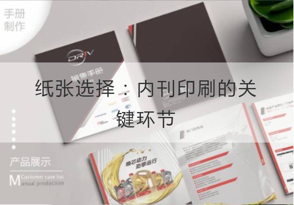
Paper selection: Key Link of Internal Periodical Printing
Paper plays a key role in the internal printing process. It is not only a medium used to convey information, but also an important indicator of the quality of internal periodicals. For the printing of internal periodicals, it is very important to choose suitable paper, which directly affects the appearance and quality of the printed matter.
In paper selection, the first consideration should be given to the texture and gloss of the paper. The texture determines the feel and appearance of the magazine, and the gloss determines the transmission effect of the image. For general internal print, the choice of soft, moderate thickness of paper, can increase the reader's comfort, at the same time enhance the overall look. For some of the interior magazines that need to display pictures and illustrations, choose a medium glossy paper to maintain the image clarity and color reproduction, make the picture more artistic.

Second, the color of the paper is also crucial. The tone of the internal publication is consistent with the theme and can give a professional, refined feeling. When selecting the paper color, we should consider the overall design style and the contents of the inside pages. In general, white paper is the most common choice for most in-house journals, which can highlight the color effects of text and pictures. And the choice of ivory white or milk white paper, can better show the high-end atmosphere and professional feeling of the magazine.
In addition, the thickness of the paper will also affect the effect of internal printing. Proper paper thickness can increase the texture of the inner print, make it more resistant to reading, and improve the quality of the printed matter. However, it is important to note that excessively heavy paper may affect the portability and writing experience of the internal magazine. Therefore, in the choice of paper thickness, according to the specific needs and positioning of the newspaper to carry on the tradeoff.
In addition to the above, paper sustainability is an important factor to consider. With the increasing awareness of environmental protection, more and more enterprises begin to pay attention to the sustainable development of paper. Choosing recyclable and reusable paper not only helps to protect the environment, but also enhances the image of the internal magazine and reflects the social responsibility of the enterprise.
As the Tang Dynasty writer Du Fu wrote in "Ascending High": "Paper expensive quality, axe broken catty injury", the quality of the paper directly determines the success or failure of the internal print. Therefore, paper selection is a crucial link in the process of internal print, which can not be ignored. Only by carefully selecting the right paper can we ensure the effect and quality of the internal print.
To sum up, paper selection is a very important link for internal periodical printing. Everything from texture, gloss, color, thickness to sustainability needs to be considered. Only by choosing the right paper, can we show the high-end feeling and professionalism of the magazine and bring better reading experience for readers. Therefore, in the process of internal print, paper selection is an indispensable key link.
Although the choice of paper is only a small part in the process of internal printing, it has a huge impact on the quality and appearance of the printed matter. Only in the choice of paper up and down sufficient effort, can make the internal print get the perfect presentation. After all, as Wang Zhihuan, a writer of the Song Dynasty, wrote in "Downing the Stork Tower": "During the day, the Yellow River flows into the sea," paper ininternal publication printingIt is as important as mountains and rivers in the human mind.
Recommended Reading:
Advertising Media Company Profile: Explore the possibilities of design, printing, production
Real Estate Company Profile: From creativity to printing
Construction Company Profile: The manufacturing process and design interest behind it
Perfect blend of form and connotation: The Key to Fine Album Design


