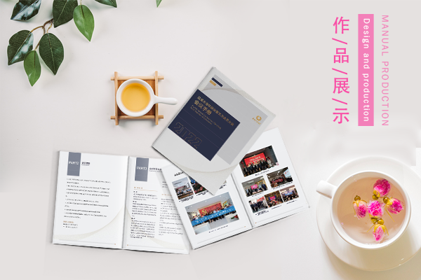
Can companies print brochures when they go to offline printing shops?
Brochure plays a very important role in any enterprise, it can promote and promote the company's cultural concept, some products and some activities, and a good brochure can even promote the company's brand image. But many people don't know where companies should go to print brochures, go to an offline print shop to print brochures? Let's take a look today.
Businesses go to offline printing shop can print brochures? To see the specific equipment of offline printing shop
Now offline printing shops can be said to be special, some printing shops can undertake a lot of business, including advertising, printing and other integrated services. Some offline printing shops are particularly well equipped, with color digital printers and so on, so they can print brochures. If you have a need to print small or scattered promotional materials, you can also consider going to an offline print shop.

Can enterprises print brochures when they go to offline printing shops? Suggest or choose a printing shop.
For most enterprises, they need to print brochures in batches. They may need to print thousands of copies at a time. If you go directly to an offline printing shop, the quotation may be higher and time-consuming. After all, the offline printing shop is small. At this time, in order to quickly, save trouble, get more affordable quotes, can choose to go to the regular printer. Formal printing plants are generally equipped with complete printing and binding equipment, and both the production process and production standards and the execution team are very professional. For example, to ensure color consistency when printing brochures in batches, printers are equipped with color management systems. And the printing factory will not print the brochure directly, will communicate with the relevant person in charge of the enterprise before printing, understand the requirements, and design the specific plan. Simply put, the formal printing factory whether software and hardware system or printing before and after the relevant process is very standard, so the quality of this piece is guaranteed. For any business, brochures are crucial and even represent the image of the business, so the job of printing brochures should be left to a more professional printer. The difference between an offline printing shop and a printer can be described in one sentence. For urgent or small-batch promotional materials, it is best to go to an offline printing shop. However, if mass printing materials are involved in brand promotion, it is best to go to a printer.
For this question, in the above has carried on a more detailed introduction, I believe everyone also has their own answer in mind. In fact, for companies, becausePrinted BrochureThe quantity of the is large, so naturally, factors such as time consumption and quotation should be considered. Taken together these factors, if enterprises have the need to print brochures in batches, printing plants are the more appropriate choice.
Recommended Reading:
Karate Club Promotional Album Design and Printing Case
LS Electricity Generation Intelligent Mechanical and Electrical Products Picture Album Design Case
Semiconductor Industry Inspection Solutions Company's internal publication brochure design case


