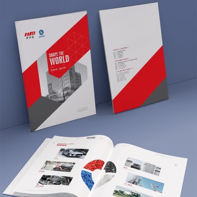
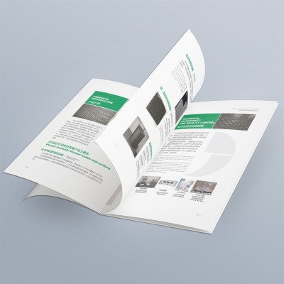
The whole album is dominated by a large area of bright red and cool gray, creating a strong sense of science and technology and avant-garde. With the design of geometric lines and gradient elements, the modern and dynamic image of the brand is cleverly shaped. The album adopts a uniform grid layout, and the contents of each section are clean and well-defined. Unified layout design and information grouping make the overall visual order excellent, which is conducive to improving the readability of the content. Different from the traditional way of text introduction, the album makes extensive use of dynamic charts such as pie charts and radar charts to present complex technical parameters and performance data in a vivid and intuitive way. This innovative message
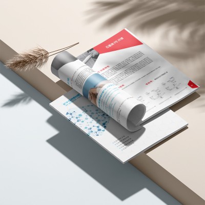
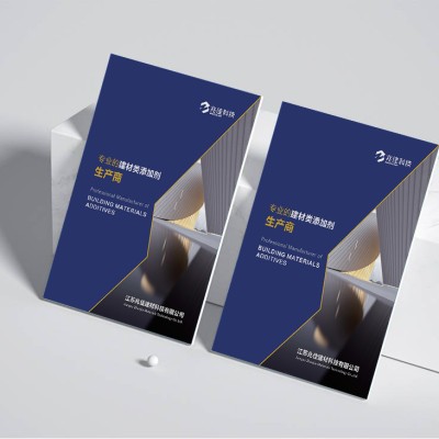
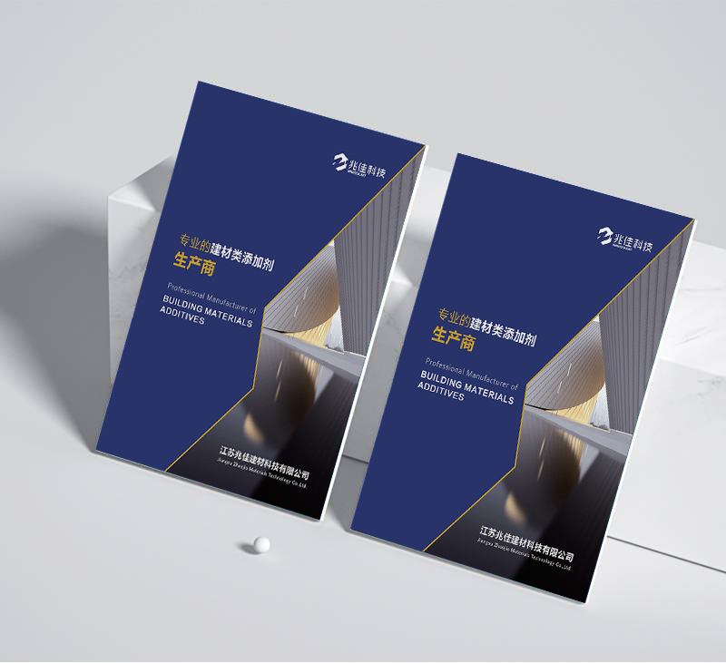
The entire album is dominated by cool blue-gray, with bright orange-red tones, creating a strong sense of technology and futurism. This edgy feel is further enhanced by dynamic geometric lines and gradient elements. This visual tone perfectly interprets XYZ's corporate image as a pioneer in the field of new materials. The rigorous and orderly grid layout lays a solid foundation for the content organization of the album. The information in each section is highly focused and has distinct levels, which greatly improves readability and information transmission efficiency. This organized design method reflects the company's professional level in technology and management. The rigorous and orderly grid layout is the foundation for the content organization of the album
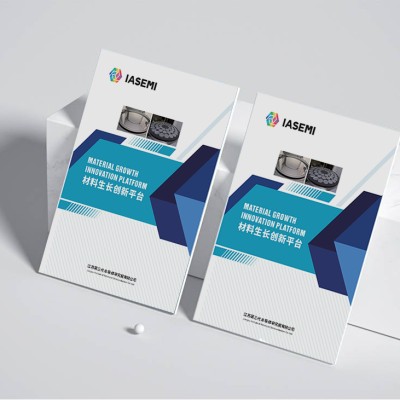
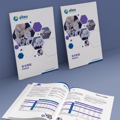
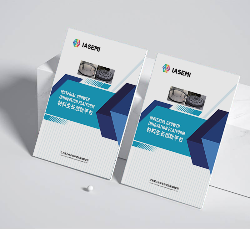
The overall visual style of the IASEMI brochure is highly aligned with the company's positioning in the new materials industry. Use a large number of blue-green tones to create a sense of science and technology and future; At the same time, the geometrically divided cover design gives the whole a characteristic of precision industry. This design technique, which perfectly combines cutting-edge technological elements with elegant visual aesthetics, can undoubtedly effectively attract the attention of target customers. IASEMI's product giclee does an excellent job of information organization. From company profile to product features to industry applications, each module has been sorted out and presented in an orderly manner, with prominent emphasis and distinct levels. At the same time, a large number of
The cover adopts a steel structure geometric segmentation layout, creating an industrialized and precise visual effect, which is highly consistent with the new material industry in which the company is located. The inner page design uses a large number of blue-green tones and delicate grid textures, giving the entire brochure a sense of science and technology and forward-looking. It is worth mentioning that some pages also use interactive elements such as dynamic explosion diagrams, which greatly enhances the reading experience. The brochure has made a good plan in content organization, starting with the company profile and product overview, then introducing the technical indicators and application scenarios of various products in detail, and finally demonstrating the manufacturing strength of the company.
The manual incorporates the visual image of the enterprise with the product application scenario by boldly adopting the architecturally full cover vision. The interior design incorporates the instrument elements of the microscanning electron microscope, and presents the atomic electronic material structure in a scientific and technological image, making the overall visual effect highly professional and visual impact. This innovative cross-border visual expression is undoubtedly a new breakthrough in the graphic design of traditional electronic product albums. The information architecture design of the album is further optimized. By rationally classifying product categories and systematically sorting out technical parameters, the audience can be more clearly defined.
The album combines microscanning electron microscopy images and AR augmented reality technology to vividly demonstrate the structural characteristics of the new environmental-friendly materials at the molecular level. Through information annotation and other interactive means, the audience can intuitively feel the internal relationship between innovative technology and product performance. This kind of visual interpretation of cutting-edge material technology undoubtedly enhances the information dissemination power of the album. The album features a fine three-dimensional folding design that makes informational guides and product displays more interactive. The audience can trigger sound and light effects as they move the slide or turn the page, creating an immersive sense of immersion. This new way of breaking the limits of the two-dimensional plane
The manual makes full use of cutting-edge technologies such as high-resolution photography and AI rendering, and incorporates three-dimensional models of material structures at the atomic level throughout the book. Through the dynamic illustration and data annotation of quantum parameters, the enterprise skillfully realizes the seamless connection between microcosmic world and macrocosmic cognition, and brings a brand new information immersion experience for the audience. The manual uses a biodegradable shell made from a bio-based material and implants nanocapsules for a controlled time. When the use cycle of the manual is over, it can return to nature and become a humus nutrient, thus realizing the ultimate closed-loop of the brand communication chain and industry ecosystem. This whole life cycle eco-friendly design concept
The cover uses self-developed recycled paper combined with laser carving technology to form the design of leaf vein texture and three-color carbon emission index. This visualization of environmental data transforms abstract carbon reduction results into tangible visual symbols, creating a new model for digital environmental statements in the industry. The technical innovation section uses a honeycomb grid structure layout to decompose 28 patented technologies into interactive information nodes. Through fold-out design, users can trace the technical development path along the logical chain, and the use of dynamic crease technology makes professional content interpretation interesting. Product Application Cases Break Through the Limitations of Traditional Layouts and Learn from Termites
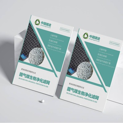
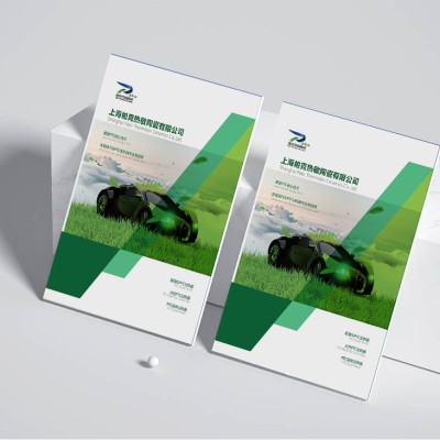
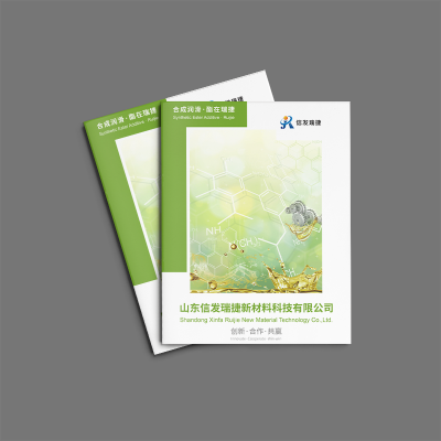
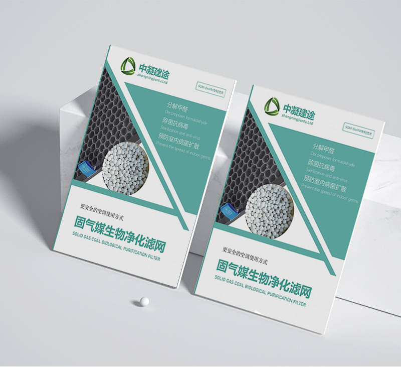
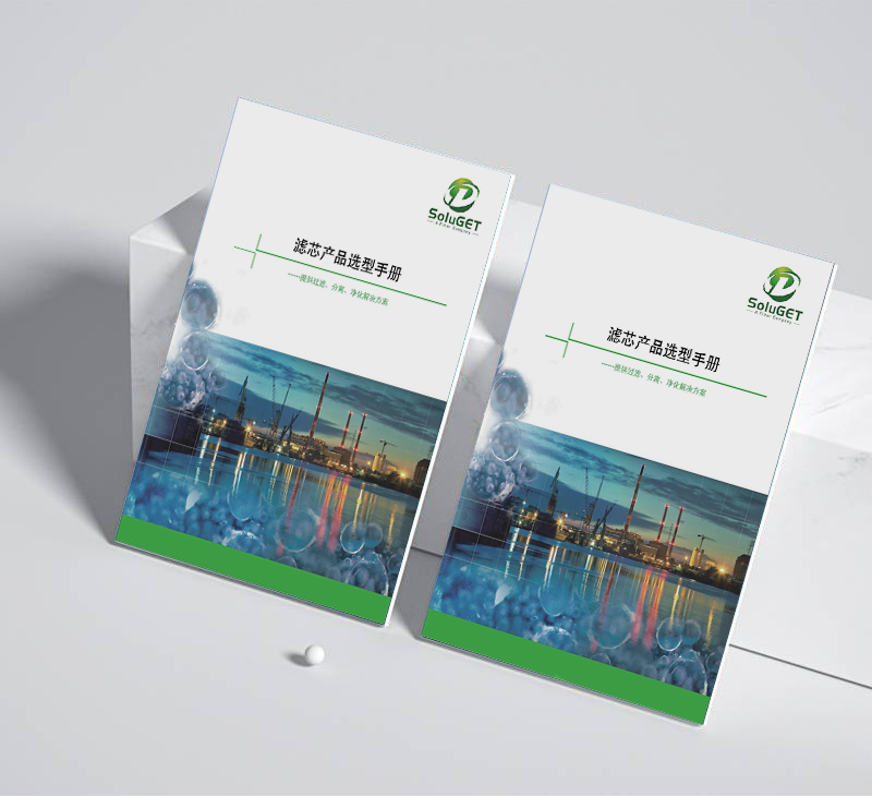
The album uses green and gray as the main colors, with geometric elements, to create a simple and atmospheric modern feel. This method of creating brand-specific visual symbols not only helps to improve brand recognition, but also echoes the company's idea of devoting itself to environmental-friendly materials research and development. At the same time, Chinese and English bilingual design arrangement, further enhances the international communication force of the album. In both Chinese and English versions, the contents of the album are highly consistent in the level of arrangement and information organization. The key information such as enterprise background, product characteristics, and technical advantages is expounded through clear block design. This precise content architecture does not
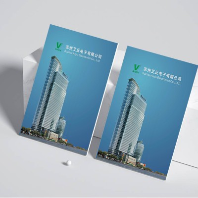
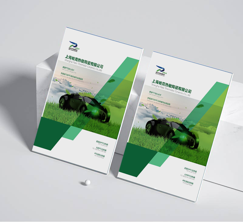
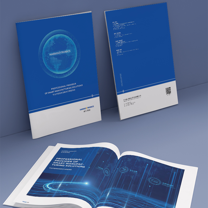
The overall vision of the album adopts cool blue and white tones, with concise and powerful geometric elements, creating a modern temperament with a full sense of science and technology. This method of integrating Chinese and western visual vocabulary not only enhances the international brand image, but also reflects the company's concept of focusing on the research and development of advanced materials. At the same time, some inner pages adopt interspersed bilingual typesetting in Chinese and English, which further improves the reading experience of international audiences. No matter in Chinese or English, the content of the album is highly consistent in structure level and information organization. Through clear hierarchical division, the company profile, product technology, application scenarios, etc. are comprehensively explained. This kind of rigor and order
The overall visual style adopts the elegant atmosphere of blue-green tone, with simple and dynamic geometric lines, to create a sense of technology full of modern temperament. This combination of East and West aesthetics complements Xinhong's green philosophy in renewable energy. In both Chinese and English versions, the inside pages of the album show a high degree of consistency in information organization. Through the hierarchical layout, the introduction of each part, product overview, technical parameters and so on are clear at a glance. This logical and clear information architecture not only enhances the reader's reading experience, but also quickly conveys the professional strength of the enterprise. In addition, the comparison of key performance indicators is improved.
The cover of the brochure adopts a simple "earth" green tone, and at the same time, it uses the rendering technique of Chinese ink painting to permeate rich natural charm in the minimalist lines. This visual style, which combines Chinese and Western styles, skillfully combines the traditional craftsmanship and modern craft aesthetics of enterprise products, bringing cross-cultural aesthetic experience to target customers. The inner pages of the brochure are highly consistent in the design of Chinese and English versions to ensure the coherence of information transmission. By organizing the company profile, product history and technical characteristics in an orderly manner, the audience can quickly understand the company's development context. At the same time, close
The cover of the manual adopts a partial UV hot silver process to create a reflective effect similar to metal materials on special coated paper. The key products on the inner page are printed with 3D relief, which reproduces the surface texture of the material through a precise embossing depth of 0.2 mm. In the layout of specific technical parameters, designers innovatively use intelligent ink printing technology. When the temperature exceeds 25 °C, the product index parameters will appear in a gradual form. These printing technology breakthroughs not only strengthen the audience's tactile experience, but also intuitively show the physical characteristics of enterprise materials. In terms of paper selection, environmentally friendly paper with 30% recycled fiber is used, and its water ripple texture echoes the company's main water treatment
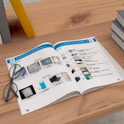
Overall, the manual features low-saturation blue-gray hues, combined with clean, smooth geometric lines, to create a sense of skillful and atmospheric technology. This fresh and cool visual tone not only coincides with the environmental protection attributes of the enterprise products, but also gives a professional and rigorous brand image. Dynamic graphic elements and textures further enrich this avant-garde and modern visual language. The inside pages of the manual show a very organized layout. All kinds of product parameters, performance indexes and process flow information are organized in a neat and orderly manner. This rigorous content structure not only improves readability, but also reflects the business in process.
The entire manual adopts a simple and bright green and white color scheme, with smooth line elements, creating a fresh and natural sense of technology. This visual tone not only reflects the environmental protection attributes of enterprise products, but also adds a lot of affinity to cumbersome technical information. Dynamic geometry and textured details further enrich this edgy and modern visual style. The inner pages of the manual adopt a neat and orderly grid layout, in which product parameters and performance indicators are carefully organized. From overview to specific data, they are clearly classified and displayed, which provides great convenience for customers to quickly understand product features. This rigorous and orderly content organization not only improves the letter
The entire album adopts the refreshing and calm blue-gray color as the main tone, with smooth curve elements, creating a strong sense of technology and futurism. Dynamic geometric lines and delicate material texture further enrich this avant-garde and modern visual experience. This scientific and technological visual language perfectly interprets the brand image of the company as an industry leader. The entire album adopts a strict and orderly grid layout, and each information module is clearly separated. Whether it is product parameters, market data or technological process, they are all carefully organized in the album. This organized content presentation not only improves the overall readability, but also reflects the enterprise's
The entire brochure adopts a refreshing blue tone and abstract molecular structural elements to create a strong sense of technology and futurism. This visual tone perfectly demonstrates the technological strength and innovative image of the enterprise as an industry leader. Dynamic geometric lines and gradient effects further reinforce this sense of technological future. The inner pages of the brochure adopt a rigorous and orderly grid layout, and each information module is clearly separated and logical. Whether it is product parameter table, market data chart or process flow chart, they are all neatly and orderly organized in the album. This organized layout design not only improves the readability of the content, but also
Break through the traditional 12-grid system and develop an adaptive flow layout structure. The main visual area adopts a wavy dividing line designed by parametric design, which echoes the irregular arrangement characteristics of material molecules. Through the negative blank space and the golden section of 3: 7 picture-text ratio, a scientific and technological aesthetic system with breathing sense is constructed. Establish a gradient color scale system from deep sea blue (Pantone 19-4053) to quantum silver (Pantone Cool Gray 11C), combined with fluorescent green (Pantone 802C) for finishing colors. Color matching method by 75% cold tone base 20% neutral transition 5% highlight embellishment


