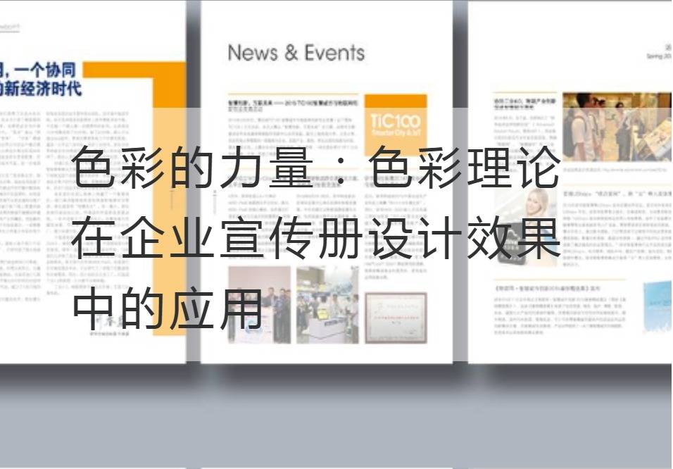
The Power of Color: The Application of Color Theory in the Design Effect of Enterprise Brochure
Color is part of the world around us. They are not only used to paint beautiful pictures or decorate the space tools, but also a means of communication and expression. In the design of enterprise brochures, the application of color plays an important role in conveying brand image, attracting target audience and arousing emotional resonance. This paper will discuss the application of color theory in the design of enterprise brochures, and analyze the influence of different colors on the psychology of potential customers and consumers.
First of all, color theory is very important for the design of corporate brochures. Color can be used to express the brand's core values and uniqueness. Blue, for example, is often associated with trust, security, and professionalism, making it suitable for brochure design in the finance and technology industries. Red, on the other hand, conveys energy, passion and creativity, making it ideal for a sports brand or an entertainment industry brochure. By choosing the right color scheme, the company can accurately convey the brand image and the value it represents.

Second, color is crucial to engaging the target audience and resonating emotionally. Colors can grab people's attention and stimulate emotional responses in a very intuitive way. According to the theory of color psychology, different colors can cause different emotional and psychological effects. Yellow, for example, can convey a sense of warmth, joy and creativity and is suitable for appealing to young people and fun-seeking consumers. Green is associated with nature, health and sustainability, and is suitable for environmentally friendly and organic product brochure design. By choosing colors that suit the preferences of the target audience and the brand's story, businesses are able to capture potential customers' attention in an instant and build emotional resonance.
In addition, color contrast and coordination also need to be considered. In brochure design, the contrast of colors can help to convey the message more clearly. For example, using high-contrast color combinations between text and background improves readability and ensures that information is quickly accessible to the target audience. However, the use of color also needs to be coordinated to avoid cluttering the brochure. By using similar tonal and color combinations, the overall visual effect can be enhanced and the brochure can be more professional and credible.
Finally, color is important for brand memory and recognition. By choosing a unique set of color schemes, companies can build a visual recognition system associated with the brand and form strong memories in the consumer's mind. When consumers see brochures or advertisements that match the color of the brand when they shop, they are more likely to associate them with the brand and further increase awareness and loyalty to the brand.
To sum up, the power of color can not be ignored in the design of enterprise brochures. Correct application of color theory can help enterprises accurately convey brand image and values, attract target audience and arouse emotional resonance. By selecting a color scheme that suits your target audience, handling color contrast and coordination, and establishing a unique brand color recognition system, you canCorporate Brochure DesignIt demonstrates professionalism, credibility and creativity. Let's use the power of color to create a charming and attractive corporate brochure!


