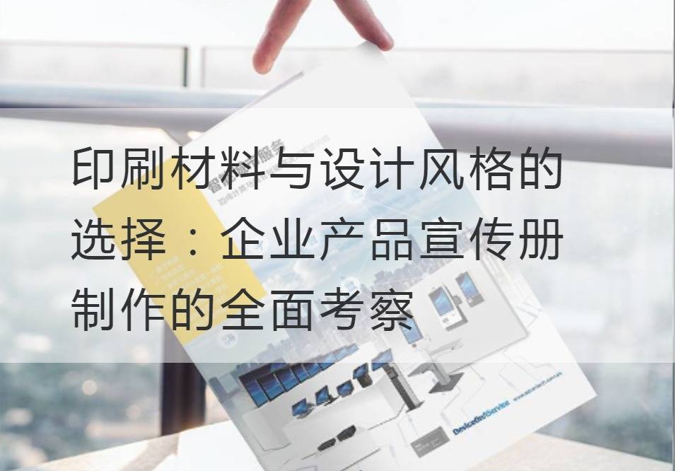
Selection of printing materials and design styles: A Comprehensive Survey on the Production of Enterprise Product Brochure
In today's business world, the power of influence has long entered the age of vision. Business brochures, which seem to be insignificant short pamphlets, are exactly the powerful uniforms for enterprises to display their image and convey information. It is the business card, it is the brand image, it is the product commentator. Behind this glossy appearance, the choice of printing materials and design styles has undoubtedly become a complex but essential knowledge.
First, let's share some topics about the choice of printed materials. A piece of paper will decide everything. The choice of printing material directly determines the quality and texture of enterprise brochure. There are numerous types of printing paper, including coated paper, papyrus, thick paper and specialty paper. However, coated paper is often chosen as the main printing material for corporate brochures because of its high gloss and expressiveness. On the contrary, papyrus, with its unique texture and environmental protection nature, is often used to demonstrate the environmental protection concept and social responsibility of enterprises.

After the choice of paper is the choice of printing technology. Printing is an industry that requires precision. In different colors, patterns and paper, there is a need for special printing methods, including offset printing, flexographic printing, gravure printing and screen printing. Which way to print, we need to take into account our design goals, budget and quantity.
Then there is the choice of design style, which is the soul of the corporate brochure. The design style is like a human facial expression, chosen properly can attract many eyeballs, people will never forget. Fresh and simple, minimalist abstract, luxury aesthetics, modern trends ...... these different design styles represent different corporate image and product ideas.
The choice of design style also involves color collocation, which can be regarded as a consonant of design, which enhances the depth of the language and makes the message more direct and powerful. Colors can awaken people's emotions, soft colors can make people quiet, bright colors can inspire people's senses, bright colors can make people full of expectations.
Finally, the quality and manner of binding, it determines the longevity and convenience of the brochure. Binding can be used to nail foot, glue, line, horse binding and other ways according to the size of the brochure and the number of pages to choose the appropriate binding way, so that it is both beautiful and practical.
Having discussed these comprehensive examinations of the choice of printing materials and design styles, we may seem to be talking about paper, design and printing, but in fact, we dig deep intoBrochure ProductionThe vitality of the enterprise is also the vitality of the enterprise. As corporate image designers, we should accurately understand and master these elements, pay corresponding efforts and sweat for each option, so that each customer's choice becomes valuable.
Recommended Reading:
Convey warmth and care: Emotional Expression in the Design of Enterprise Calendar
Making Time More Valuable: Create a functional and powerful corporate calendar design
Leading the brand image: Key Elements of Enterprise Calendar Design
Creative: Secrets to creating a unique corporate calendar design


