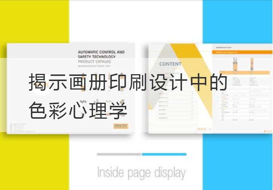
Revealing the Psychology of Color in Album Printing Design
Wandering in the imperial domain of album printing design, every detail is extremely sharp, each element is unique and blood-soaked. Among them, "color", like the glittering jewel in the crown of empire, exerts its seductive and profound magic. This is color psychology. Behind the brilliant color lies the scientific mystery of human nature, perception and visual psychology.
First, let's take out the gem of print design - the color gamut. Color gamut is a term used to represent all the color ranges of a device, and its breadth determines how many colors an illustration can choose from. A vast color gamut provides the illustrator with endless possibilities, making the albums full of life and deep emotion.

Walking between gamuts, we illuminate this key parameter of luminosity, shade contrast. This is an important factor that determines the visual effect of the album, from the dark abyss to the bright peak, luminosity is the bridge between perceived depth and three-dimensionality. Every subtle change can stir up new ripples in the viewer's mind.
Of course, we can't ignore another star element - saturation. "Saturation" is a measure of the purity of a color, and changes in it will change the degree of vividness of the color, resulting in a strong visual impact. High-saturation colors can burst out with intense vibrancy, low-saturation colors are like vintage movies, sprinkled with vicissitudes and stories.
However, in the design of album printing, the choice of color is not just the pursuit of visual effect, but the deeper will behind it comes from color psychology. For example, red can evoke excitement and passion, while blue can create a peaceful, serene atmosphere. The simultaneous insertion of completely different colors into the album design sometimes creates unpredictable psychological effects, enough to shock the soul of every viewer.
Here, we salute the human visual perception mechanism, which enables the effect of color psychology to be embodied. The physical process by which pigment absorbs light, the refracting of light in the eyeball and the transmission of nerve signals, is complex and delicate, all combined to create a colorful world.
It can be seen that from gamut, luminosity to saturation, every technical parameter in print design is the interpretation and service of color psychology. The application of color psychology in the design of album printing is not only the combination of technology and art, but also the practice of psychology. Let people experience color, feel life at the same time, enjoy subconscious surprises and shocks.
That's what's revealed in the album.Print DesignColor psychology, careful design and scientific color matching, has been quietly affecting what we see, feel, and even think. About color, we only know the tip of the iceberg, let's go deep into the depths of its sea, explore more mysterious and intense color mystery.


