Avoid the value trap: official website, an album design company, reveals ten common design misunderstandings of corporate albums.
Recently, I chatted with a few customers who just got a new album. It's a worry! It cost tens of thousands to make a brochure, and the customer turned two pages and threw it aside. The boss looked at it and sighed, and the salesperson was too heavy to take it out... What's the problem? Many enterprises, ah, have stepped on a big pit in the step of album design. Money is spent, but the effect is in vain! Today, let's take a look at those fatal misunderstandings hidden under the "good-looking" appearance, and help you spend your money wisely!
Misunderstanding 1: Stacking information is comparable to "product manual"
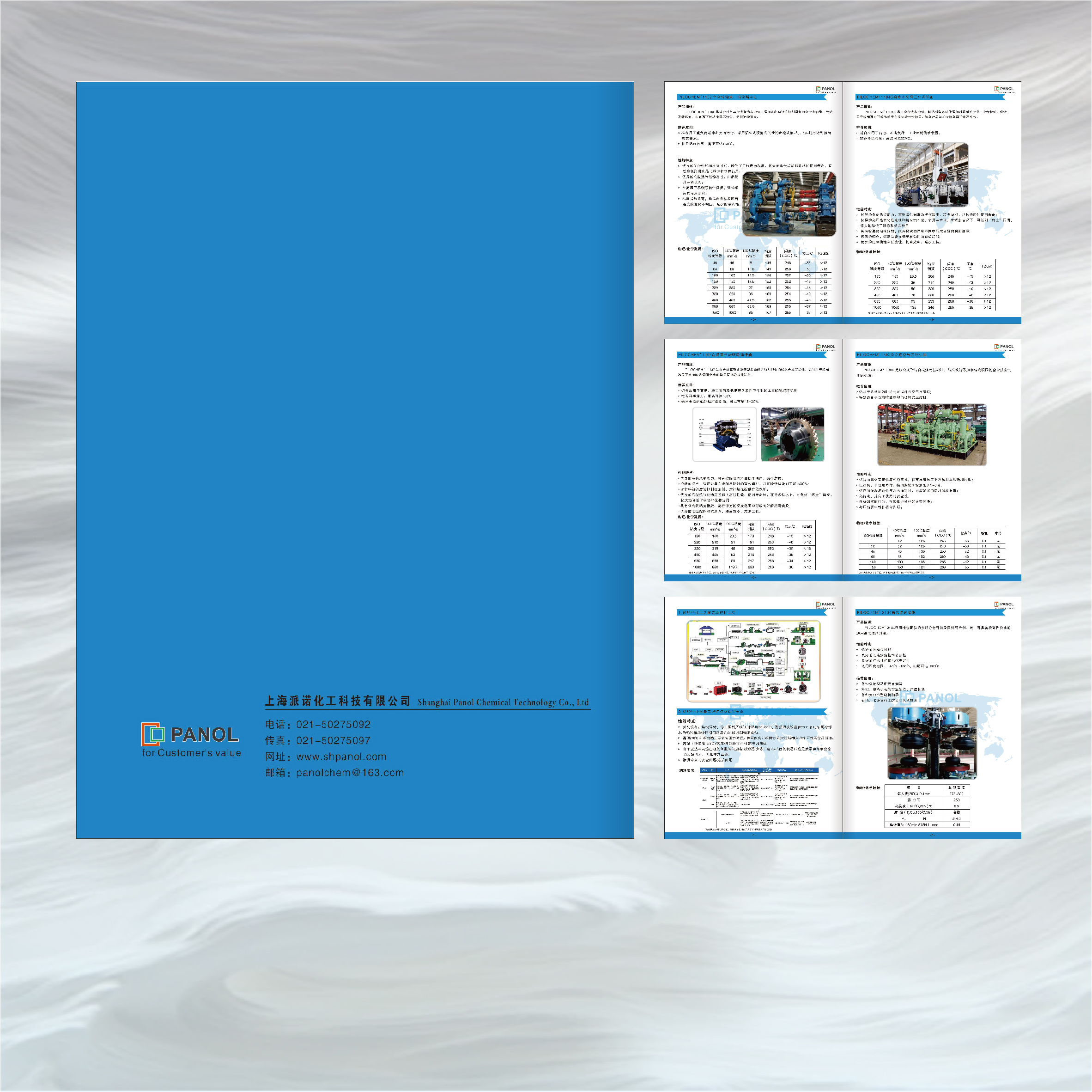
Stepping on the pit scene: I wish I could stuff all the products, technical parameters, and leadership speeches of the company from its establishment to the present! The words are densely packed, and the pictures are seeing every opportunity.
Consequence: The reader's head is as big as a bucket, and he can't find the key point within 5 seconds, so he abandons the treatment directly. Brand Image? What does not exist is only the "information bomber".
Guide to avoiding pitfalls: Speak people's words and tell stories! Clarify the core message (who are you? What pain points are solved? Why choose you?). Bold blank space, focus on key products/services, and guide the reading rhythm with visuals. Remember: the giclee is a "bait", not an "encyclopedia"!
Myth 2: Self-enjoying copywriting, users scratch their heads after reading it
Stepping on the pit site: "Leading the cutting edge of the industry", "Creating excellent quality" and "Disruptive innovation"... Full of gorgeous rhetoric, just don't speak human words. Users looked confused after reading it: What does this company do? What's the use for me?
Consequence: emotional connection cannot be established and effective value cannot be delivered. User's inner OS: What does it have to do with me?
Guide to avoiding pitfalls: Speak from the customer's perspective! In a language they are familiar with, talk about their concerns (save money? Worry-free? Improve efficiency?). Turn "we are so cow" into "what benefits can you get". Clear, straightforward and warm!
Misunderstanding 3: Visual "hodgepodge", style changes seven times a week
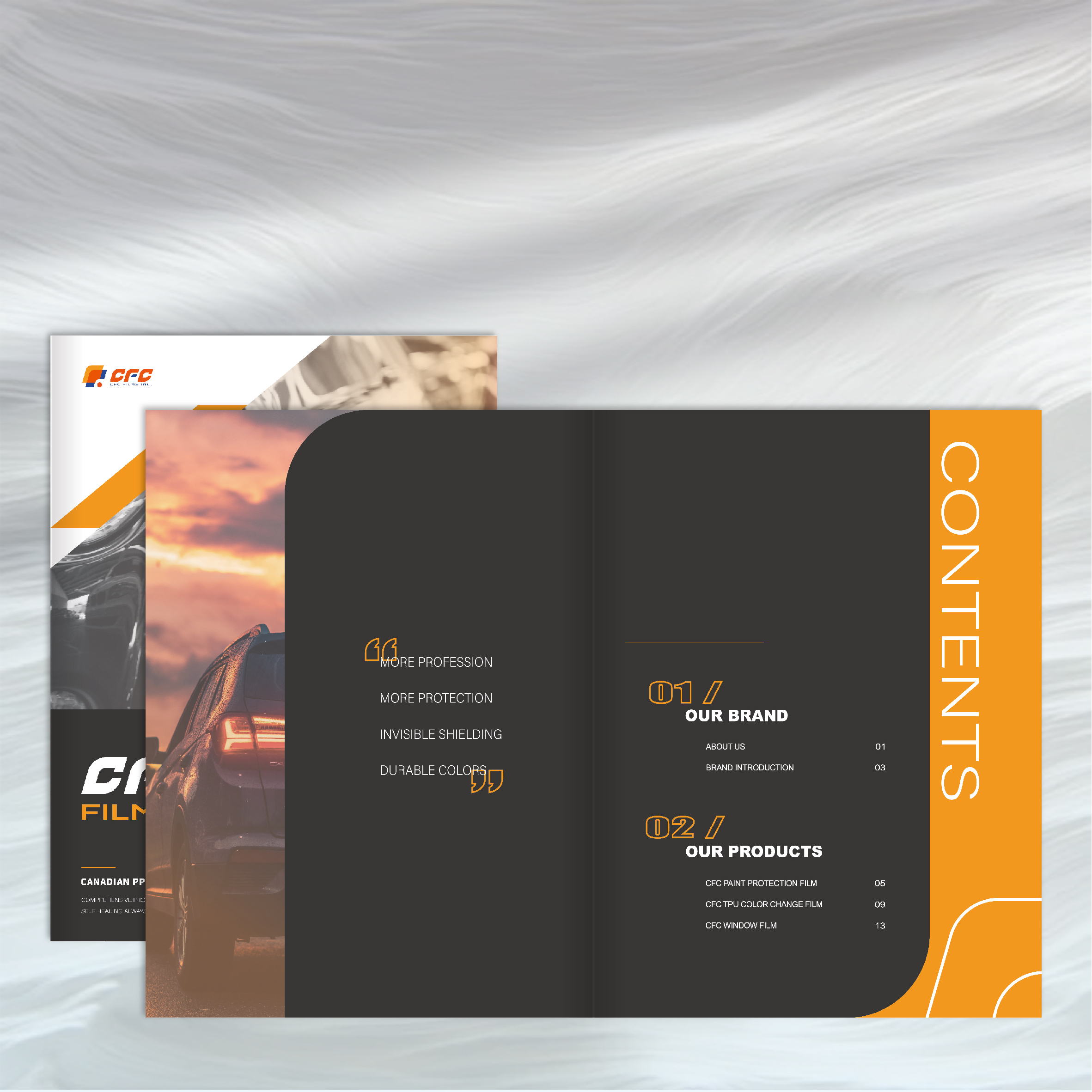
Stepping on the pit scene: The cover is tall and technological, the inner pages are suddenly small and fresh, and after two more pages, it becomes retro and industrial... The style of the picture is not uniform, and the font is cramping (I wish I couldn't collect seven kinds of summoning dragons).
Consequence: The brand image is split and extremely unprofessional. User trust? Shattered all over the floor.
Pit Avoidance Guide: Unification! Unity! Still unity! Establish clear brand visual specifications (main color, auxiliary color, font system, picture style, layout grid). The whole album conveys a consistent and stable brand temperament from beginning to end.
Misunderstanding 4: The picture quality is "touching", which lowers the brand by N grades
Stepping on the pit scene: the official website map is directly cut out and used, and the pixels are as low as a mosaic; The product picture is taken with a mobile phone, and the background is messy and the light is dark; The team took a group photo as a "wanted photo", and the expression management was completely out of control.
Consequences: The company is instantly exposed to being "stingy" or unprofessional, and the brand texture falls off a cliff. User's heart: The quality of products/services is estimated to be sufficient...
Guide to avoiding pitfalls: Pictures are faces! Core products, scenes, team photos, invest when you need to invest, find professional photography/buy high-quality galleries. Clear, exquisite composition, in-place light, conveying brand tonality. Fuzzy pictures, casual shots? Please throw it straight into the trash can!
Myth 5: Excessive design shows off skills and dazzles people
Stepping on the pit site: Designed for the "sense of design": full-page bleeding, complex hollowing out, special paper bronzing UV striking concave and convex... The craftsmanship is dazzling, but the core information is drowned out.
Consequences: Soaring costs, flashy. The user's attention is attracted to the fancy form, ignoring what you really want to say. The loss outweighs the gain when you usurp the host.
Pit Avoidance Guide: Form Serves Content! Any design technique (including craftsmanship) has to ask: Does this better convey the core message? Can it improve the user experience? Can it strengthen the brand impression? If the answer is no, give up decisively! Restraint is sometimes more sophisticated design.
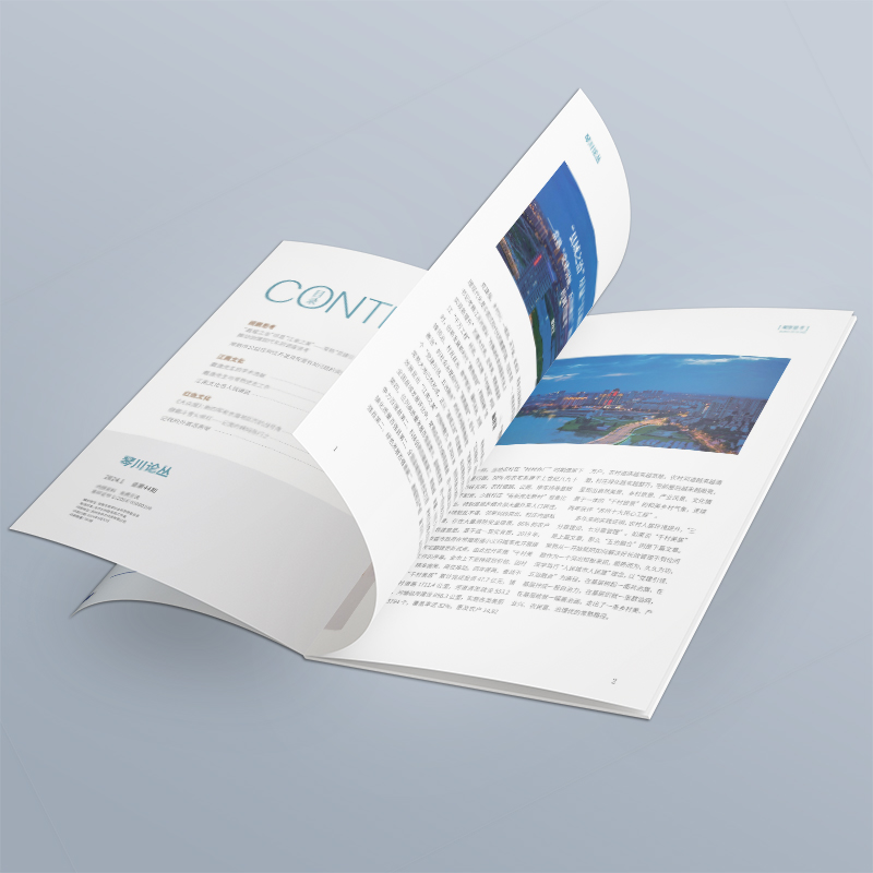
Myth 6: The structure is confusing and illogical, and readers are "lost" in the booklet
Stepping on the pit scene: There is no clear reading line, and the chapters jump around. Important information is hidden deeply, and secondary content occupies the C position. The user is like circling in a maze, unable to find the north.
Consequences: The information transmission efficiency is extremely low, and the user experience is negative. Users may give up reading directly.
Pit Avoidance Guide: Design Structures Like a Tour Guide! Define the table of contents hierarchy and set clear visual guidance (title hierarchy, color blocks, page number navigation). Follow users' cognitive habits (such as F-shaped or Z-shaped reading mode) to make the information progressive, smooth and easy to read.
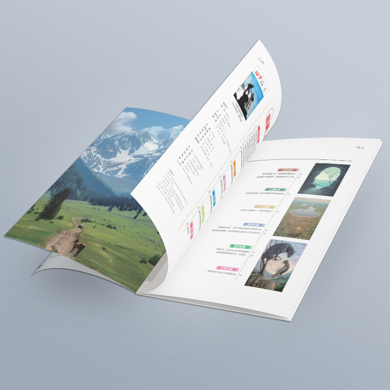
Misunderstanding 7: Ignore the printing process, the design draft is picturesque, but the finished product is ugly and cry you
Stepping on the pit site: The colors were used too much during design (high saturation, large area spot colors), and the actual printing color gamut and ink limitations were not considered; Thin lines and small print are arranged in positions that may be inaccurate; Paper selection is completely based on feeling.
Consequences: The color difference of printed finished products is huge, the details are pasted out, the text can't be seen clearly, and the paper feels cheap... The ideal is full, the reality is skinny, and the money is wasted.
Guide to avoiding pitfalls: It is important to know some common sense of printing! At the beginning of the design, consider the later implementation: design with CMYK pattern; Key text, lines avoid die-cut and binding positions; Consult the printing factory in advance for the feasibility of complex processes; Choose the right paper (gram weight, texture, feel) according to the giclee positioning and budget.
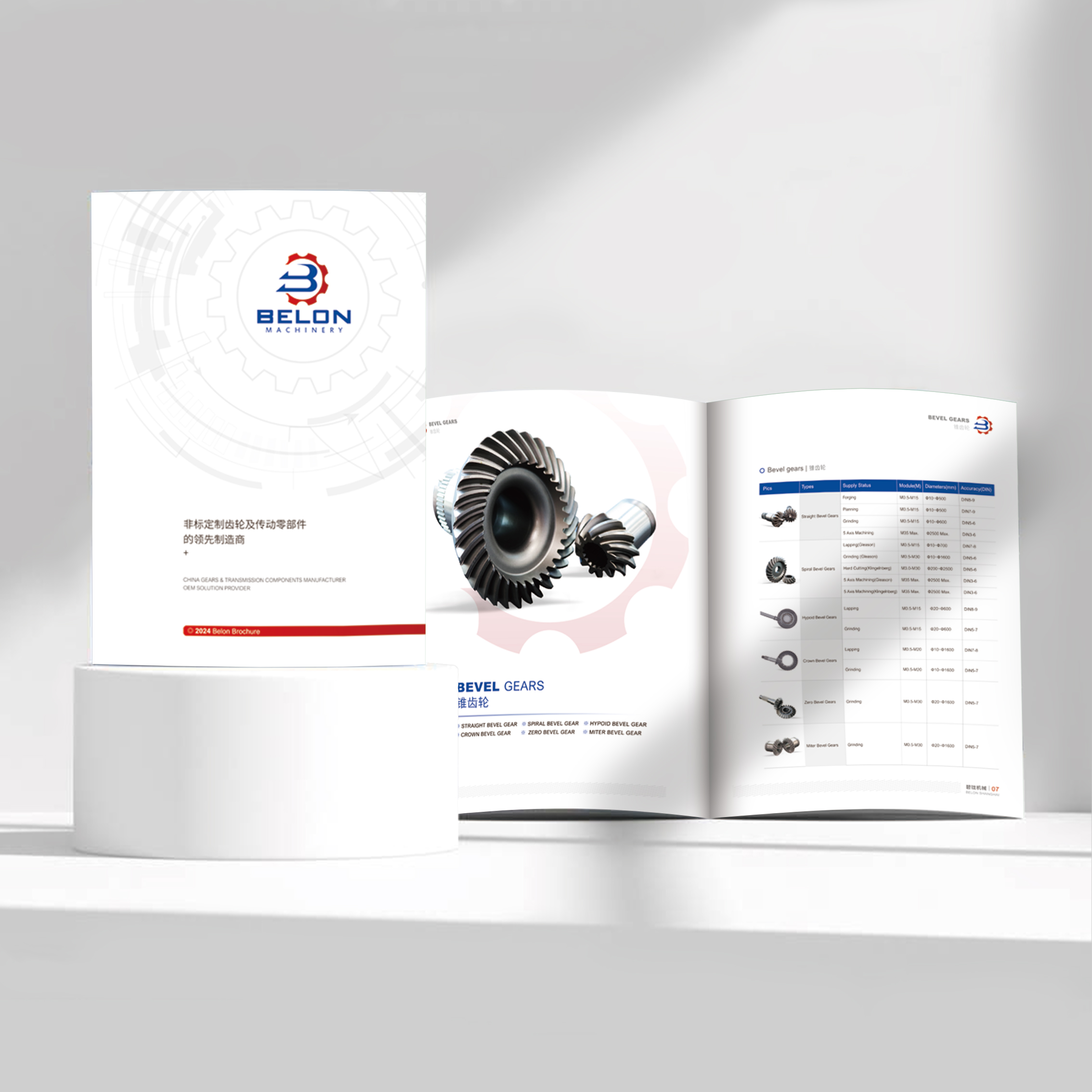
Myth 8: The goal is unclear, and I want to catch everyone in one fell swoop
Stepping on the pit scene: A picture album not only wants to show investors strength, but also wants to sell products to end customers, and also wants to talk about policies to partners... The content is large and comprehensive, trying to please everyone.
Consequences: Fuzzy focus and lack of targeted appeal to either party. It has become a book of "Four Dissimilarities".
Guide to avoiding pitfalls: Identify the core audience! Who is this album mainly for? Curate content, design style, and language tonality around their core needs and pain points. When necessary, make different editions or emphasis of albums for different audiences.
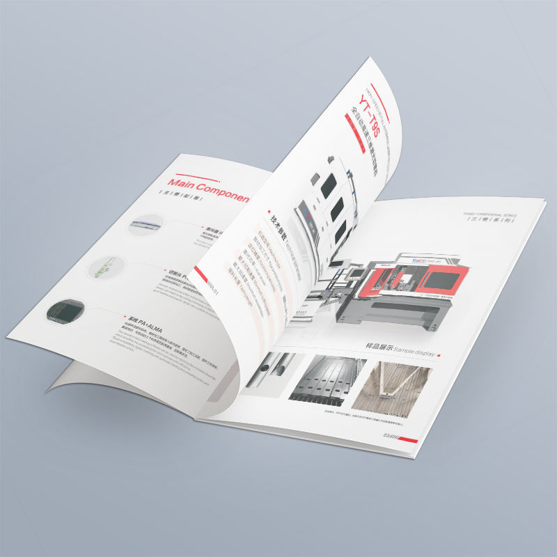
Misunderstanding 9: Blindly imitating competing products and losing one's soul
Stepping on the pit scene: Look at the beautiful album of the industry leader, and directly copy the style, layout and even color matching. The result is like a "cottage version" with no brand recognition.
Consequence: Submerged in similar albums, unable to convey unique value. Users can't remember who you are.
Pit Avoidance Guide: Be Yourself! It is possible to study competing products, but the core is to tap the unique genes, core values and differentiated advantages of one's own brand. Design should serve to express "who you are" rather than "who you are like". What is unique is valuable.
Myth 10: One draft is set for life, never updated iteratively
Stepping on the pit scene: After the album is printed, it will be shelved, and it will last for three to five years. The company's business, products, team and contact information have all changed, and the content of the album is still in the "ancient times".
Consequences: The information is seriously lagging behind, misleading customers and damaging professional image. Users get it: Is this company still there?
Guide to avoiding pitfalls: Picture albums are "living" materials! Establish a regular review and update mechanism (at least annually). Update key information (product, case, data, team, contact details) in a timely manner. Alternatively, a more flexible modular design is adopted to facilitate partial replacement of updated content.

Don't let "design" become the invisible killer of brand value! A truly excellent picture album, by no means just "looks beautiful". It should be an accurate communication tool, which can clearly convey your core values, accurately impress target customers, and effectively promote business goals.
Step on these pitfalls above? Don't panic! This is the significance of the existence of official website, a professional album design company-we not only help you "make a beautiful album", but also become a "strategic partner" of your brand. From precise positioning, content planning, visual design to printing landing, we are deeply involved in the whole process to help you avoid every value trap, spend your money clearly, and make the album truly a super engine driving your business! Still worried about the effect of the album? Looking for a design partner who really understands the brand, understands the strategy, and can land? Serve snacks and find a reliable oneAlbum design company official website Have a good chat! A right picture album will bring rewards far beyond your imagination.


