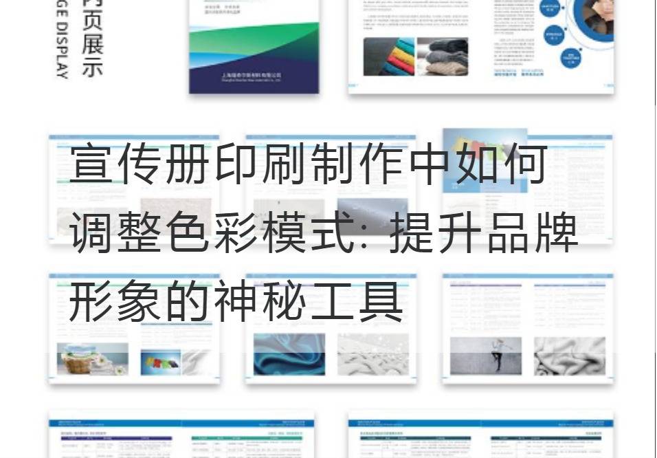
How to adjust the color mode during brochure printing: Mysterious tools to enhance brand image
In a world dominated by vision, color is not only a decorative element, but an essential vivid language, a powerful means of expression, a thousand words, a smile and a smile. Especially in the brochure printing, the adjustment of color pattern is an important tool to promote the brand image, display the brand characteristics, attract and retain the attention of consumers.
So how to explore the unique charm of color pattern in printing with modern and gorgeous style of writing and sharp viewpoint, and how to adjust color pattern scientifically so as to make it have decisive influence in interpreting brand value and conveying brand information?

First, the basis for understanding color modes is CMYK and RGB. In printed products, we usually use the CMYK mode, which consists of Cyan, Magenta, Yellow, and Black. This pattern is a spectrum that covers all possible printing colors. In contrast, the RGB mode, consisting of red (Red), green (Green), and blue (Blue), is a color mode used for display of an electronic device.
When adjusting color modes, the first thing we need to ensure is color consistency. The technical parameters in this aspect include color depth, color saturation, and color luminance. It is only when these parameters are coordinated and coordinated that we can create an eye-catching color effect. For example, color depth enhances the visual impact of a brochure, while color saturation enhances the recognition of a brand and creates a unique brand identity.
Secondly, mastering color contrast skills is also an important means to adjust color patterns. Professional visual designers will use color theory, according to the brand image and the theme of the brochure, carry on color contrast and collocation, guide the eyes of consumers, highlight propaganda information. With contrast as the basic parameter, visual designers create a color scheme that is both tension and harmony, enhancing brand awareness.
Finally, from the angle of color psychology, using some color elements in time can influence consumers' psychological activities and behavioral reactions in subconscious. For example, red is often associated with passion and impulsivity, while blue is associated with calmness and reason. Adjusting the color pattern according to the brand orientation and consumers' psychological needs can effectively stimulate consumers' curiosity about the brand and improve consumers' attention and purchase intention.
With the appropriate color pattern adjustment and the combination of technical parameters, we can create a distinctive and distinctive brand image. To sum up, the color is inBrochure PrintingThe role in the production can not be ignored, is to promote the brand image, create the brand unique mysterious weapon, needs us to give enough attention and attention.


